
All Out Sarap, Every Screen
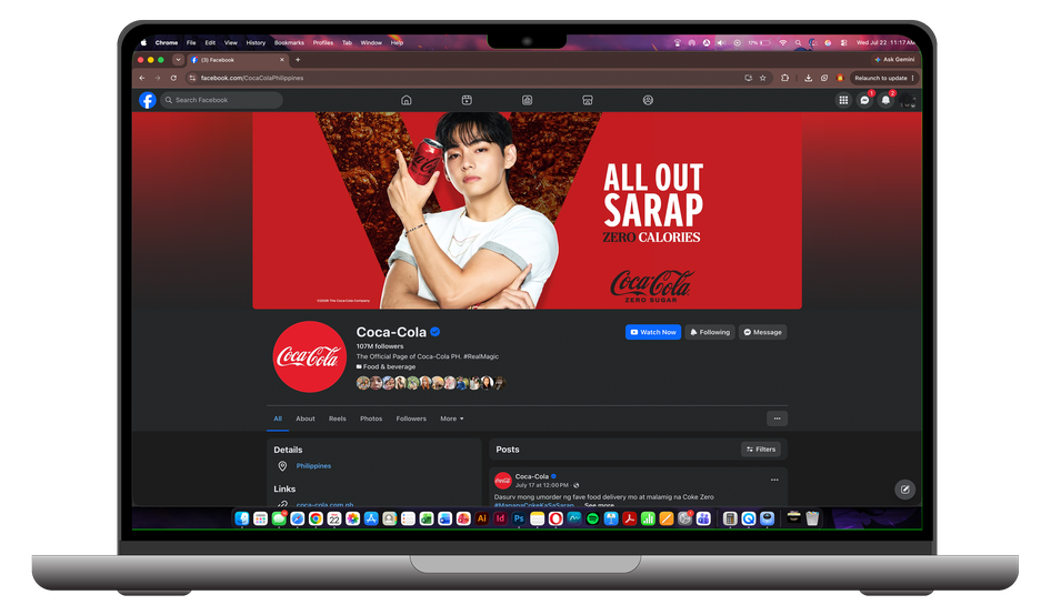
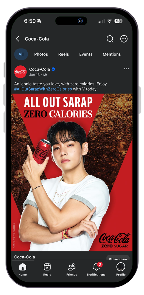
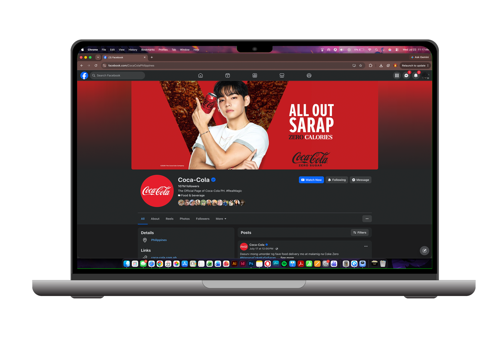
A Facebook feed post, a live page cover, and the flat crop underneath it — one BTS V key visual built to hold up in every placement's own native chrome.
Beli & Menang RM500,000
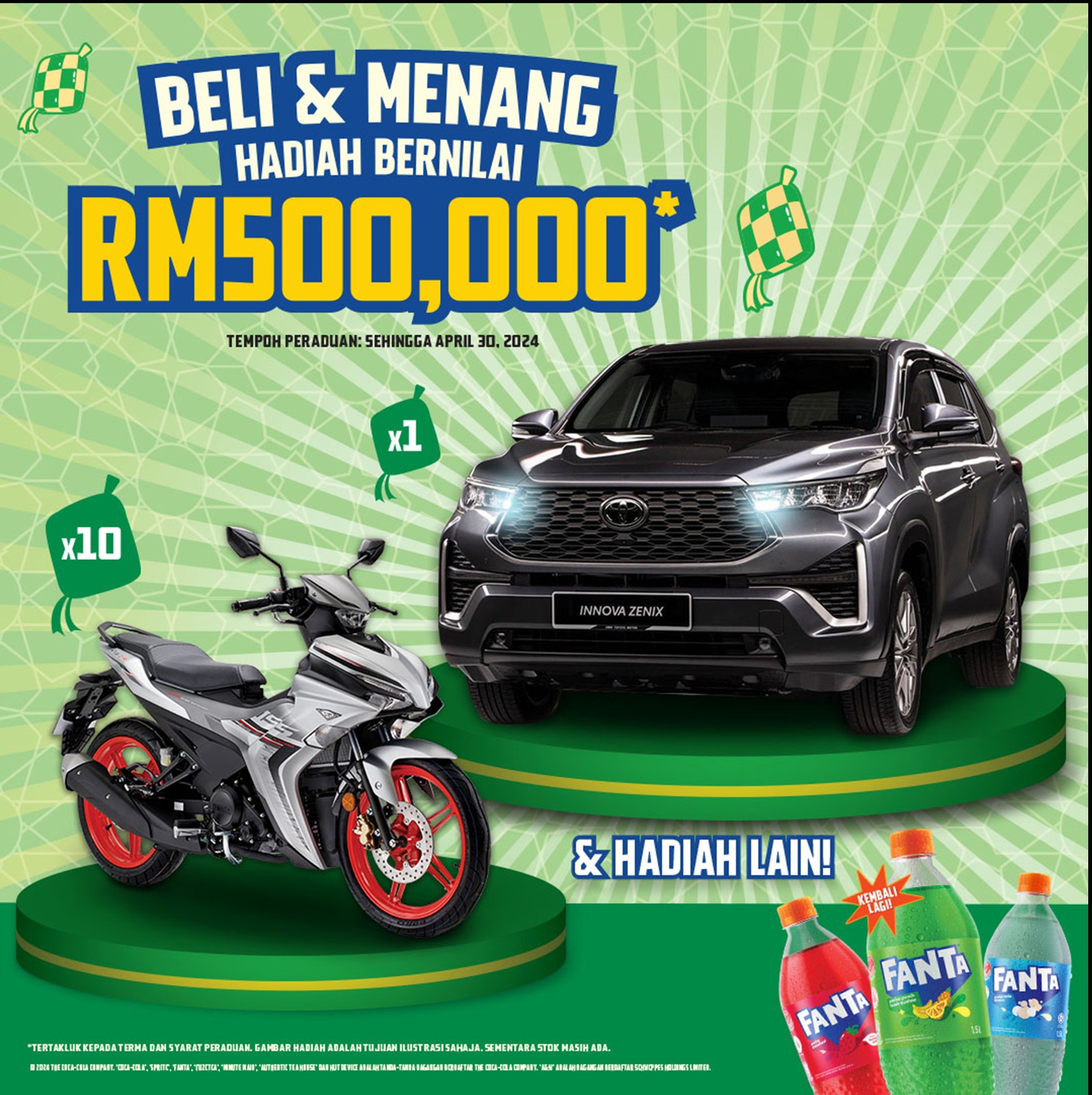
A straightforward Fanta Malaysia pitch — buy 3, win from a prize pool topped by a car and ten motorbikes — carried from a live Facebook post down to leaderboard and OLV companion sizes.
Feel It All Together
A pillar-wrap and LED campaign built for two very different canvases — a subway column commuters walk past, and a stadium-scale board they can't miss.
Rasai Semuanya Dengan Coca-Cola
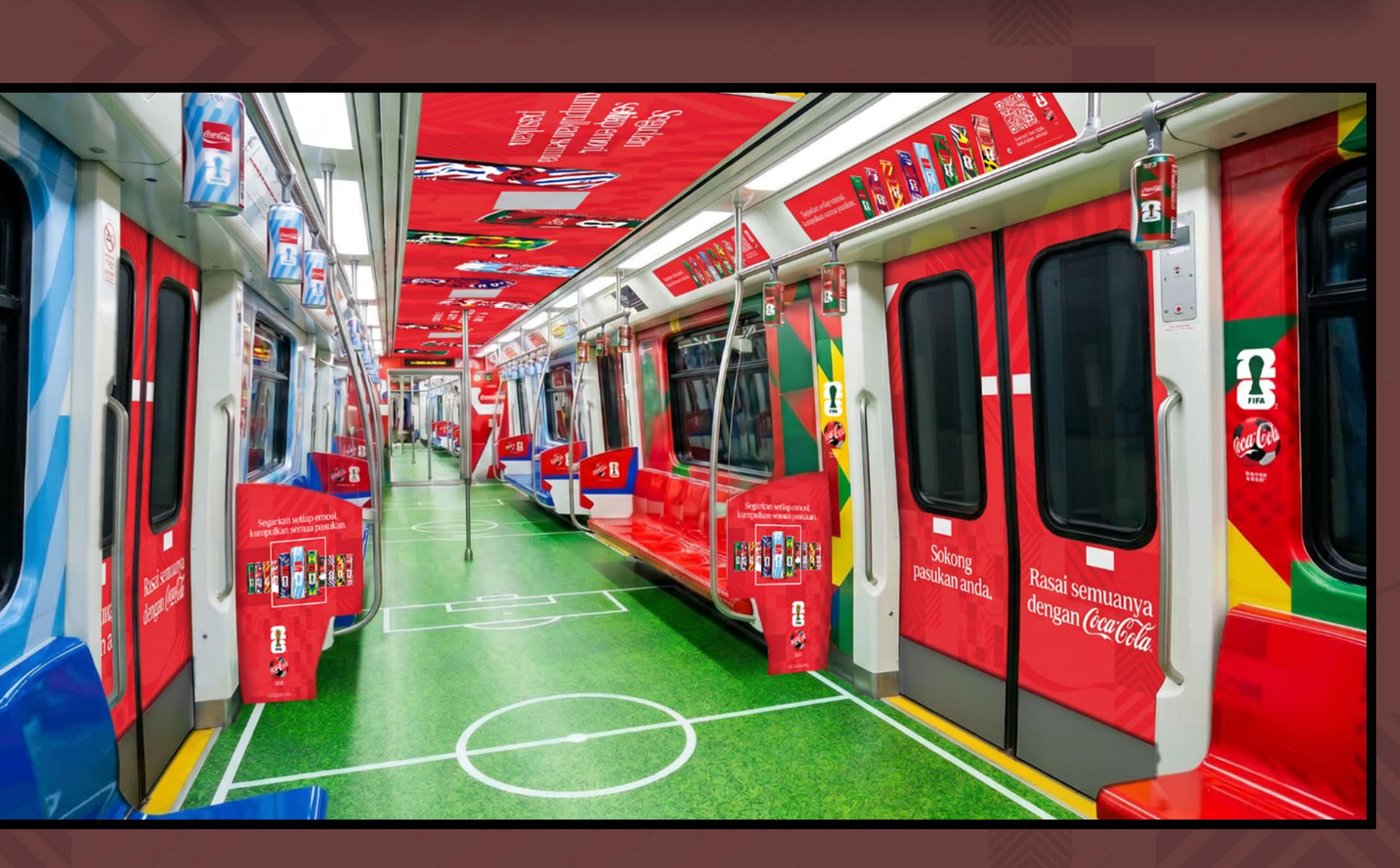
A full interior train transformation — ceiling, seats, doors, handgrips, control panels — turning a daily commute into a stadium-like environment.
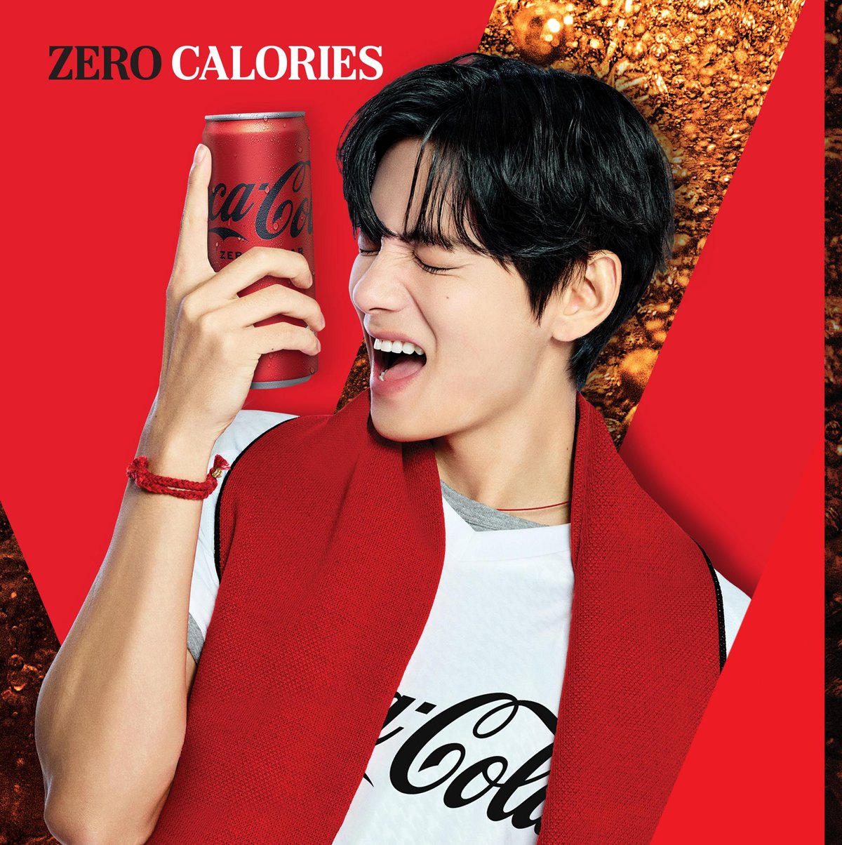
Coke Time V
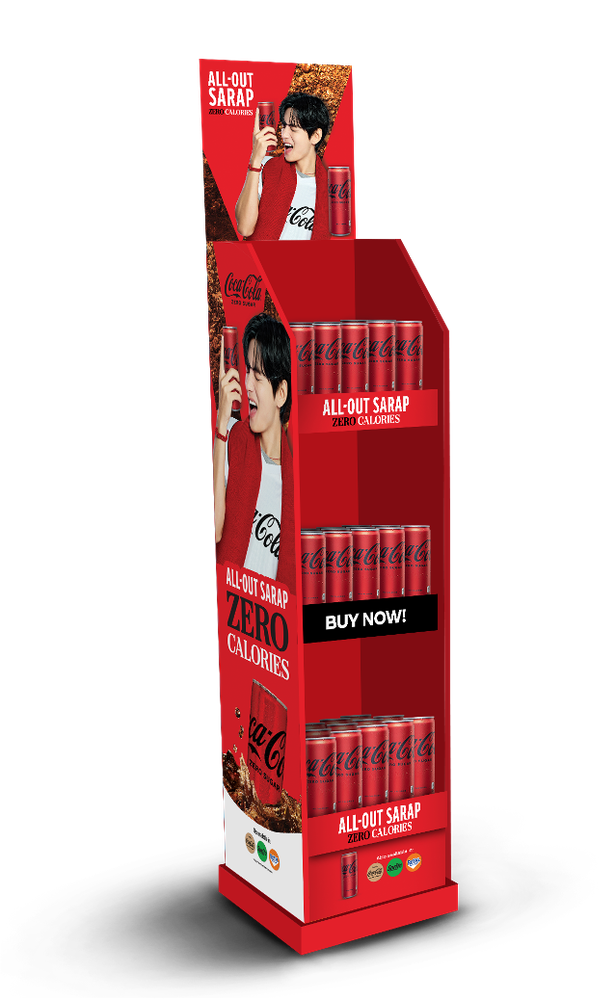
A full retail key-visual system built around K-pop artist V as the year's brand ambassador, translated across nine different in-store formats.
Display Systems for LEGO
Retail display artwork across licensed LEGO lines — Jurassic World, Minecraft, City, and Creator — each built as a full structural system, not a flat poster.
Magic Happens When We Bond
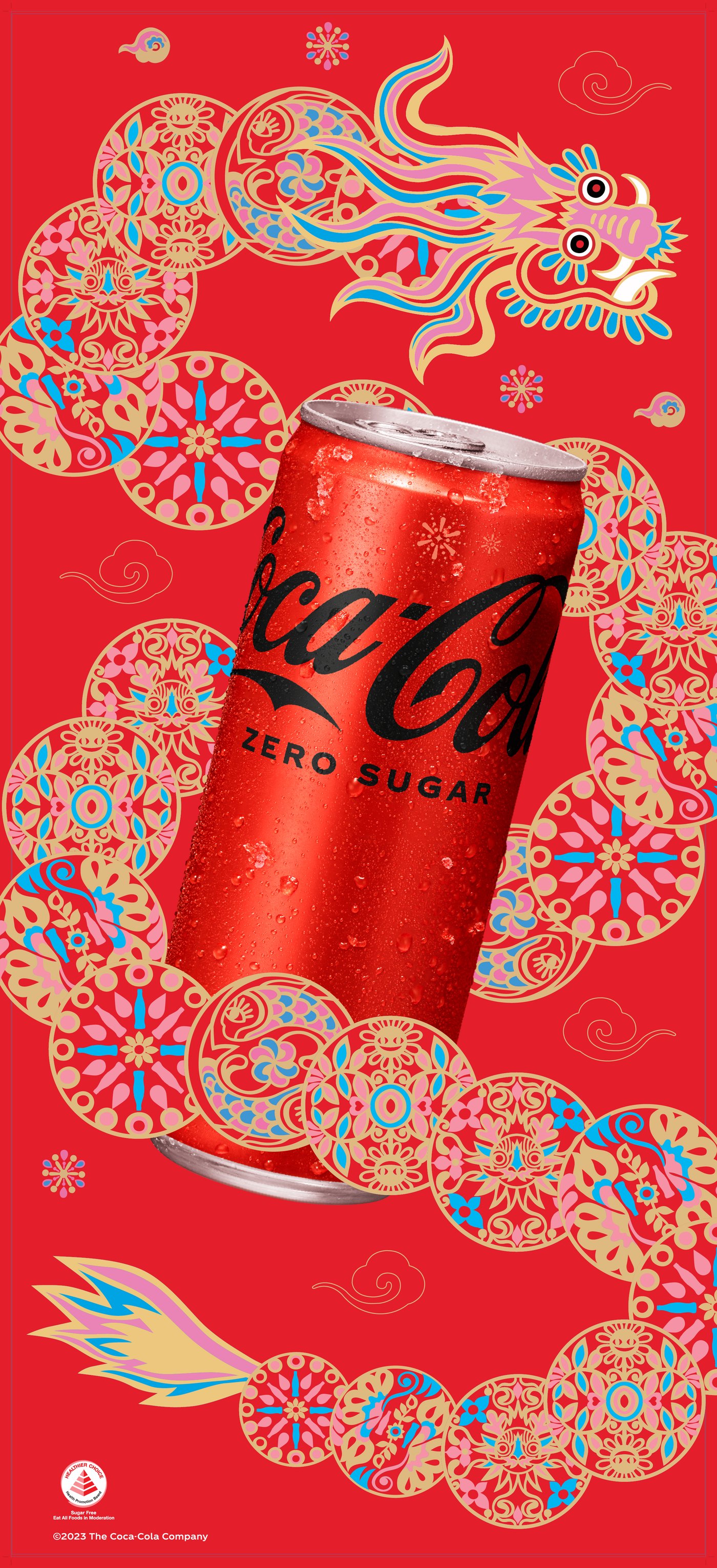
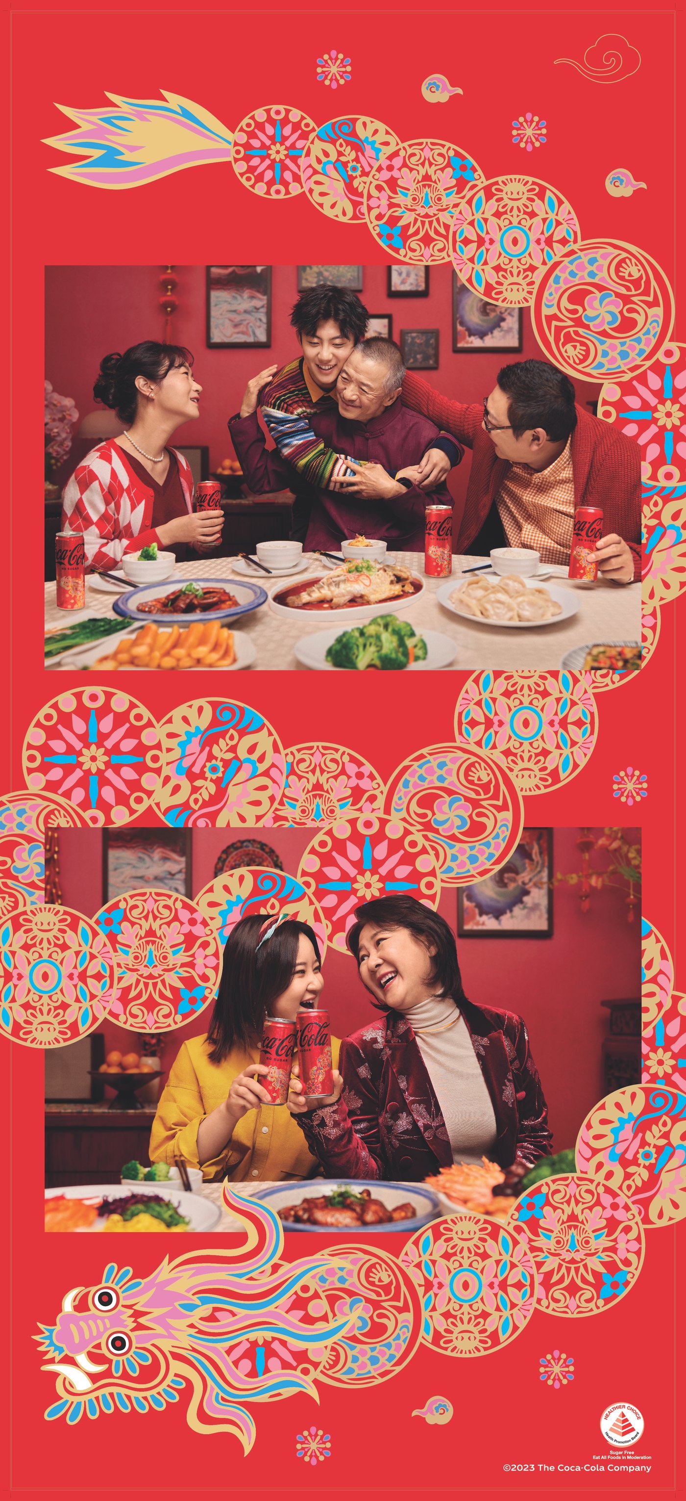
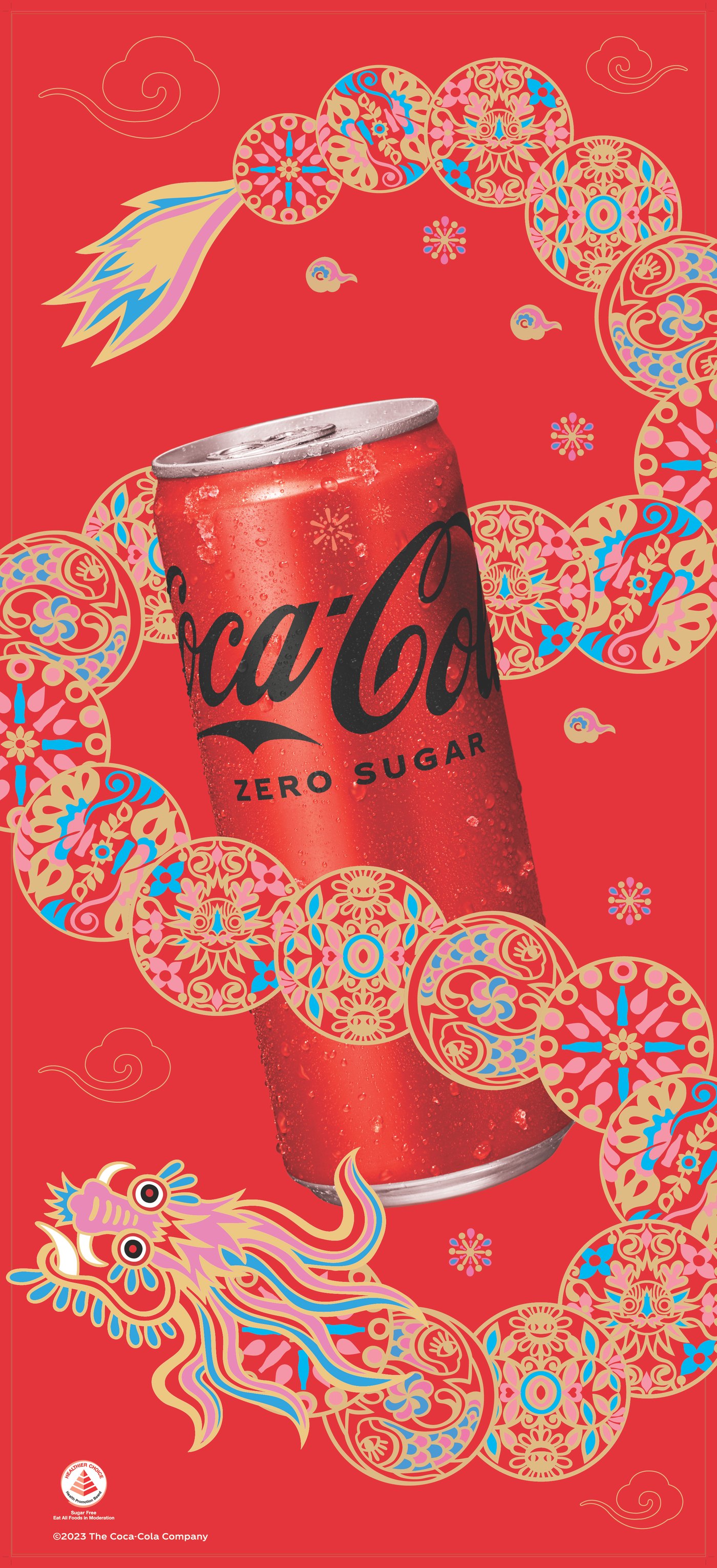
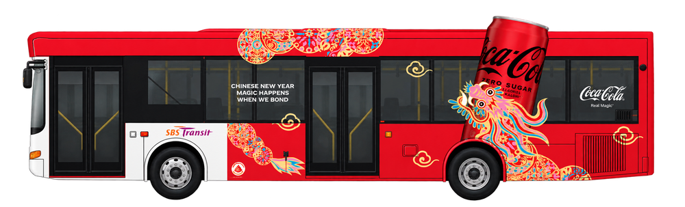
One dragon motif, in Coca-Cola's signature red and gold, carried across escalator decals, pillar stickers, wall decals, and a full city bus transit wrap.
From file to wall


Over 12 years in print production, final artwork, and digital design, specializing in production-ready collateral and large-format output for leading brands across APAC — from first working file to signed-off, on-brand, print-ready art.
Alongside the physical work, I produce digital ad creative for Meta, TikTok, YouTube, and Lazada — resizing and adapting the same campaigns for teams and markets across the US, UK, and APAC, each with its own platform specs, safe areas, and review cycles to work around.
Most of what I do lives outside a browser window — on a subway pillar, a mall stairwell, a stadium LED board, an office lobby screen. That means every project comes with its own real-world constraint: a resolution, a material, a viewing distance, an install date that doesn't move.
I care about getting handed a creative concept and figuring out exactly what it takes to make it real — the right bleed, the right crop for the format, the right proof before it goes to print. Along the way I've mentored junior artworkers on the same workflow.
 PhotoshopAdvanced
 IllustratorAdvanced
 InDesignAdvanced
 Acrobat DCProficient
 Premiere ProFamiliar
 FigmaBasic
 ChatGPTAdvanced
 ClaudeFamiliar
-
2008 — 2013B.S. Computer EngineeringMarinduque State College — Marinduque, Philippines
12 years, five studios
-
2025 — PresentSenior Creative ArtworkerWPP Production Manila — promoted from Creative Artworker, Sept 2025
Production-ready artwork for APAC print and digital campaigns — billboards, banners, retail, OOH — with a focus on technical accuracy, bleed, and color consistency. Mentors junior artworkers on quality control.
-
2023 — 2025Creative ArtworkerHogarth Philippines (now WPP Production)
Final artwork for print and digital layouts across shopper materials, posters, banners, and large-format designs for clients across Asia and international markets.
-
2017 — 2023Production Artist / Graphic ArtistSGS Asia Pacific Manila Incorporation (now Propelis)
Print-ready artwork for LEGO campaigns across retail, packaging, e-commerce, and shopper marketing — banners, packaging, wobblers, standees, and flagship store materials.
-
2016 — 2017Graphics Layout Operator / Esko-Mac RetoucherScanwell Graphics Corporation (now Fortune Packaging)
Layouting, retouching, and file prep for magazines, posters, cereal boxes, and calling cards — color correction and bleed settings for print.
-
2014 — 2016Digital-Imaging EngineerScanwell Graphics Corporation (now Fortune Packaging)
Operated digital printing equipment (HP Indigo, HP FB500, HP Kongsberg), verifying output quality and color accuracy before mass production.
Coca-Cola FIFA ATL SIMA
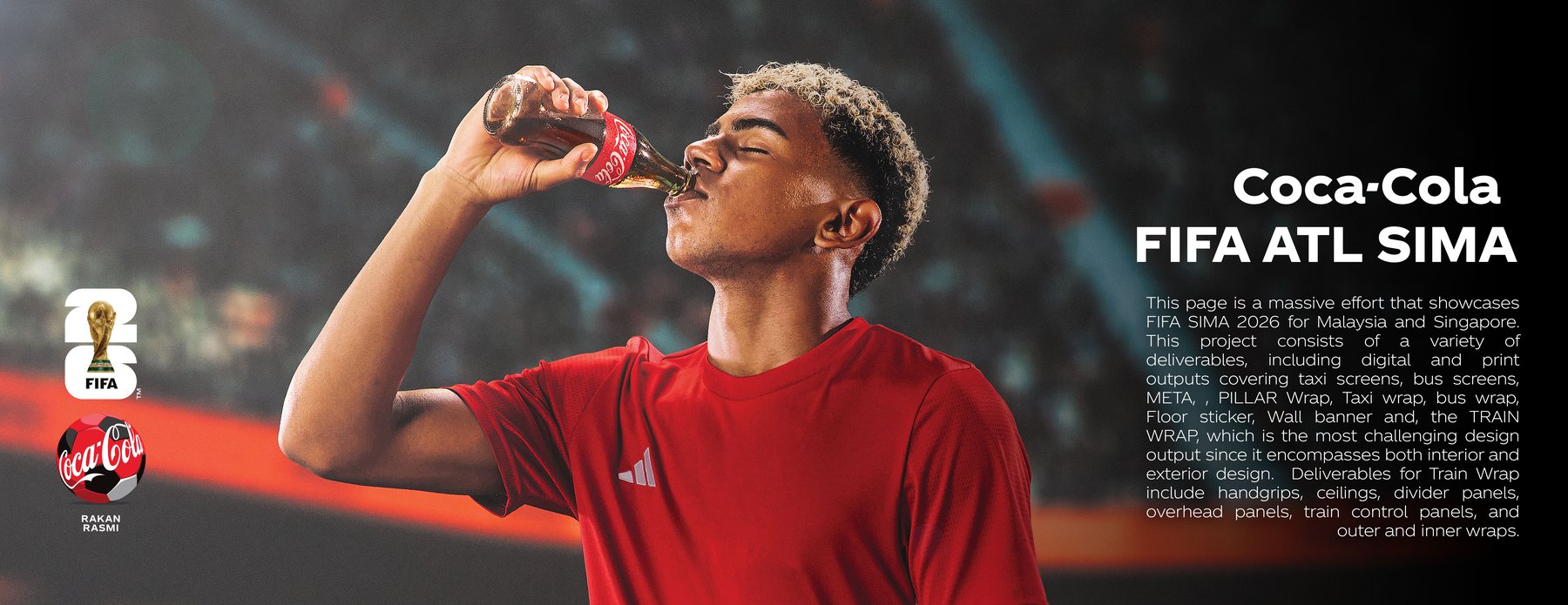
A single activation spanning both Malaysia and Singapore, covering print and digital output across taxi screens, bus screens, Meta placements, pillar wraps, taxi and bus wraps, floor stickers, wall banners, and the full LRT train wrap — the most demanding piece of the set, since it covers both the interior and exterior of a working commuter train.
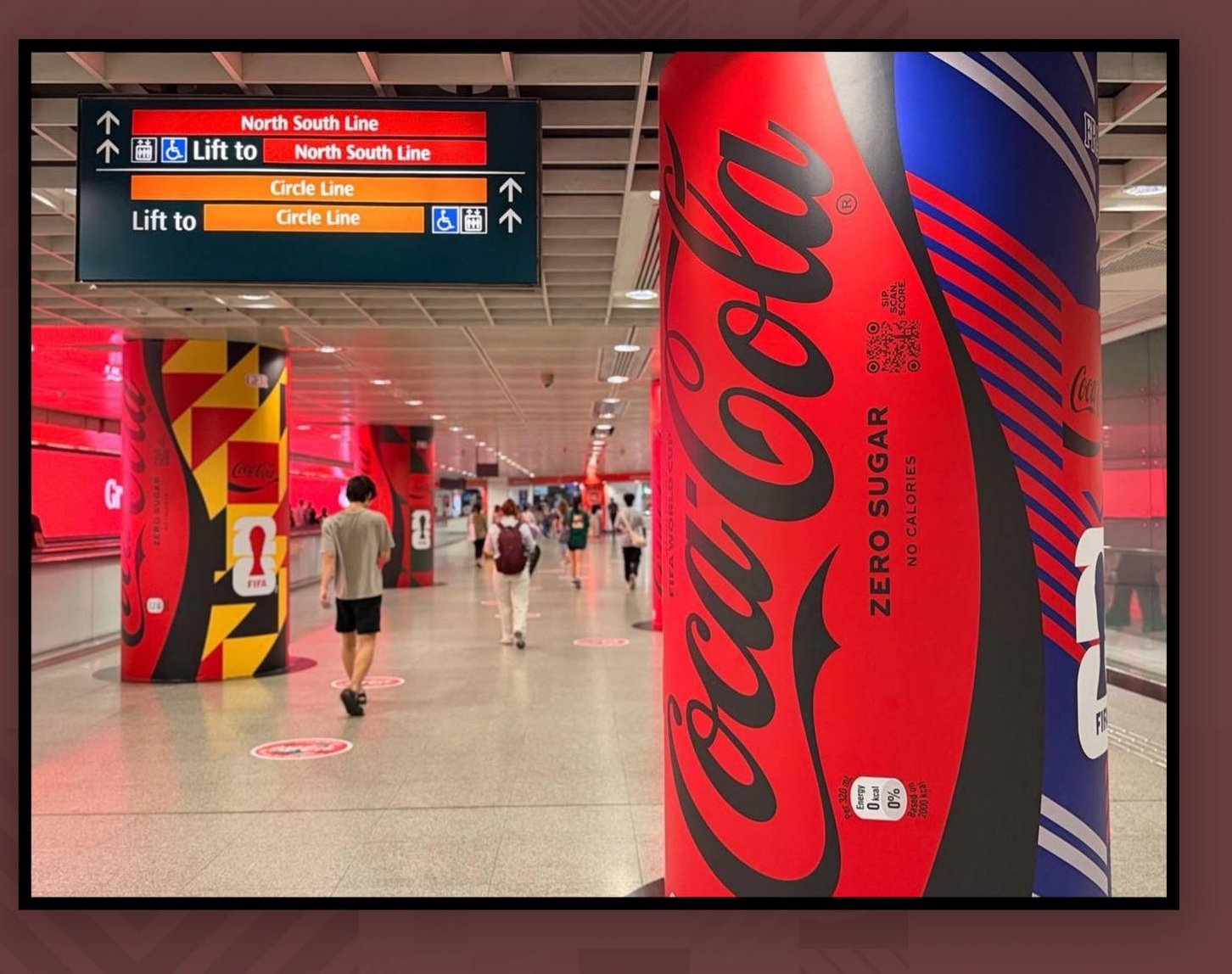
Live at Dhoby Ghaut — Pillar Wrap & LED, In Motion
Pillar wrap and digital LED shot together on-site at Dhoby Ghaut MRT — the "Grab a Coca-Cola" and "Refresh every emotion" lines cycling on the LED strip while commuters pass the wrapped column beside it, confirming both pieces read together exactly as designed.
Pillar Wrap — Singapore
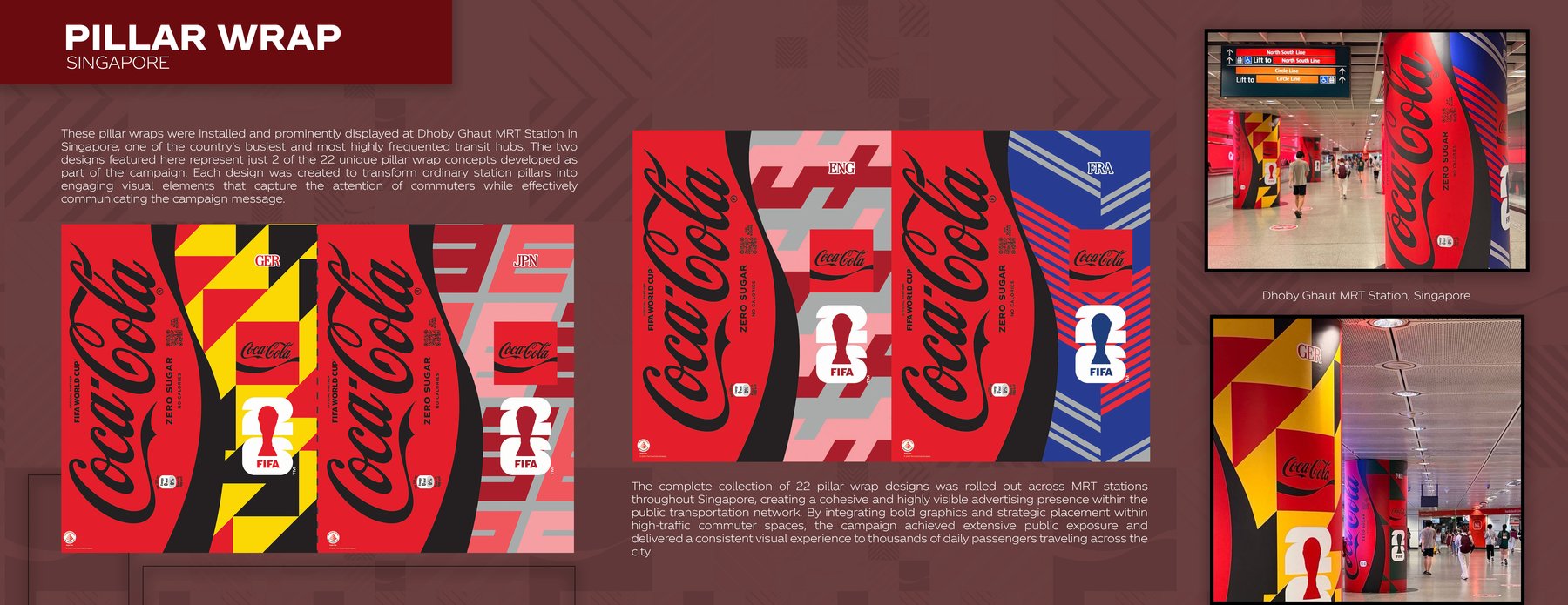
These two designs represent just 2 of the 22 unique pillar-wrap concepts built for this campaign, installed at Dhoby Ghaut — one of Singapore's busiest MRT interchanges. Each had to transform an ordinary station column into something that stops a commuter mid-stride, while still reading clearly at walking speed.
Digital LED System
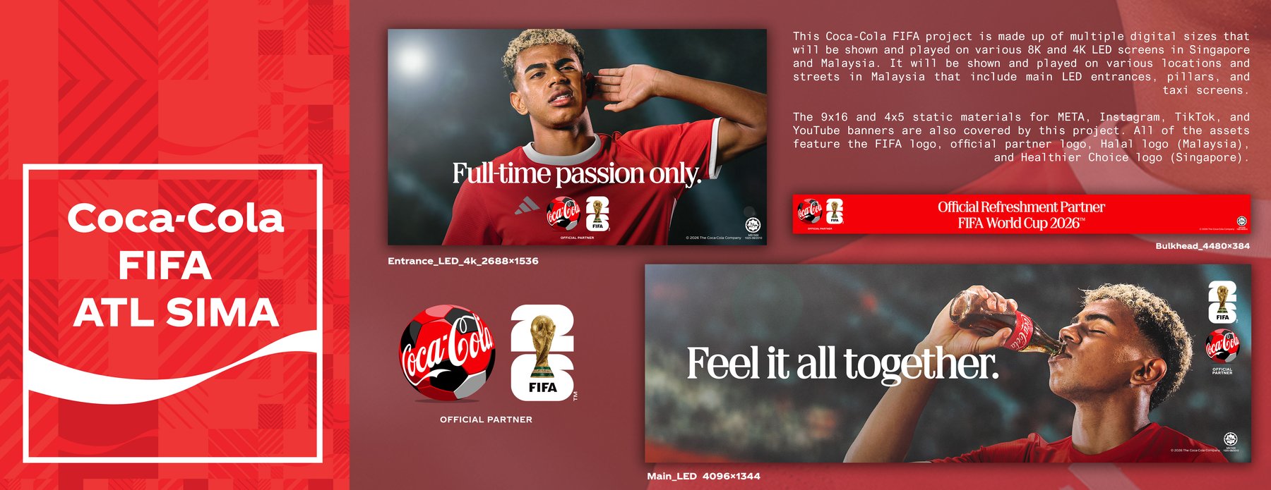
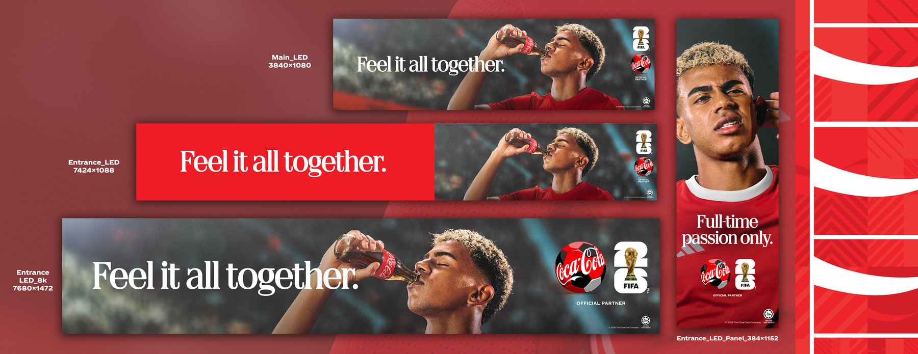
Built for 8K and 4K LED screens across Singapore and Malaysia — main entrances, pillars, and street-level taxi screens — each size produced as its own asset rather than one file stretched to fit. Every version carries the FIFA logo, official partner mark, and the relevant local compliance logo (Halal in Malaysia, Healthier Choice in Singapore).
Taxi Wrap & Roof Screen — Singapore
 Watch full video on LinkedIn ↗
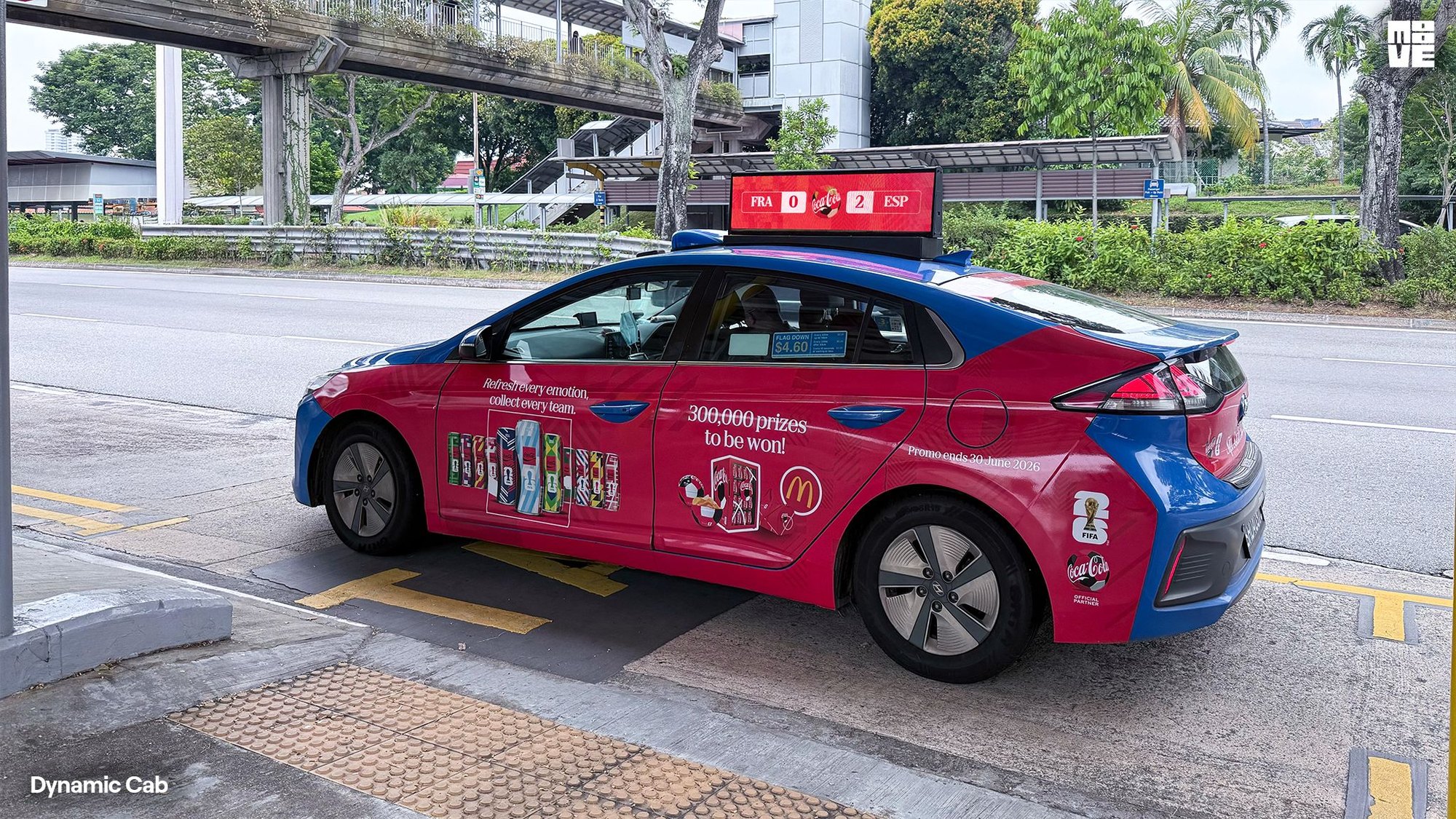
The campaign rode on Dynamic Cab taxis across Singapore — a full side wrap on both sides of the car, with a digital roof screen above it — carrying the "Refresh every emotion, collect every team" line out onto the street.

The side-decal artwork for both sides of the car, built to the vehicle's cut line — wheel arches cut out, with the can line-up and the "300,000 prizes to be won!" promo each sitting on its own door panel.
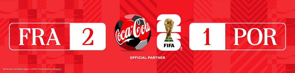
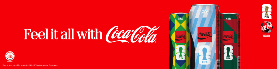
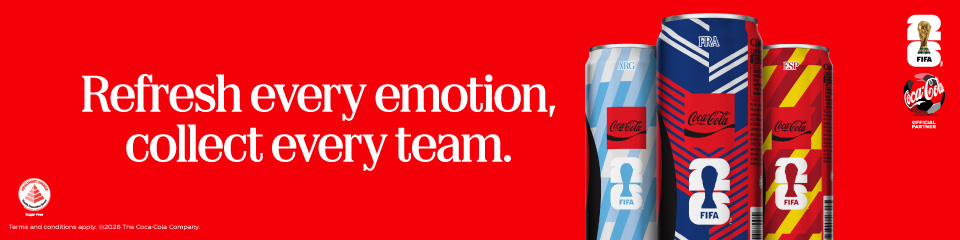
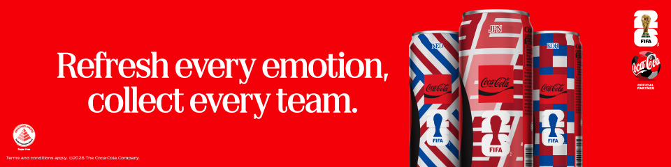
The roof screen rotated the collectible can line-ups with a live-score format — team codes and the match score set into one fixed branded frame, so each result could go up on the screen as matches were played.
Bus Screen — Singapore
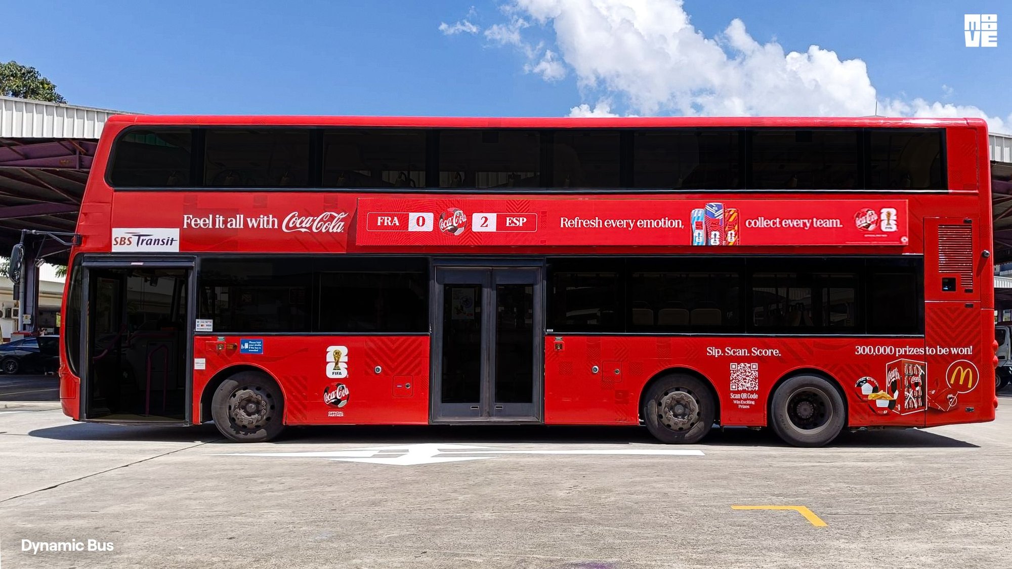
On SBS Transit double-deckers, the campaign ran as a long strip screen along the side of the bus — the same live-score frame on the left, with the can line-ups and the campaign line carried across the rest of its width.




At 1920×160 — a 12:1 strip — every frame had to hold the score, the headline, the cans, and the FIFA and official-partner marks in one line, readable from the street as the bus passed.
The LRT Train Wrap and Wall/Floor Sticker from this same activation are shown as their own case studies elsewhere on this site.
Rasai Semuanya Dengan Coca-Cola
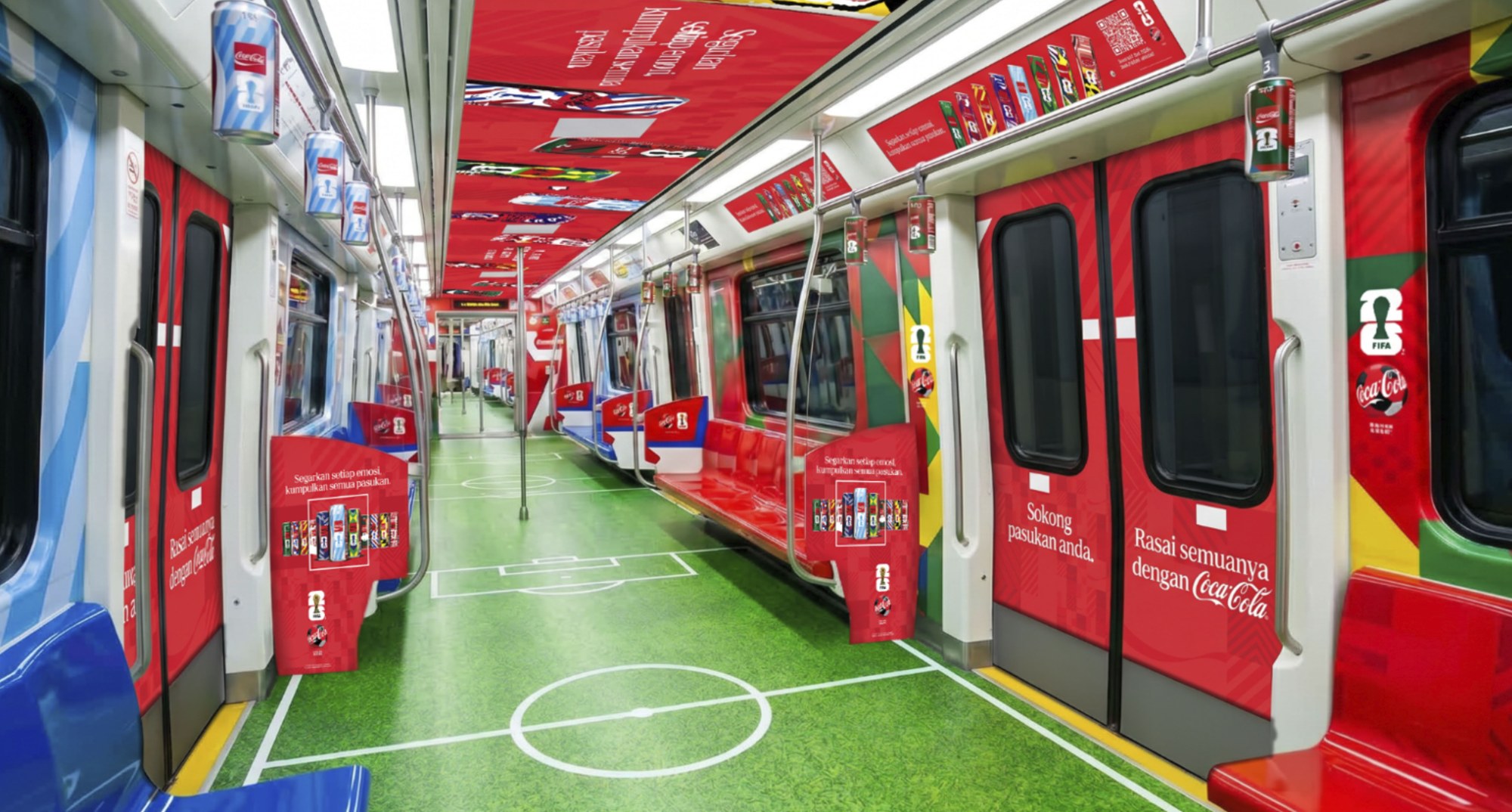
As part of a major nationwide brand activation, this meant wrapping the interior of a working commuter train in Malaysia — a wide variety of country-specific, limited-edition Coca-Cola can designs, every asset formatted to the exact, millimeter-accurate dimensions of the train's own architecture.
Control Panel & External Internal Dividers
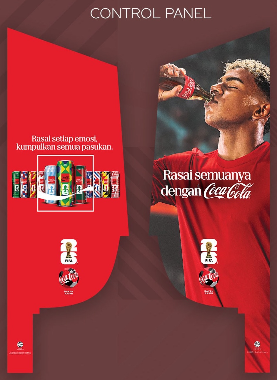
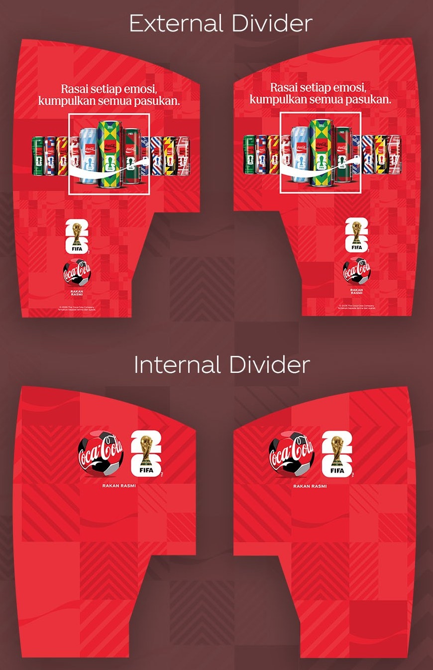
The two control panels bookending each car — one built around the flag-can lineup and campaign line, the other around the ambassador photography — both carrying the FIFA and Coca-Cola partner marks. Dividers needed two distinct versions — external panels carrying the full can lineup and campaign line, internal panels kept clean with just the partner marks — each cut to the same curved die-line as the train's actual divider architecture.
Inner Coach — Four Flag Variants
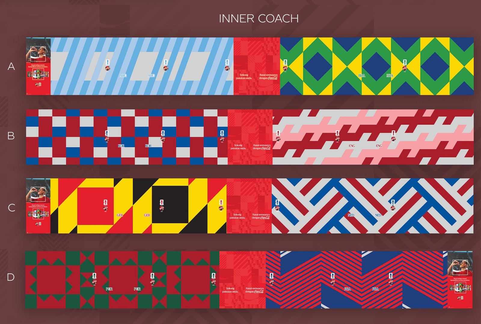
Eight country patterns across four wall variants — Argentina/Brazil, Korea/England, Germany/Netherlands, Portugal/France — repeated down the length of the car so the wall changes depending on exactly where a rider is standing.
Overhead Panel & Hand Grip
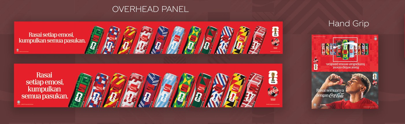
The overhead panel repeats the full can lineup as a continuous banner above the windows, while the hand grips carry a smaller version of the same key visual at eye level for standing passengers.
Train Ceiling

The ceiling strip runs the full length of the car in individual angled segments — the most fiddly production piece of the set, since each segment had to align with the one before and after it despite the train's own paneling seams.
Coke Time V PH Shopper
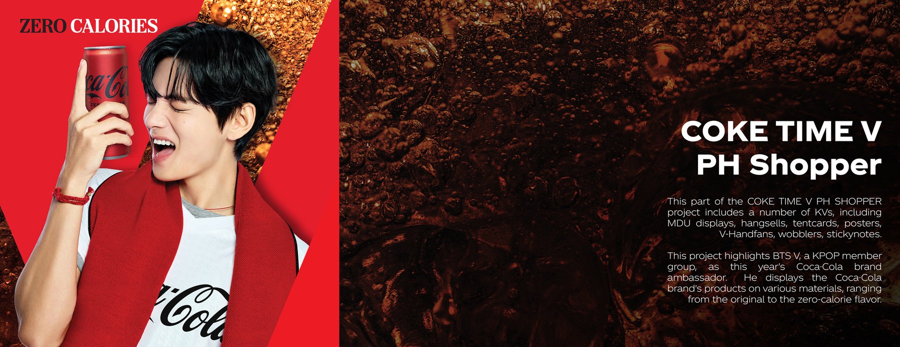
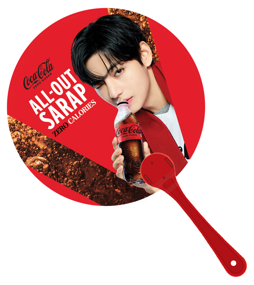
Built around K-pop artist V as this year's Coca-Cola brand ambassador, this project covers nine in-store formats — MDU displays, hangsells, tentcards, posters, V-shaped handfans, wobblers, and stickynotes — each showing the brand's products across original and zero-calorie flavors.
MDU Display
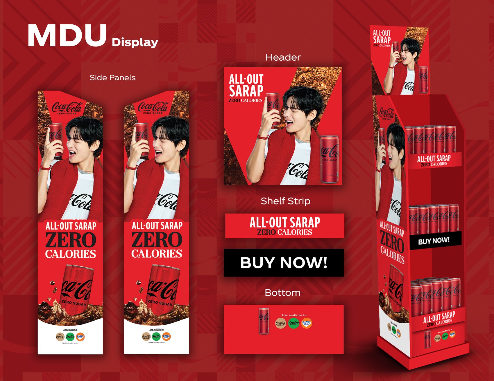
Built from four separate print components — side panels, header, shelf strip, and bottom label — that fold into a single full-height tower stocked with cans. Two tower widths were produced from the same components to fit different shelf footprints.
Hangsell
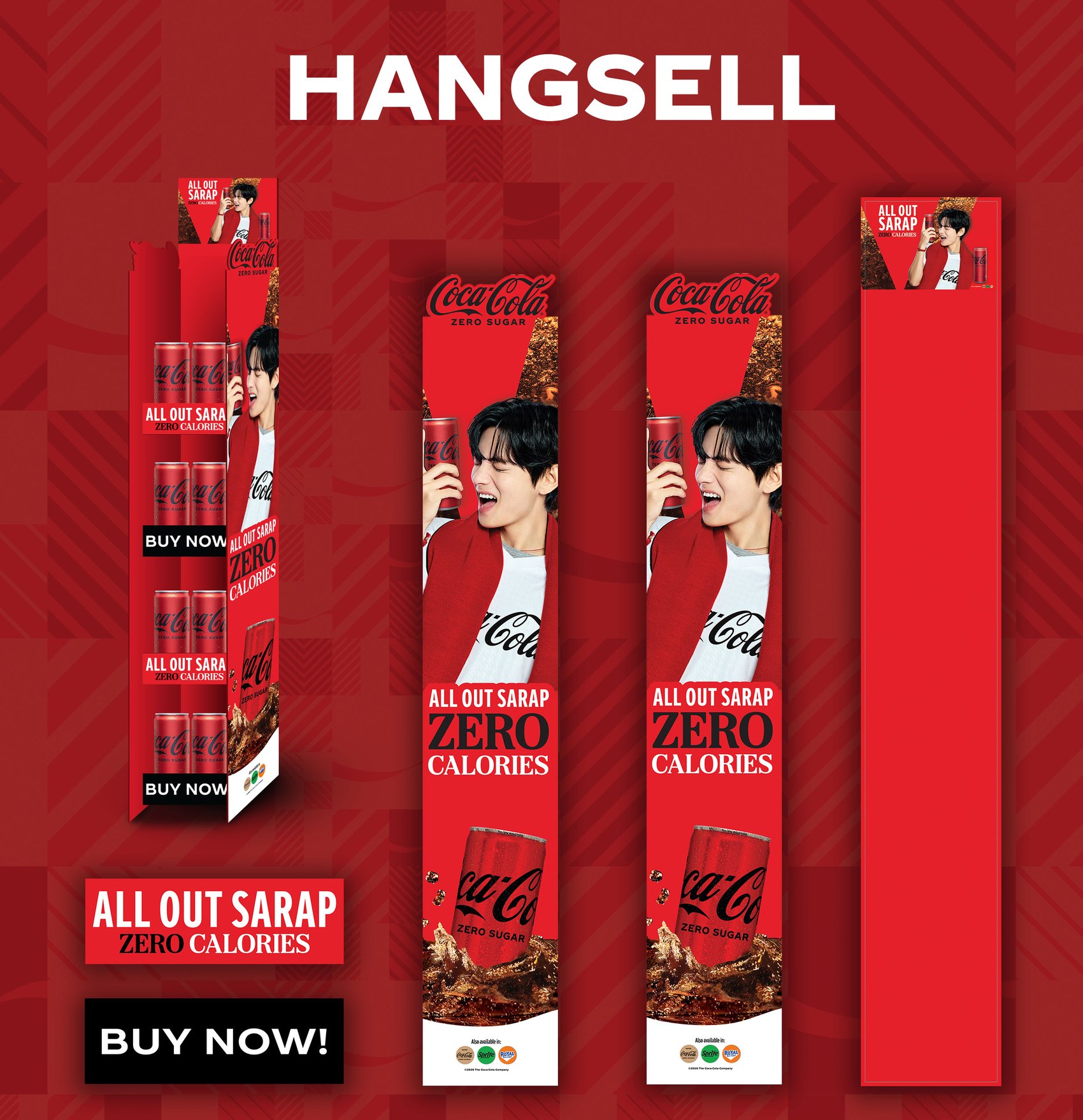
A simpler hanging format for aisles without shelf space to spare — same key visual, same "All Out Sarap Zero Calories" line, condensed into a single continuous strip.
Bookmark, Fan & Sticky Note
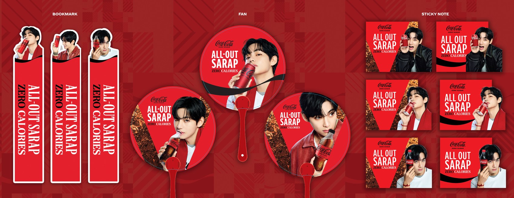
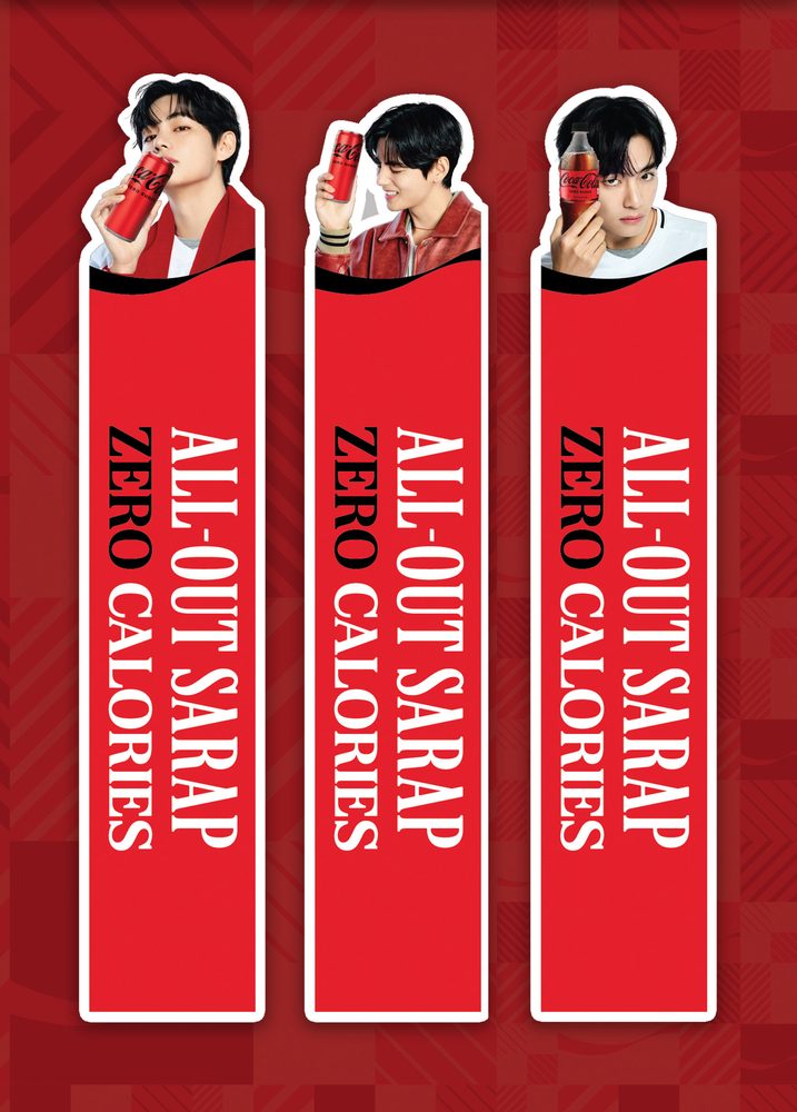
The giveaway tier — a die-cut bookmark, three circular hand fans, and six sticky notes — each a different crop of the same photography, sized for something a shopper actually keeps rather than throws away.
Poster, Tent Card & Wobbler
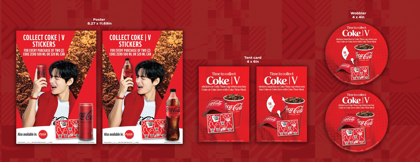
The mechanic-driver tier — posters explaining the "Collect Coke V Stickers" offer, counter tent cards, and shelf wobblers — all pointing back to the same sticker and Coke Time cap collectibles.
Display Systems for LEGO
Jurassic World — Hypermarket Display
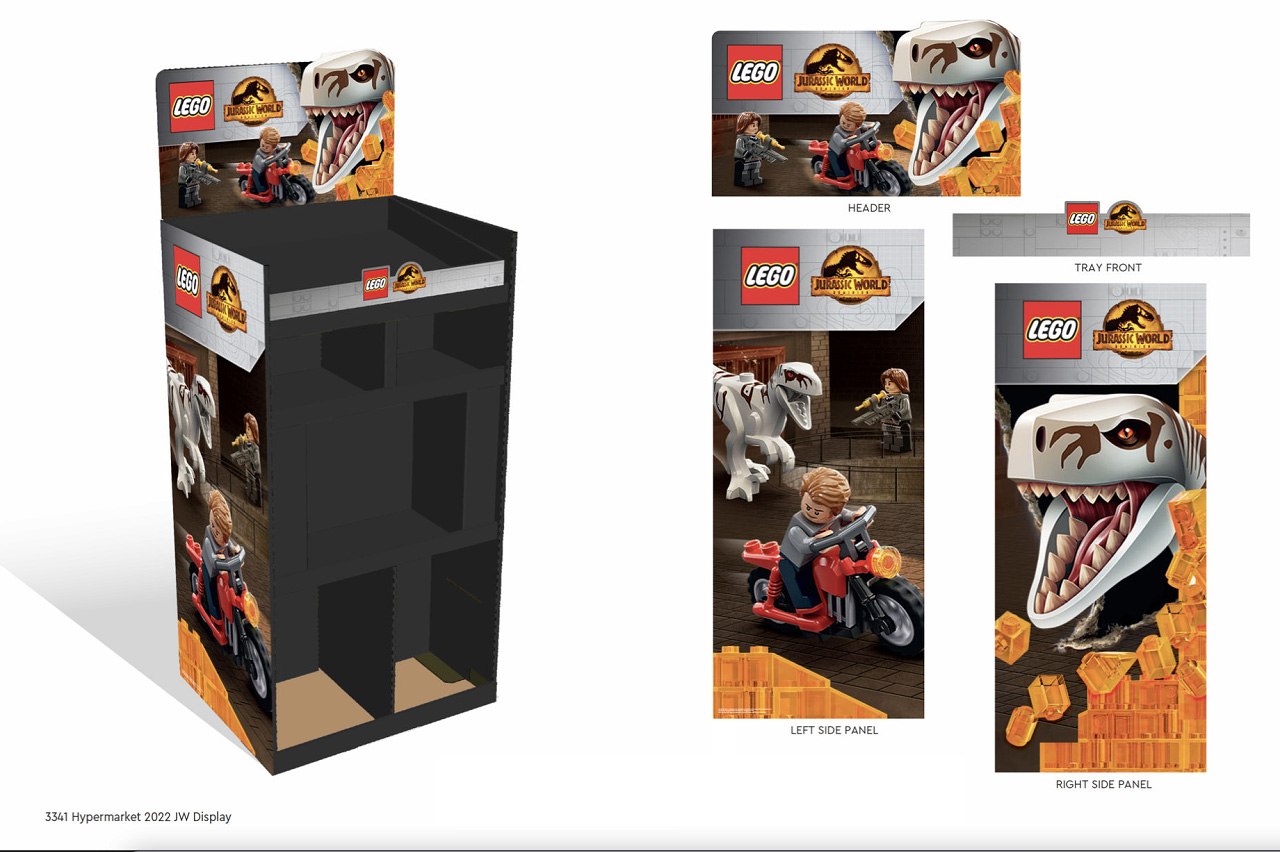
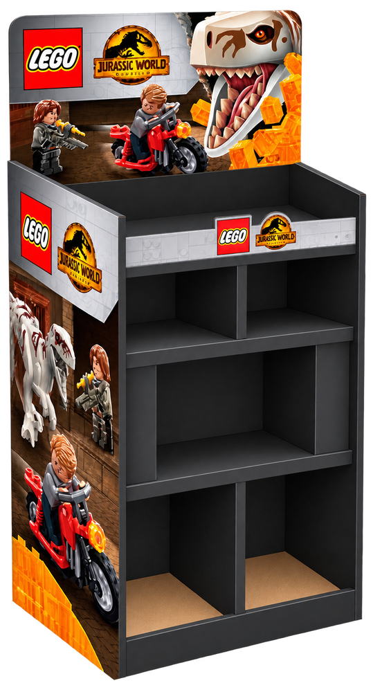
A full-format floor display for hypermarket placement — header, tray front, and two side panels, each cut from the same dinosaur-skull key art but built to its own panel dimensions rather than one image stretched across the structure. Every panel carries LEGO's own brand block alongside the Jurassic World license lockup, the two-rulebook problem that ran across the whole account.
Minecraft — Display System
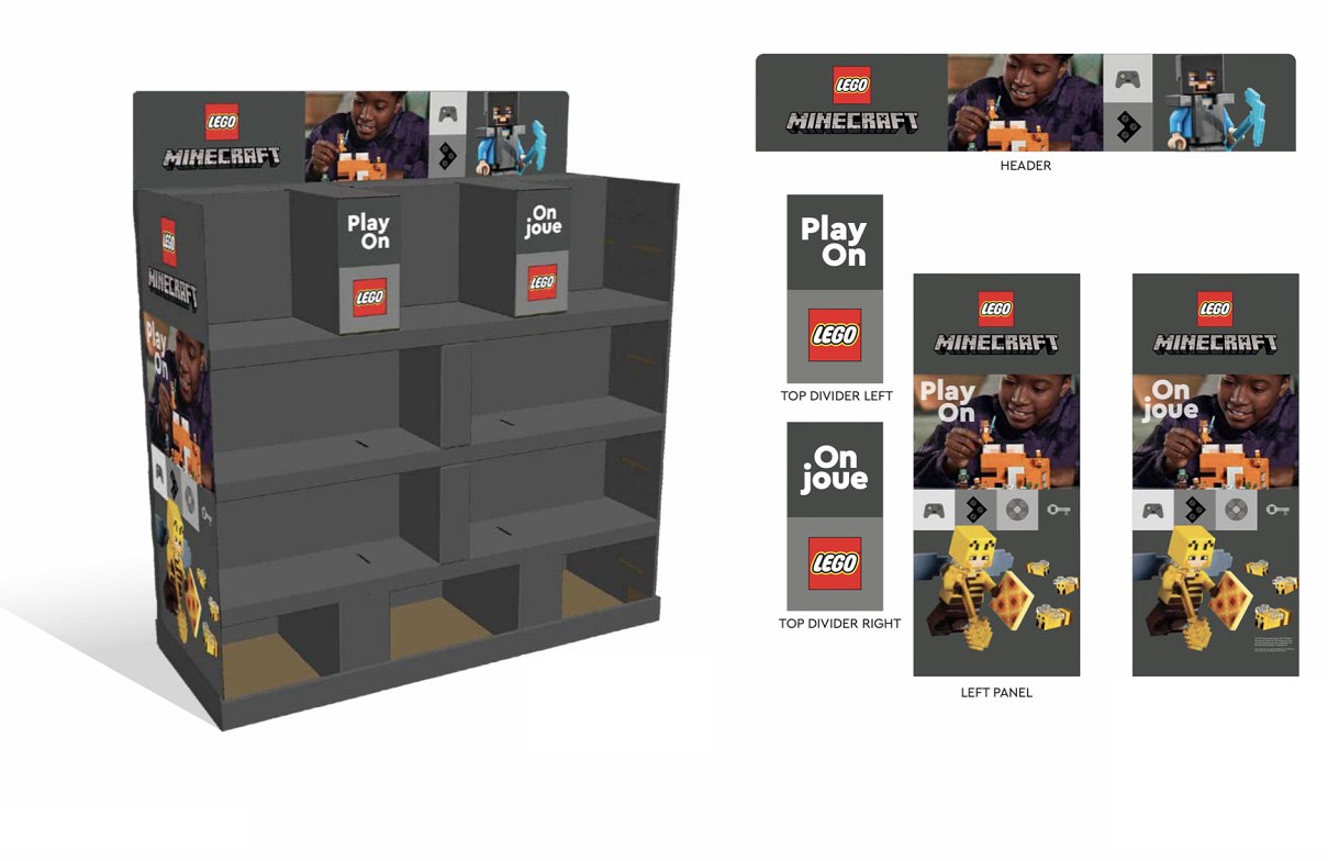
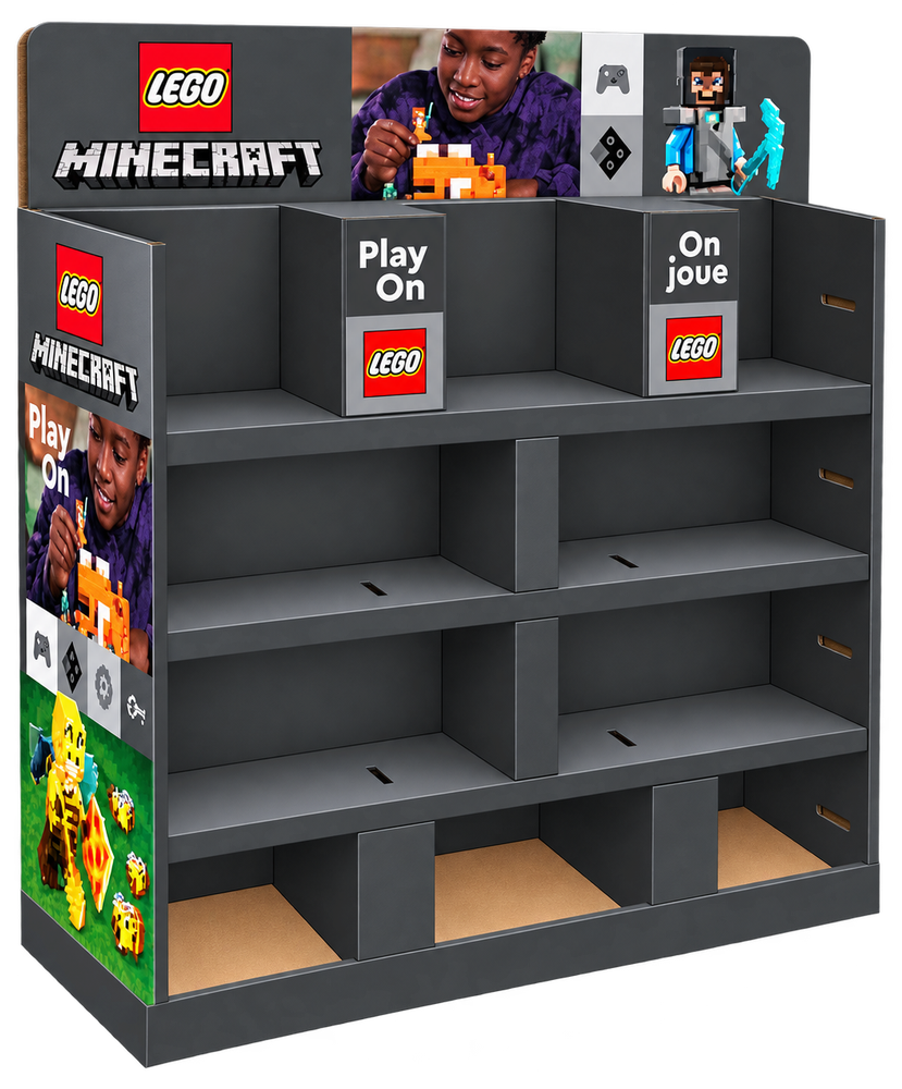
Built bilingual from the start — every panel produced in matching "Play On" and "On joue" versions for an English/French shelf, down to the top dividers. The gondola's own blocky Minecraft world print carries through from the header band to the base, so the display reads as one system rather than a header stapled onto a generic shelf.
Advent Calendar Display
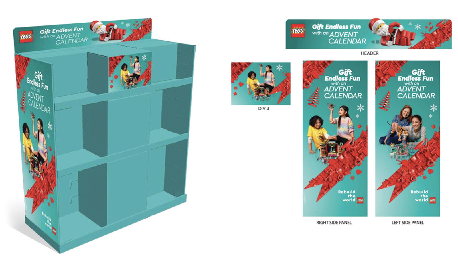
The account's seasonal side — a Christmas gondola built around "Gift Endless Fun with an Advent Calendar," pairing real kids' photography with LEGO's own product art under the year's "Rebuild the World" campaign line. Same kit of parts as the license displays — header, side panels, divider — just dressed for the holiday shelf instead of a movie tie-in.
Birthday Countertop Display
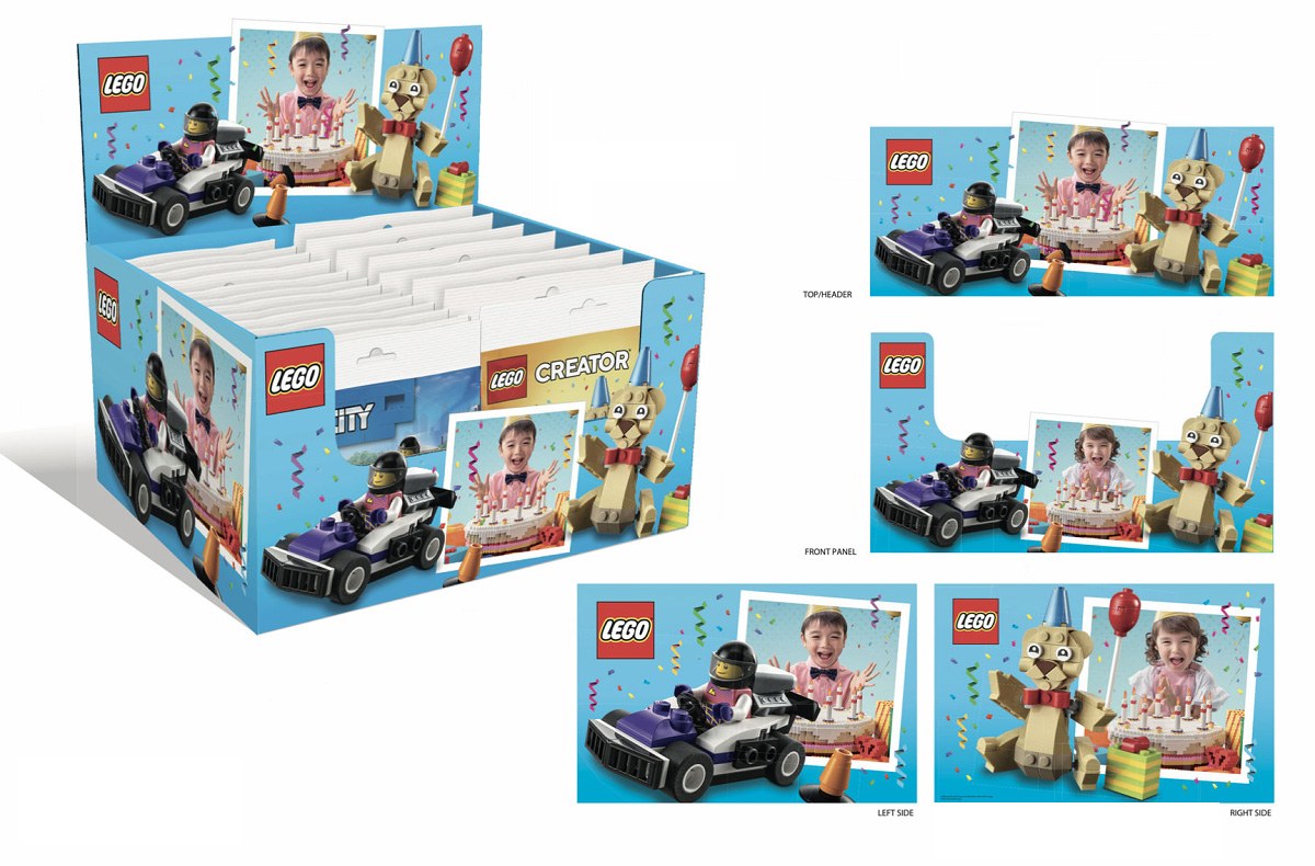
A smaller-format counter box for the birthday gifting season, mixing LEGO City and LEGO Creator SKUs under one party-themed key visual. Same discipline as the shelf towers, just scaled down — header, front panel, and both side panels each cropped from the same photo, balloon, and confetti art rather than one image wrapped around all four faces.
Coca-Cola Bus Wraps
Bus Wrap — Cambodia
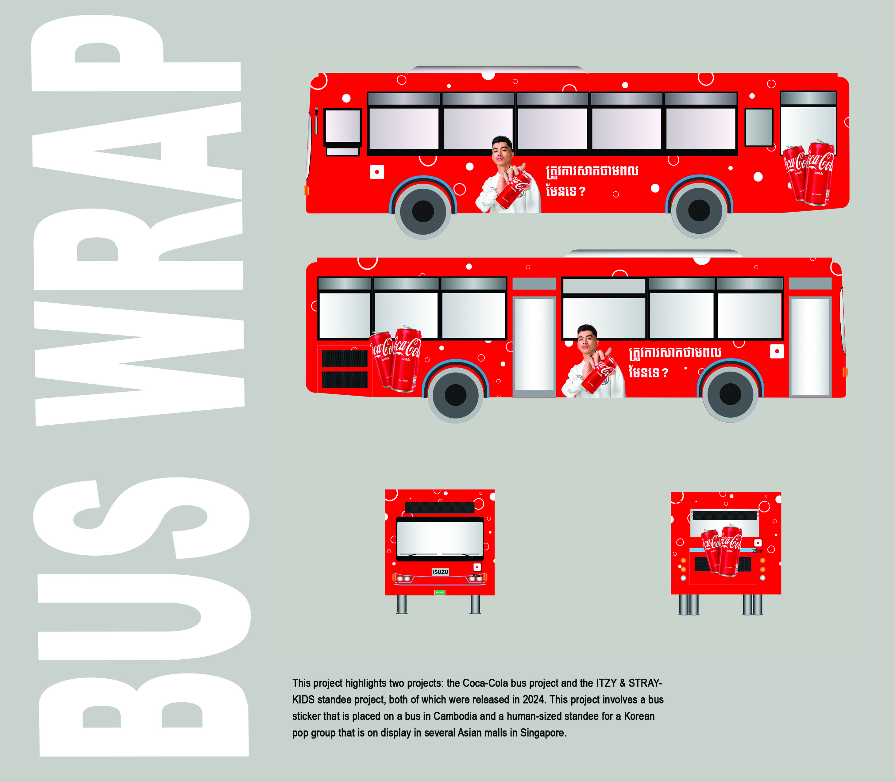
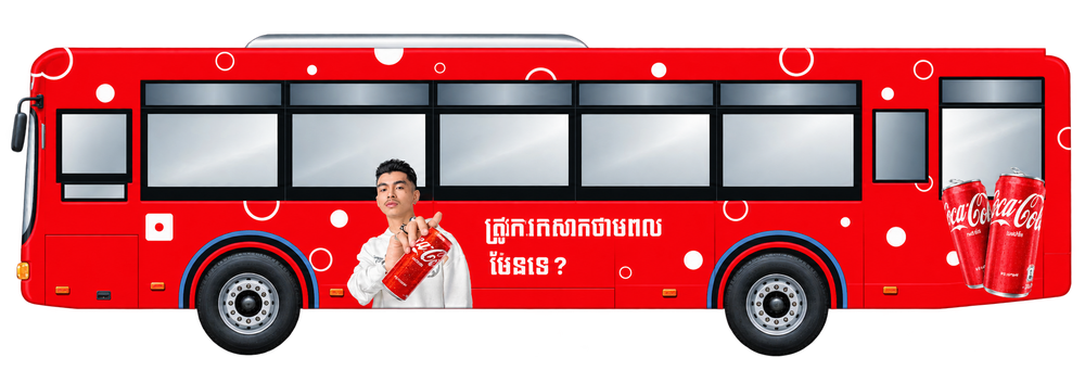
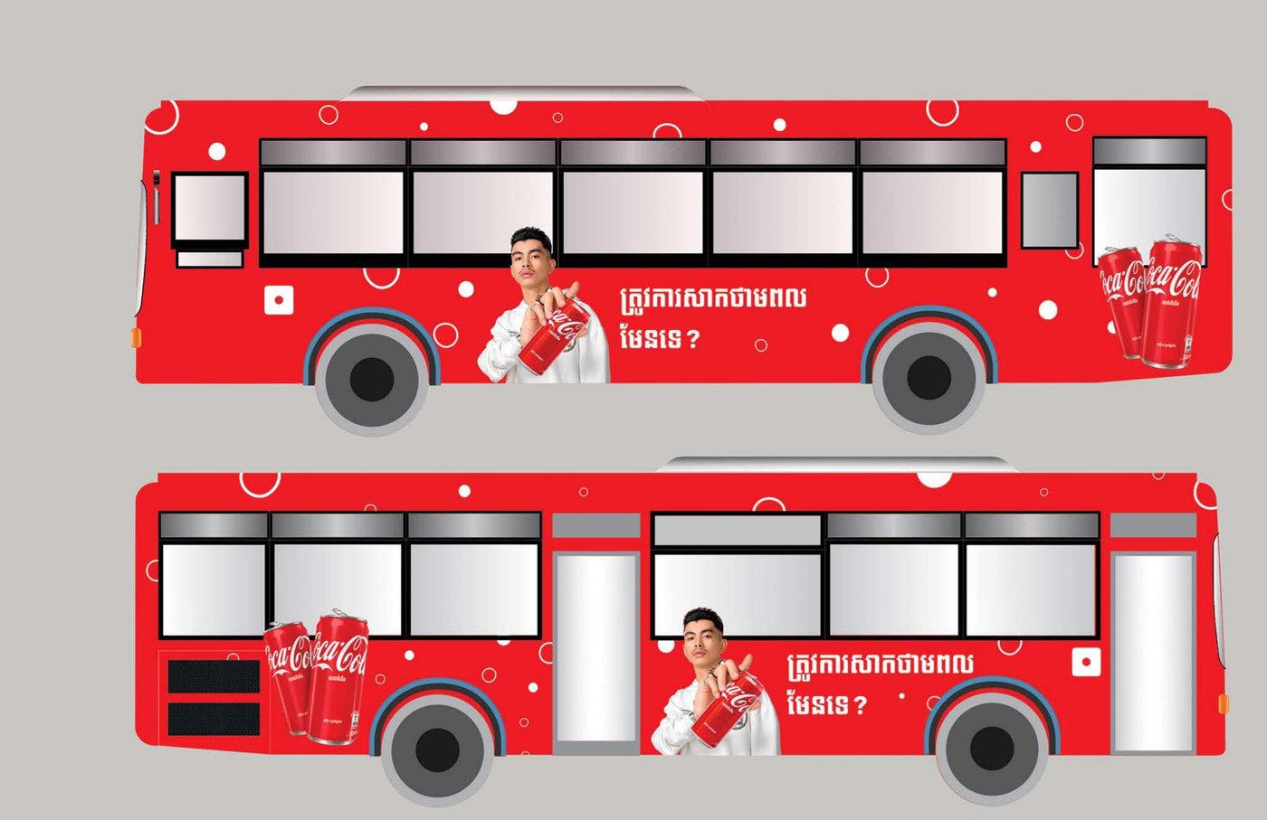
The full livery, broken out panel by panel: both side profiles, the front cab, and the rear door, each carrying the same Khmer headline, product shot, and single face across the entire vehicle length. Built to read in the two seconds a pedestrian actually looks at a passing bus, with the design repeating cleanly across every panel rather than one image stretched to fit.
ITZY & Stray Kids
Stray Kids Standee — Singapore
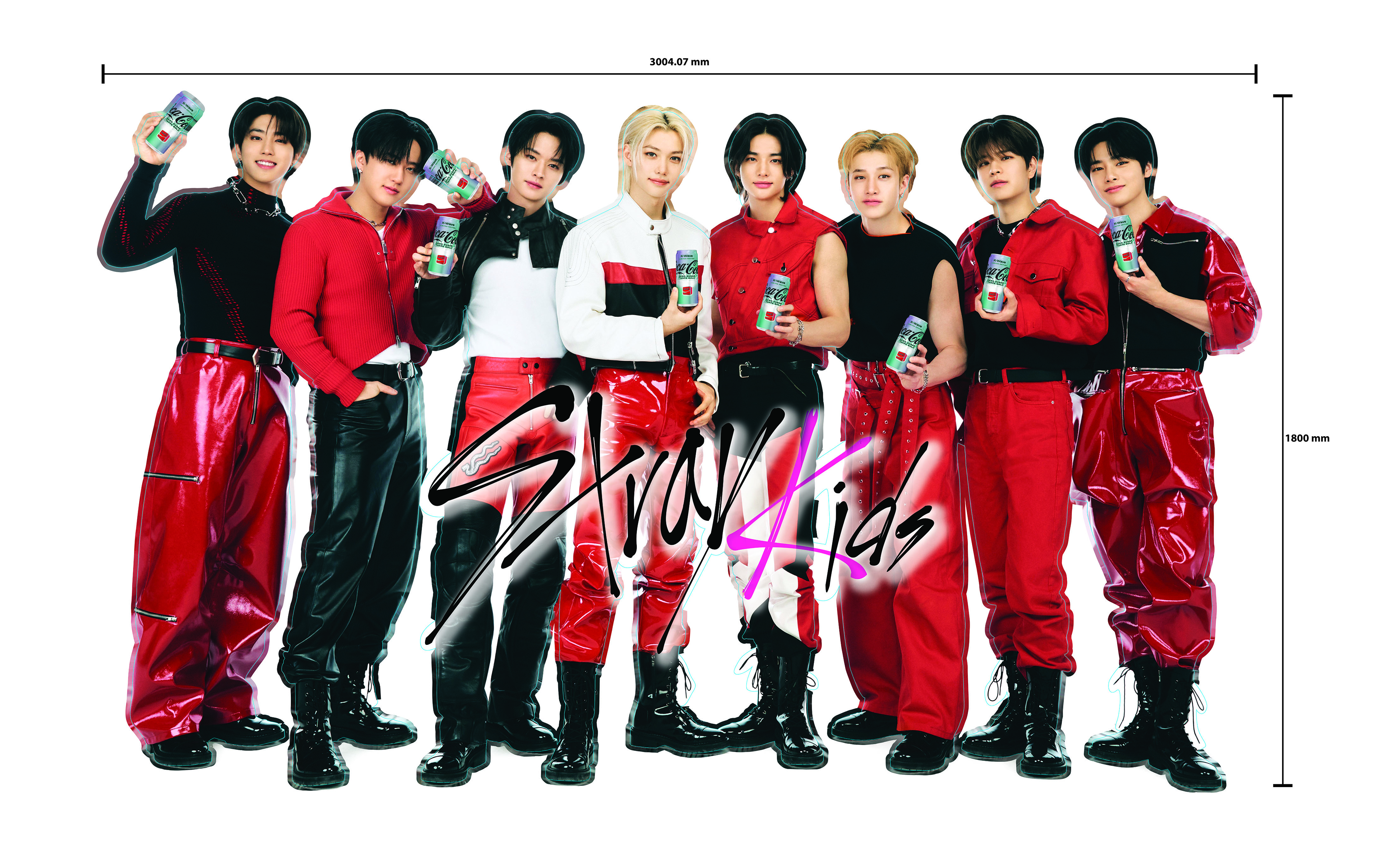
A 3004mm × 1800mm die-cut of all eight members, each holding their own K-Wave can — every likeness, hand position, and can placement had to cut cleanly enough for the piece to stand on its own at full scale in a mall, with no fixture or backing to hide behind.
ITZY Standee — Singapore
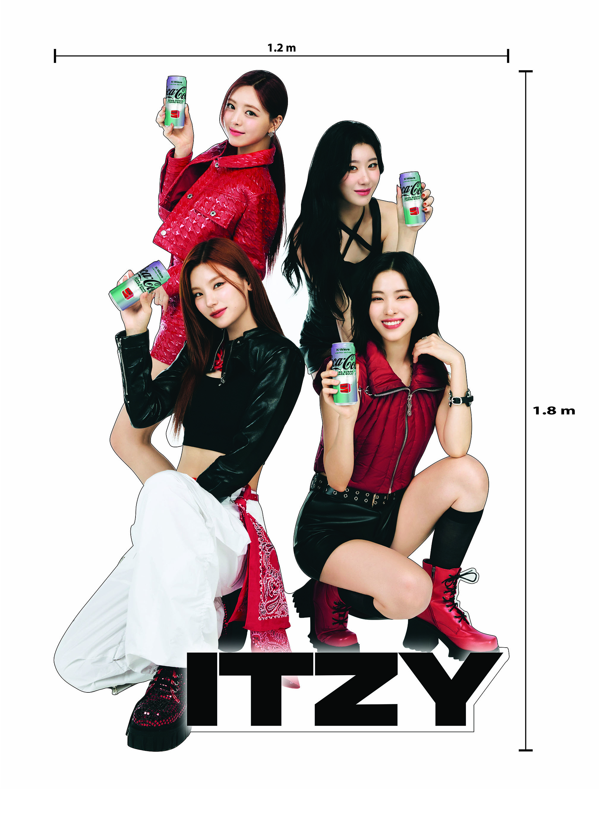
The same K-Wave standee system scaled down for ITZY's four members — a 1200mm × 1800mm die-cut built alongside the Stray Kids piece as a companion release, sharing the same production discipline at a smaller footprint.
K-Wave Floor Display & Digital Activation — Singapore
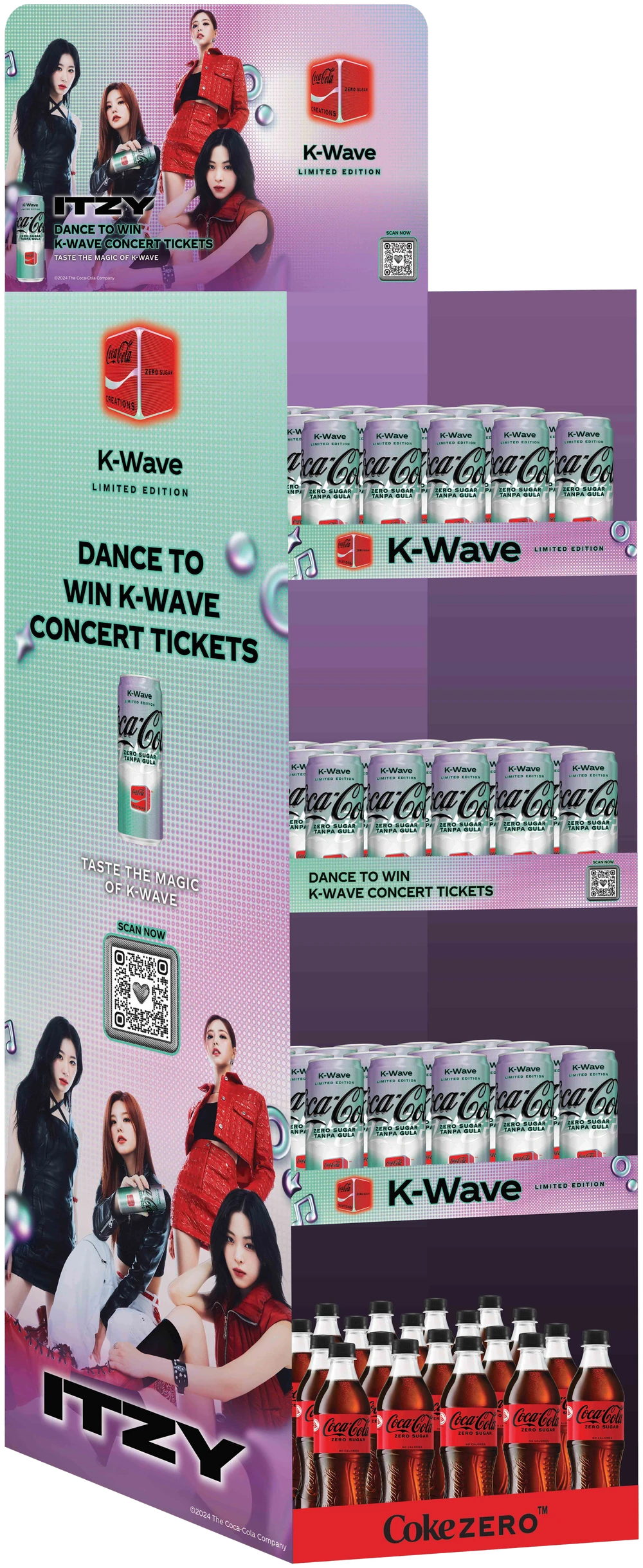
The wordmark, contest, and Coke Zero strips below weren't just banner art — this is how they were meant to be seen: wrapped around a freestanding retail display, stacked over rows of K-Wave cans and bottles on the shop floor.

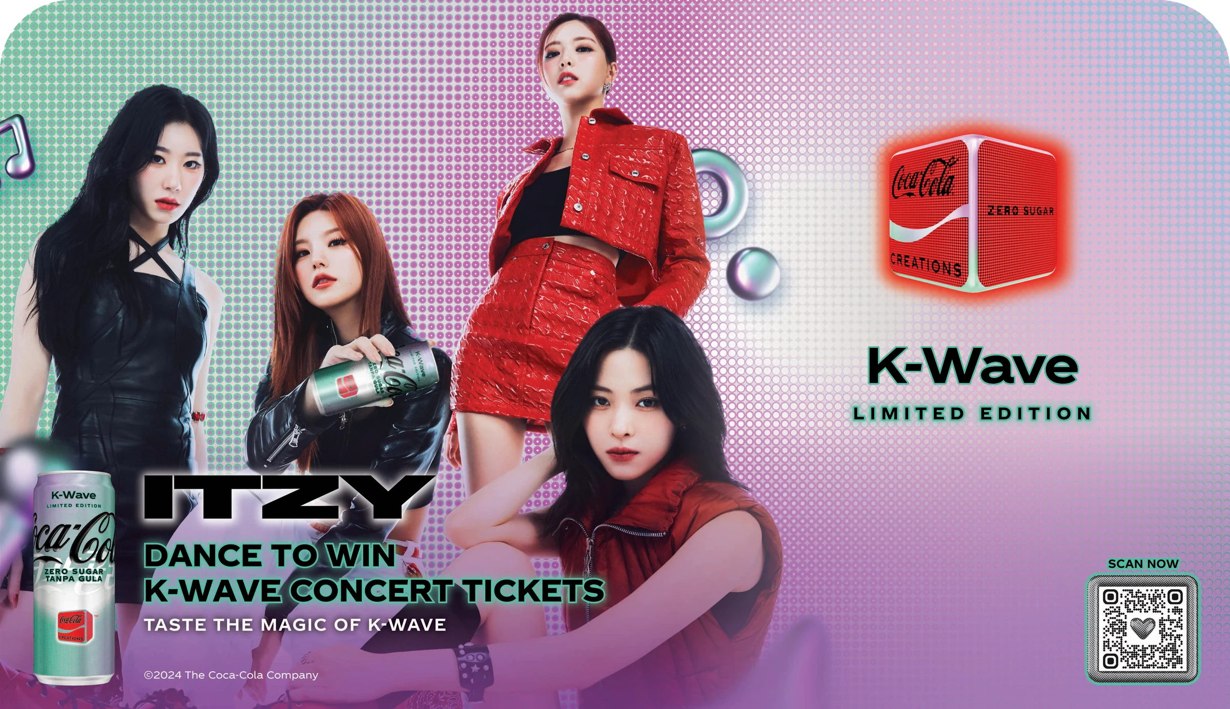



The standees anchored the in-mall moment, but the K-Wave push ran just as hard online — a "Dance to Win" contest fronted by ITZY, built out across a vertical social/OOH poster, a wide hero banner, and a set of wordmark and contest strips sized for whatever placement picked them up next.
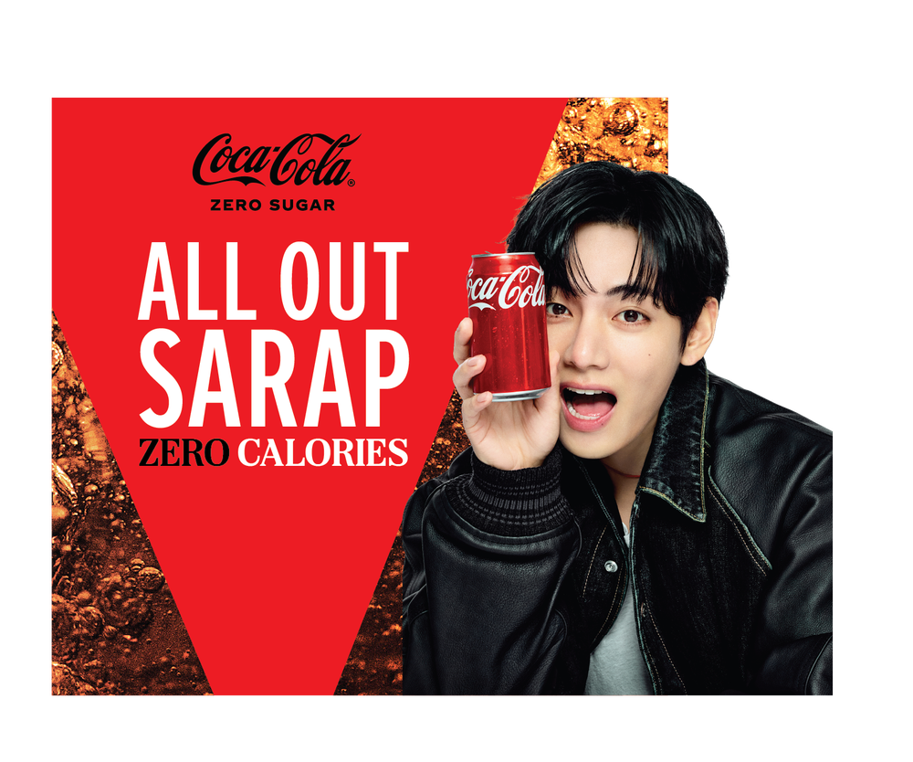
All Out Sarap, Every Screen
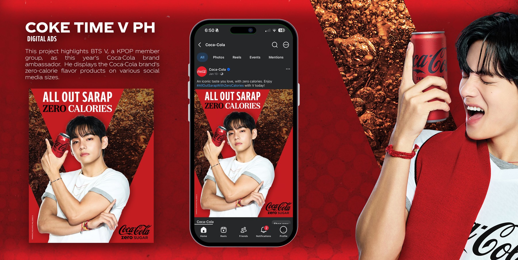
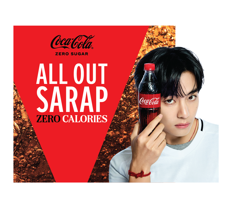
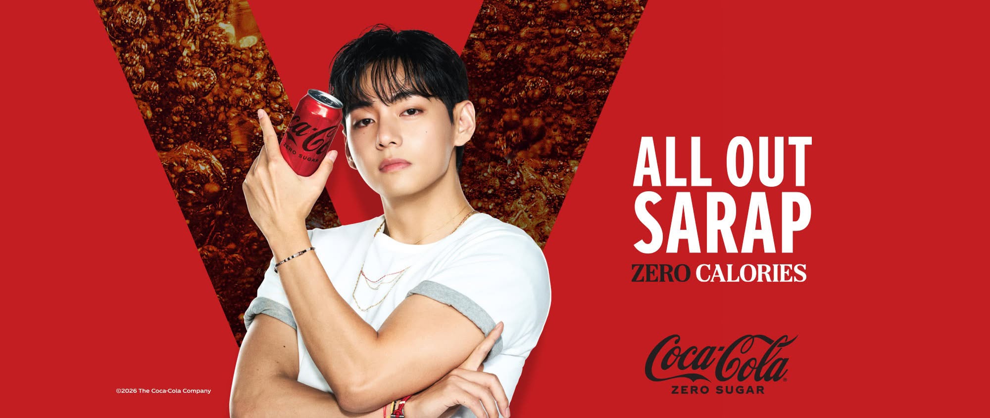
This project highlights BTS V, as this year's Coca-Cola brand ambassador for the Philippines, carrying the zero-calorie "All Out Sarap" message across the platform chrome native to each placement — a Facebook feed post, a live page cover, and the flat cover crop underneath it.
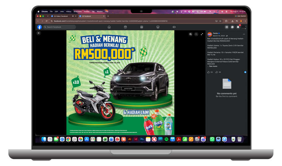
Beli & Menang RM500,000
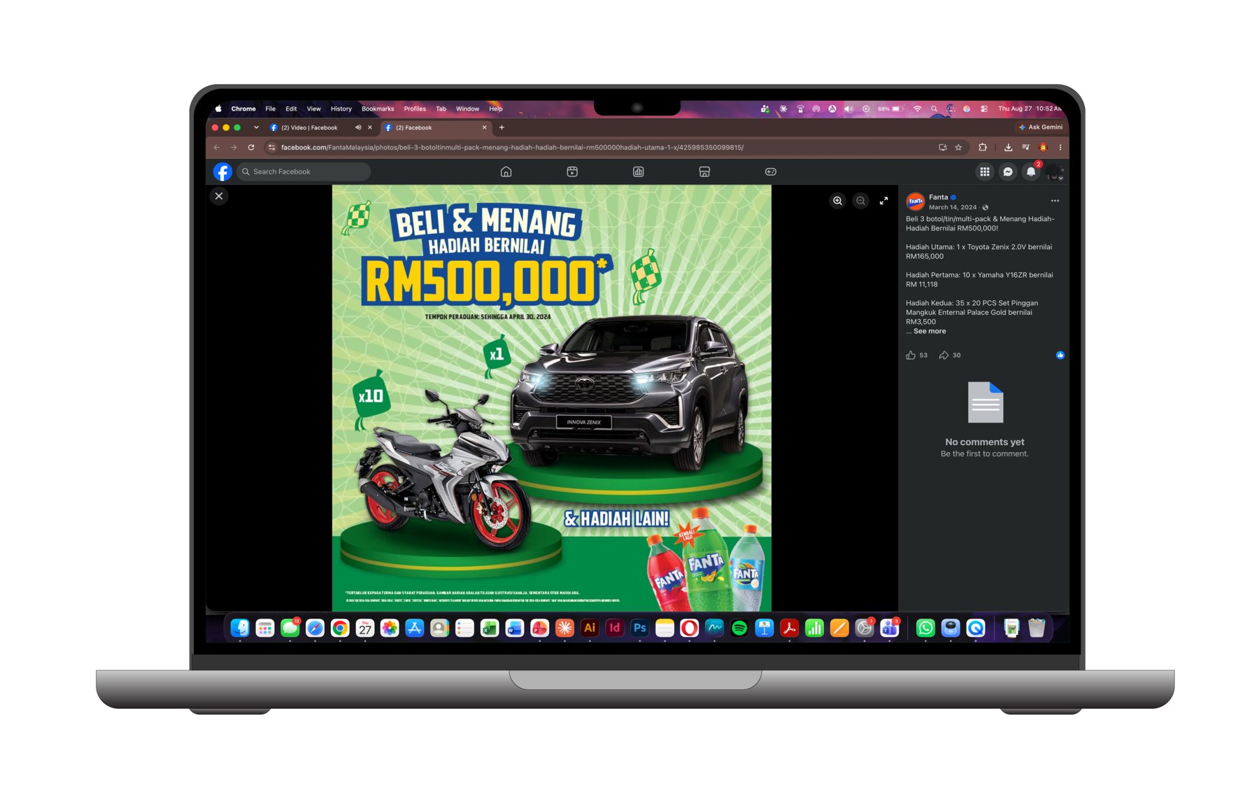
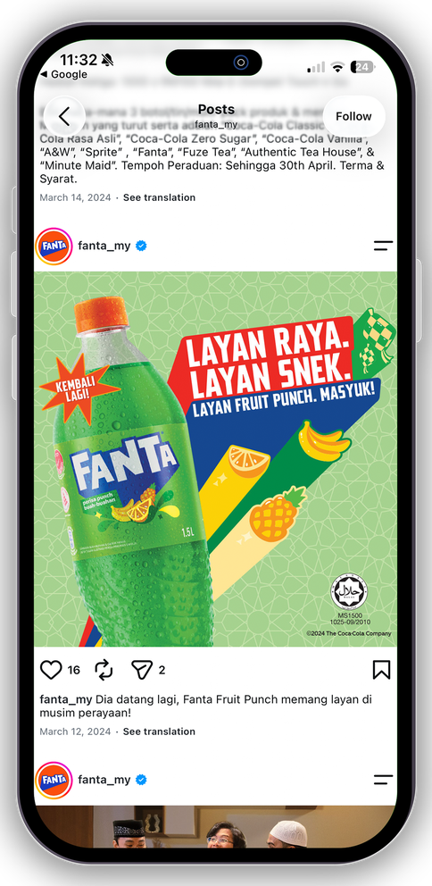
A Fanta Malaysia trade promotion built around a straightforward pitch — buy 3 bottles, win from a prize pool topped by a car and ten motorbikes. The clip above is pulled straight from the live post on Fanta Malaysia's own Facebook page, confirming the key visual holds up exactly as designed once it's actually running in-feed.
Multi-Size Rollout
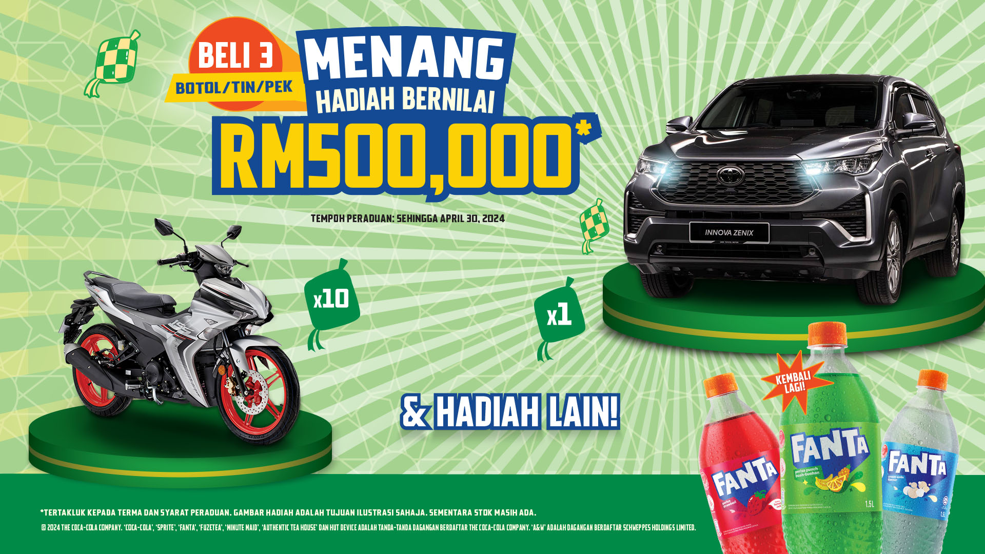

The same contest pushed across the rest of the standard ad-serving sizes — the online video companion banner and the leaderboard — each cropped to keep the RM500,000 headline and the car legible at its footprint.
Stand Here
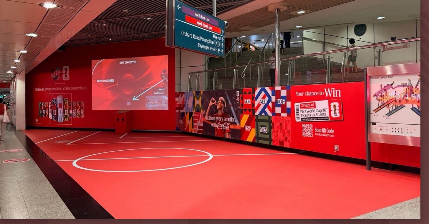
One large-format floor sticker and two oversized wall graphics, installed together near one of the main exits of Dhoby Ghaut MRT — the same station as the pillar wrap campaign, but designed as its own standalone environmental moment rather than a repeat of it.
Floor and wall worked as one continuous surface: a pitch underfoot, the campaign message at eye level, positioned along the exact route the station's highest volume of daily commuters already walks.
Wall Graphic — Contest Banner

The longer of the two wall graphics ran the full length of the balustrade — country-flag blocks bookending the hero shot, with the FIFA World Cup 26 ticket contest built directly into the same surface rather than tacked on as a separate panel.
Wall Graphic — Product Wall & LED Cutout
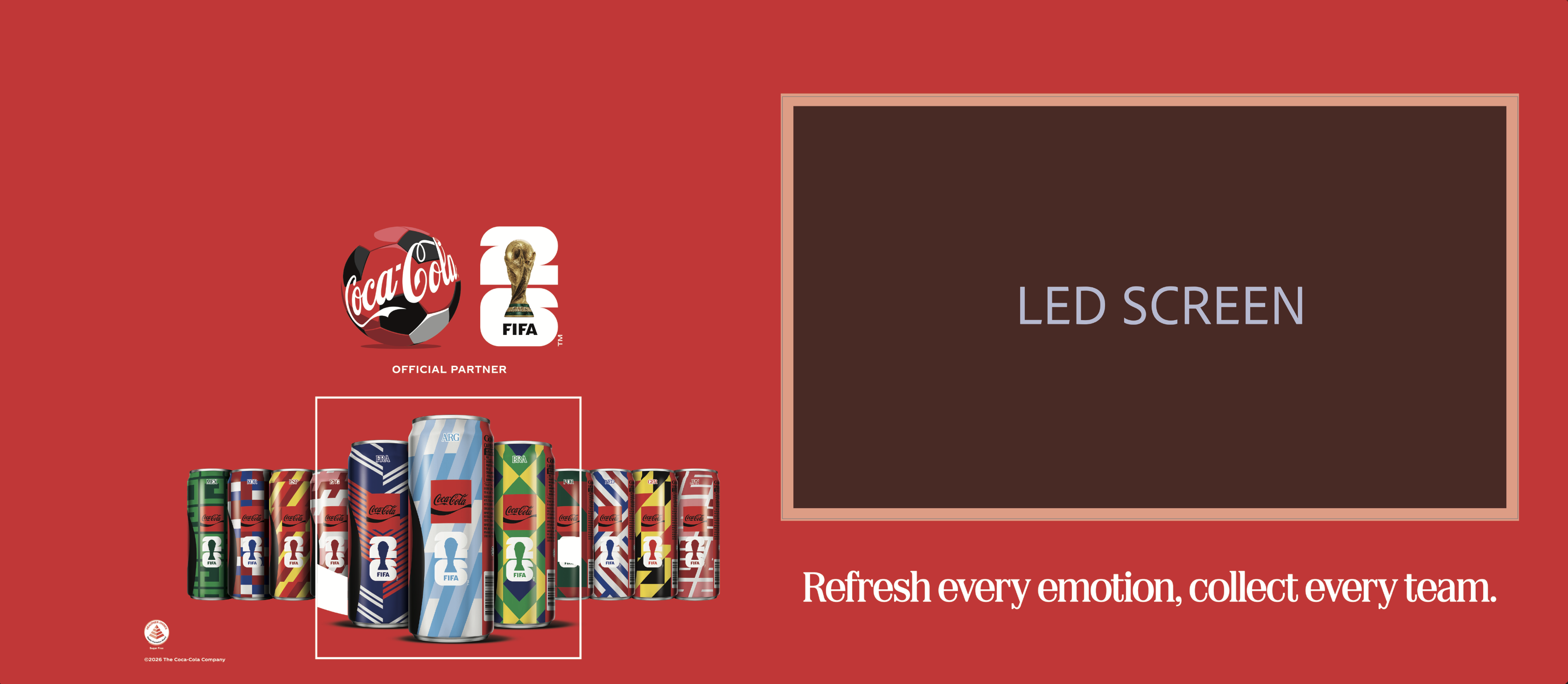
The second wall panel paired the full can lineup with a reserved cutout for the embedded LED screen — the "stay on center" interactive prompt visible live in the install photo above — so the static print and the on-screen motion sit on one continuous wall instead of competing for it.
Floor Graphic — Print-Ready Artwork
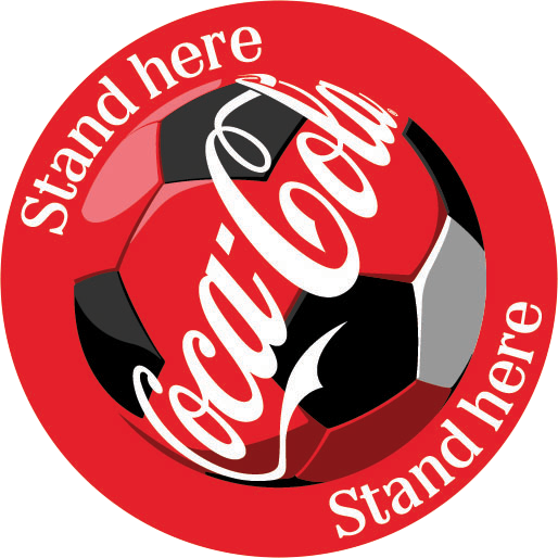
The companion badge that gave the activation its name — repeated as a floor decal and signage mark, turning the instruction into a literal, physical cue for commuters passing through.

The floor sticker reads as a simple idea — turn the walkway into a pitch — but had to be built as one continuous pattern at true production size, so the touchlines and center circle still line up once the sheet is cut and tiled across the actual floor at Dhoby Ghaut.
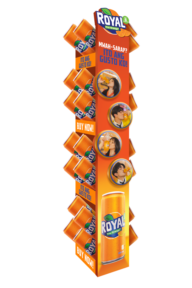
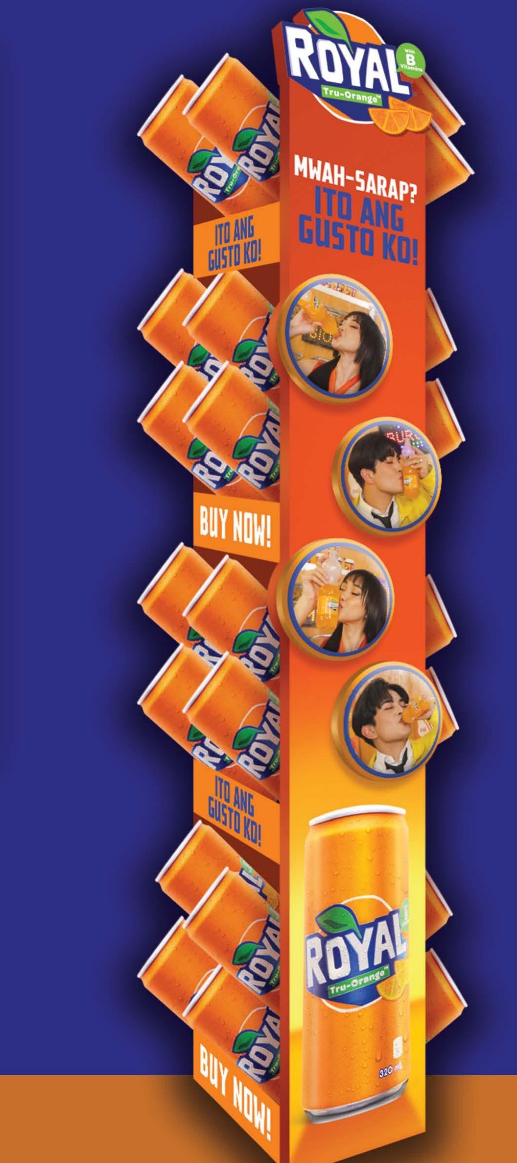
Mwah-Sarap? Ito Ang Gusto Ko!
Hangsell displays live or die on one thing: whether they actually catch a shopper's eye from the end of the aisle. Built from corrugated board, this one for Royal Reset Shopper suspends in-store to communicate the offer and reinforce the brand without needing a fixture or shelf space of its own.
The circular tags use real fans mid-sip rather than posed product shots — a deliberate call to make the display feel like a moment, not an ad — repeated down the full drop to stay visible at multiple eye levels.
Die-Cut Photo Tags — Production Sheet
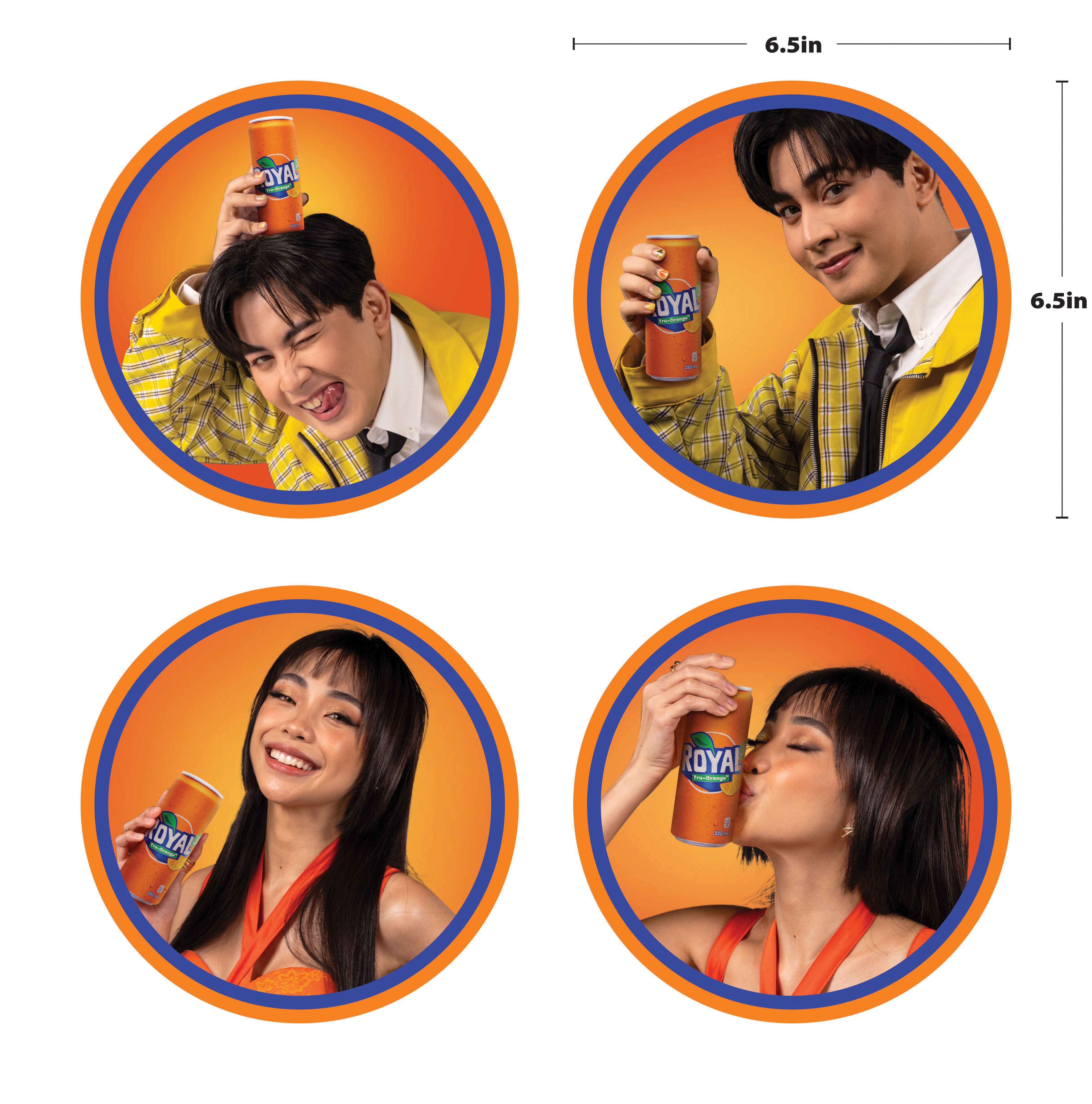
Each tag was built to a fixed 6.5-by-6.5-inch die line, so the four talent shots had to be framed, cropped, and color-matched to sit inside an identical circular window and still read at a glance from down the aisle.
Laid out as one flattened production sheet with dieline guides, so the print vendor could cut and repeat the set consistently down the full drop of the display.
Header Strip — Front & Back
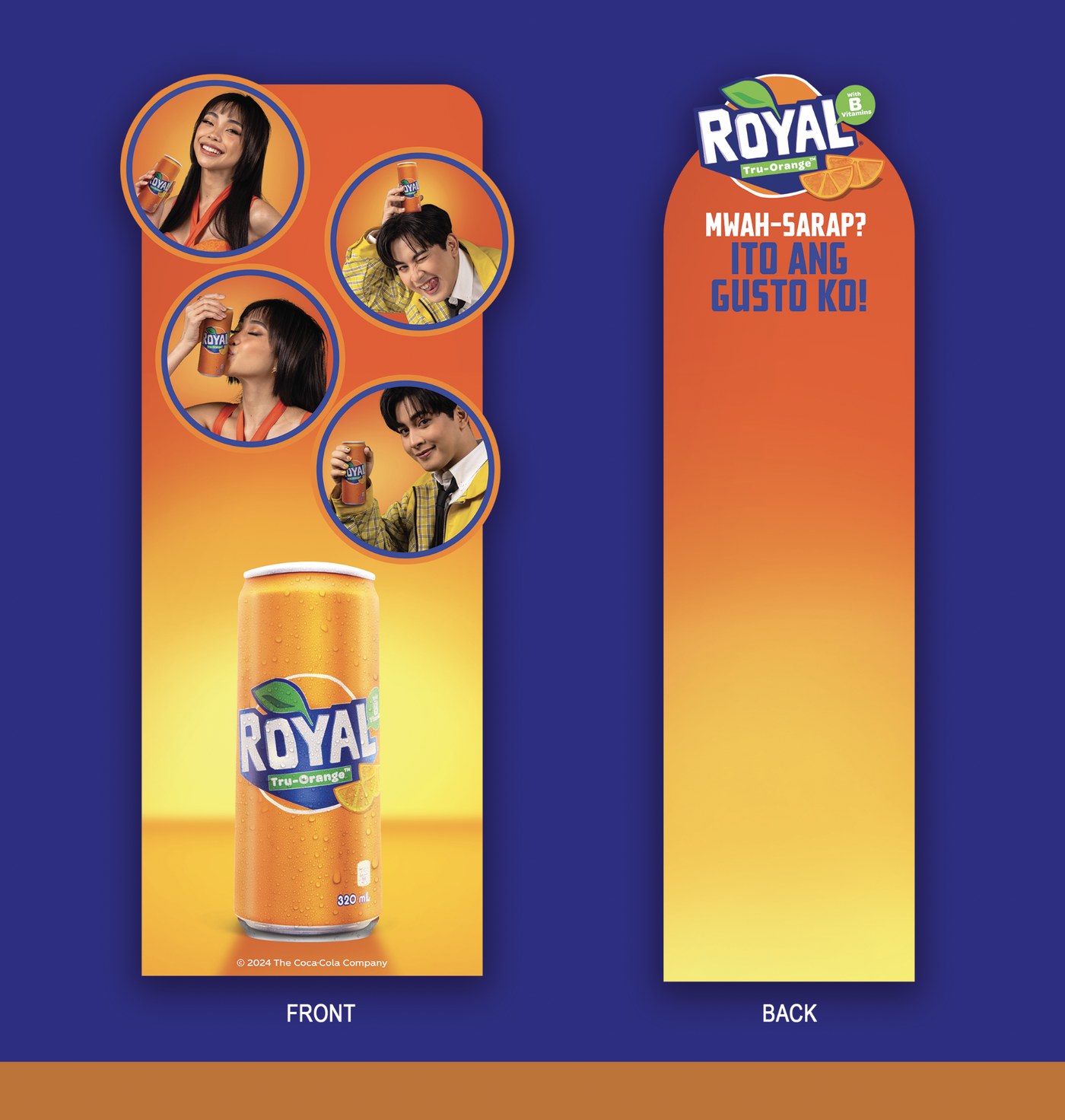
The header strip carries the same four tags down its front face into a single product shot, while the back face — visible from the opposite side of the aisle — repeats the headline on its own, so the display reads clearly no matter which direction a shopper approaches from.
Shelf Signage
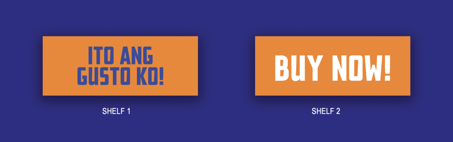
Two small call-to-action tags mark the shelf breaks where the display sits — "Ito Ang Gusto Ko!" and "Buy Now!" — keeping the same headline live at shelf level even where the full drop can't reach.
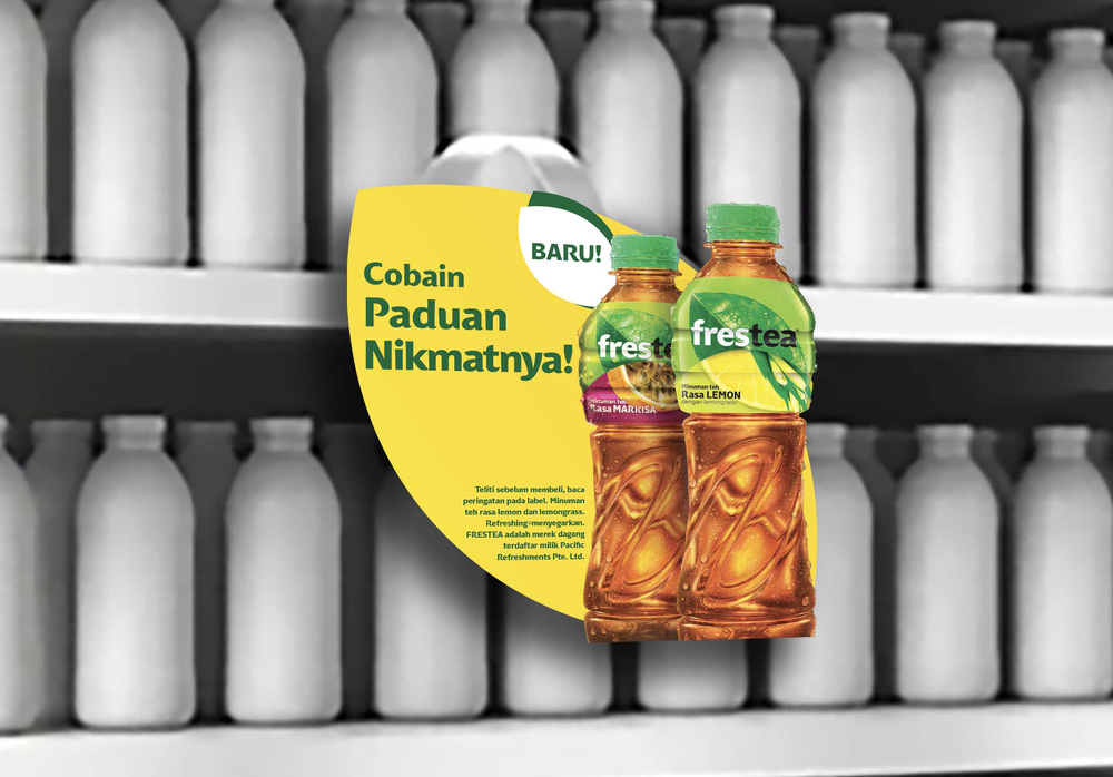
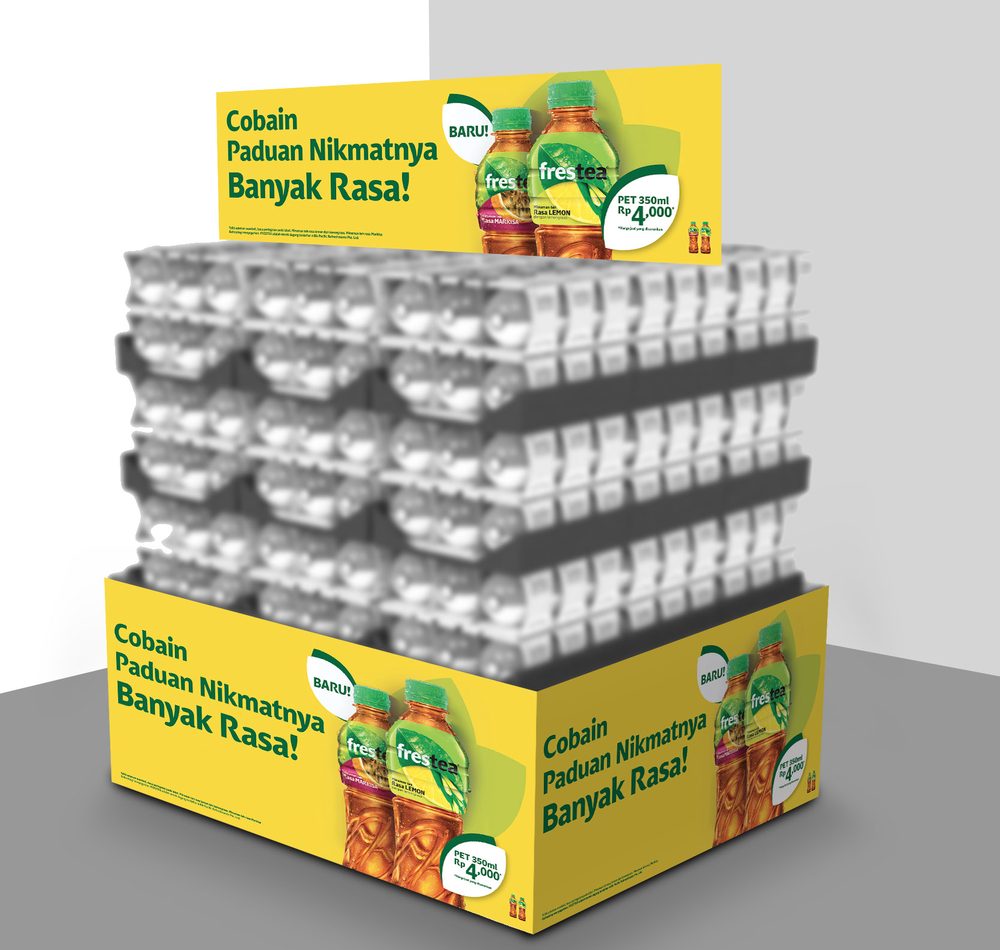
Cobain Paduan Nikmatnya, Banyak Rasa!
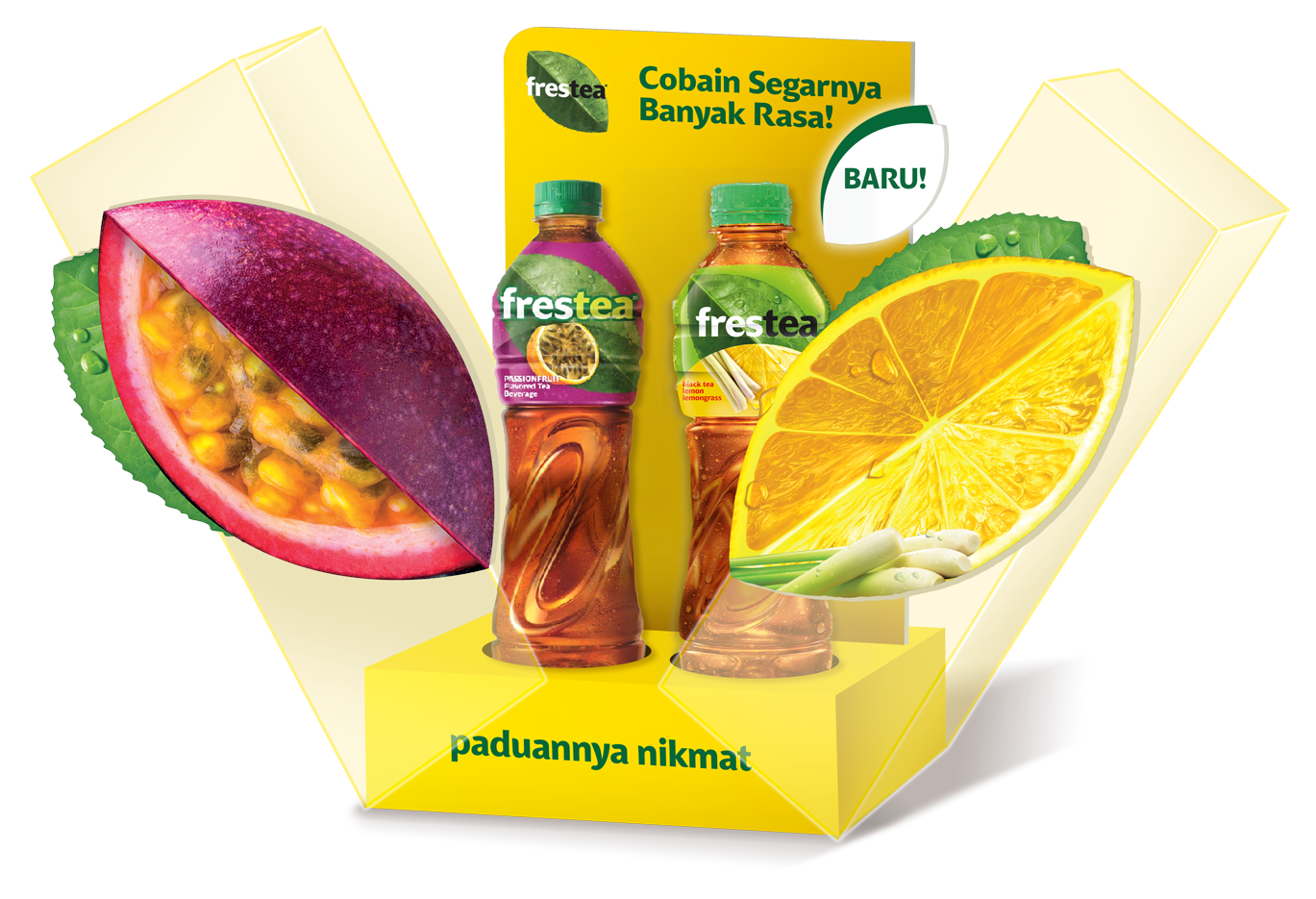
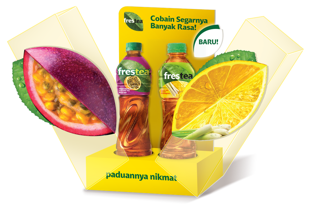
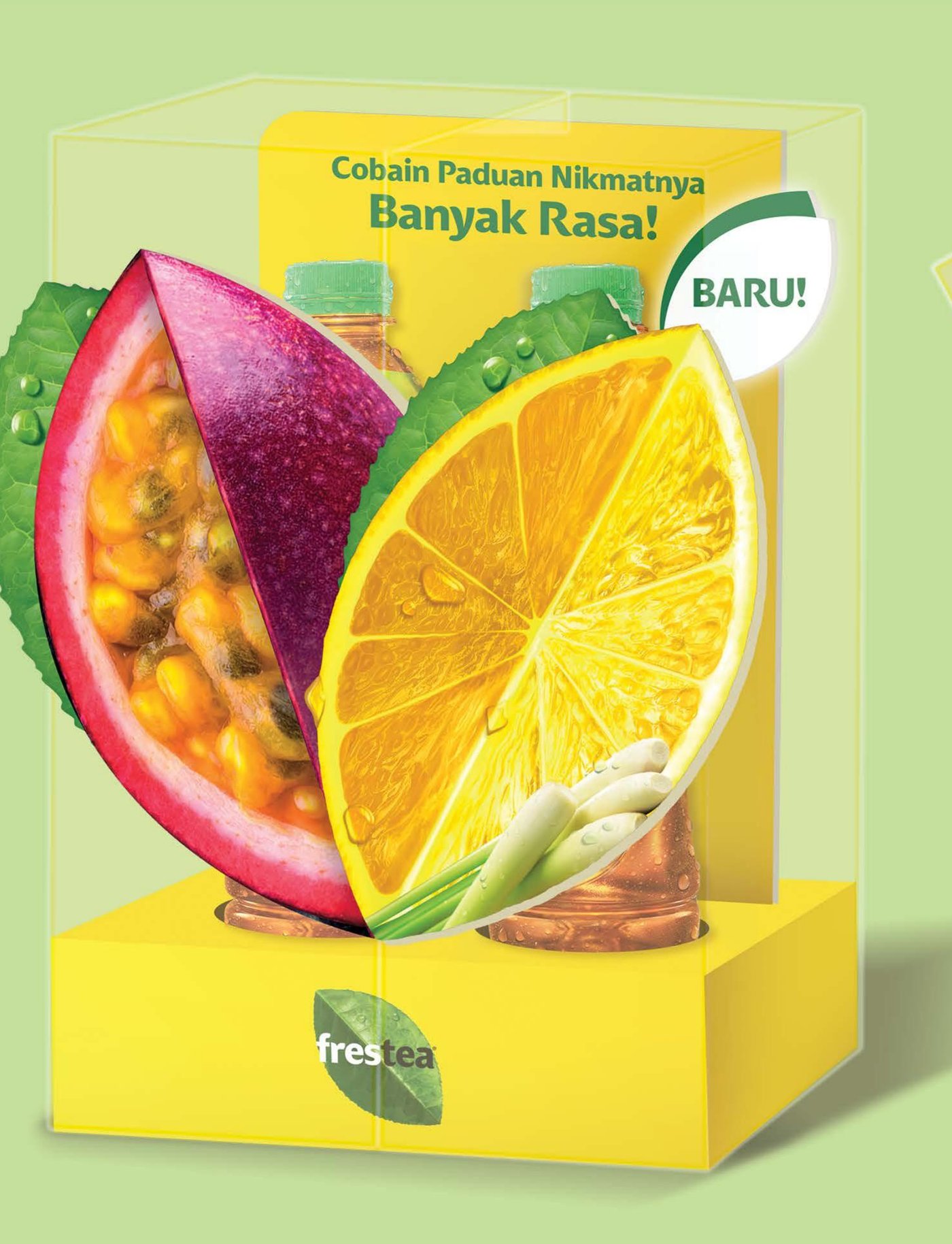
Built as a 3D model of a real exhibit for an Indonesian shopping center, the glorifier combines a base, back panel, side panels, and the fruit-slice components — passionfruit and lemon, sliced open — into one self-supporting shelf piece.
The same fruit motif then had to scale down cleanly across seven more physical formats: gondola, pallet wrap, posters, wobblers, banners, and shelf fins — each a different size, same visual logic.
Closed to Open — Assembled Mockup
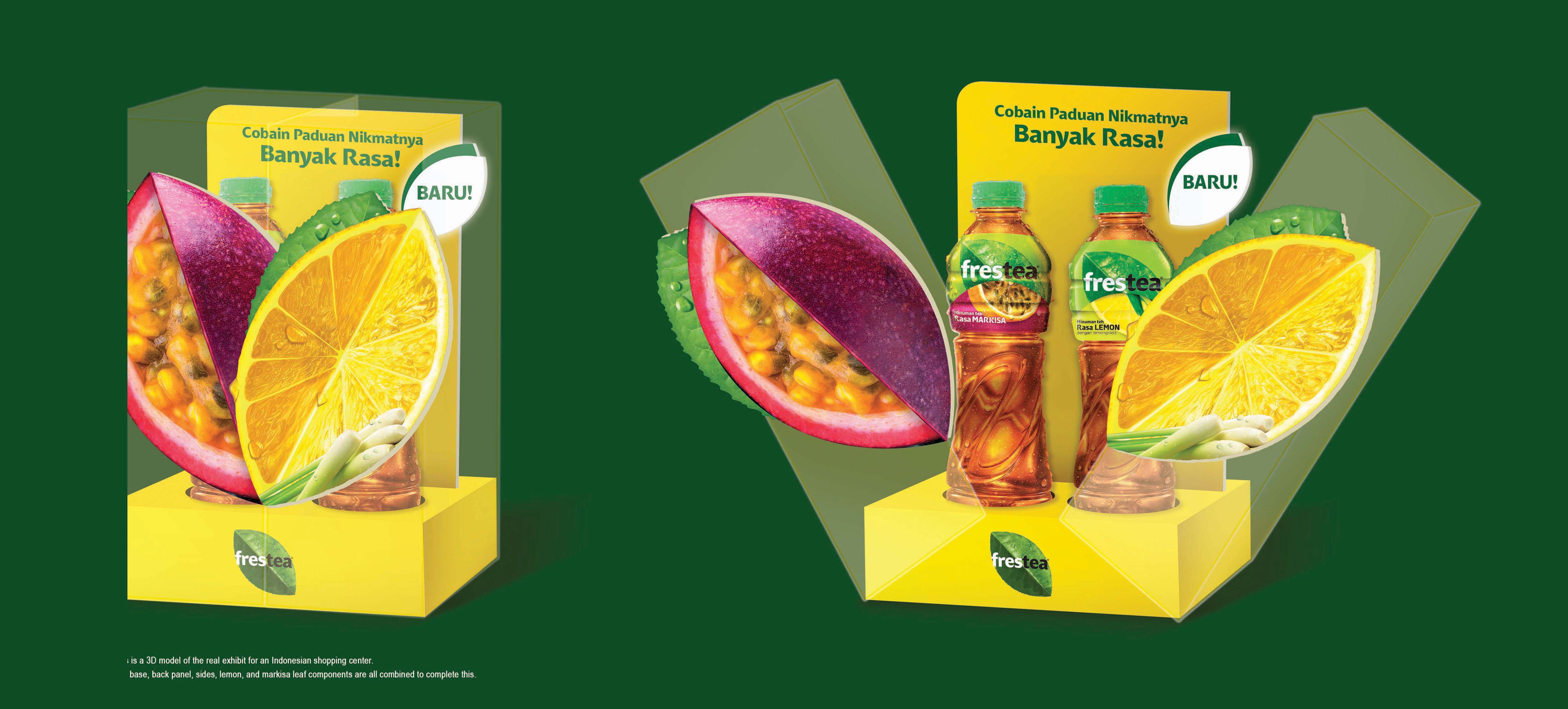
The whole piece ships and stores flat-packed as a compact box; the fruit-slice panels fold out from the sides on assembly, opening into the full V-shaped reveal that gives the display its shelf presence.
Production Components — Flat-Pack Pieces
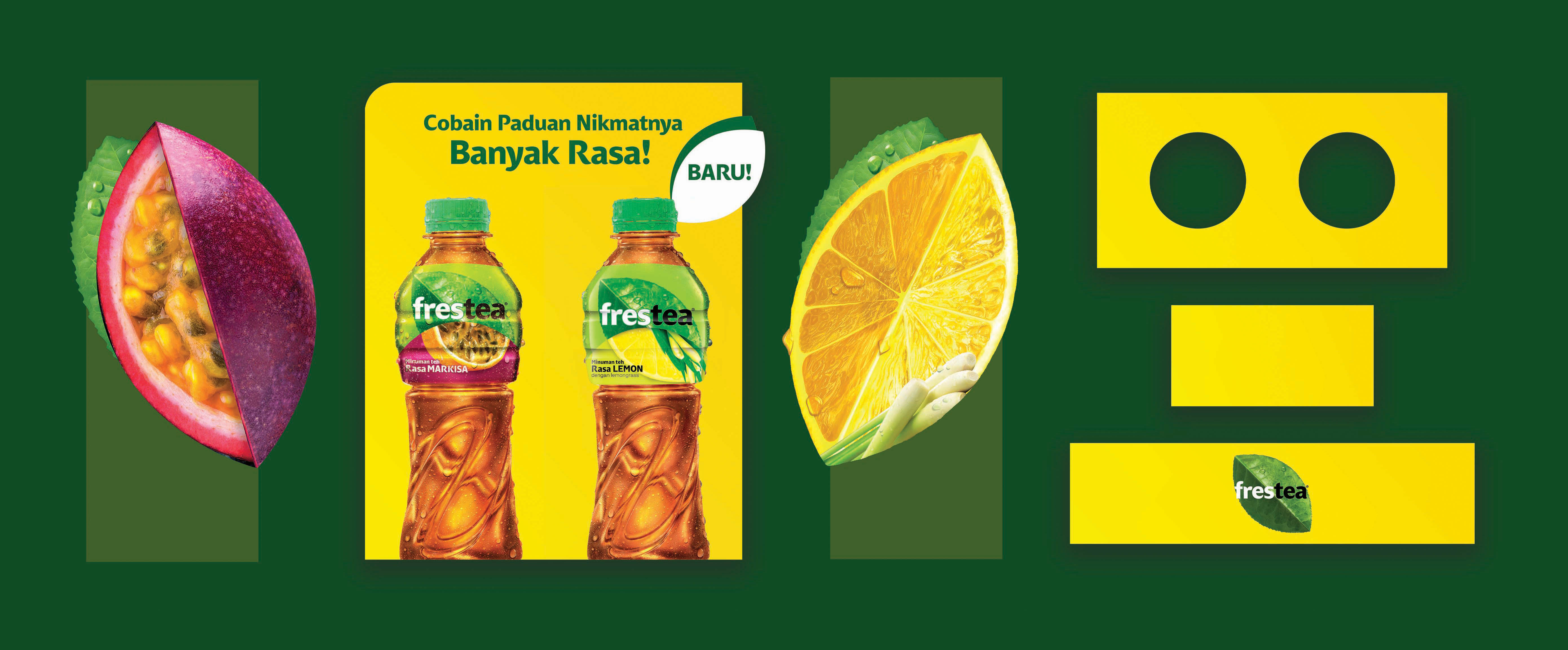
Each piece — the passionfruit slice, the header card, the lemon slice, and the base, back panel, and branded strip — had to be laid out as its own flattened, die-cut-ready file, sized and keyed so the full set folds together into one self-supporting unit on assembly.
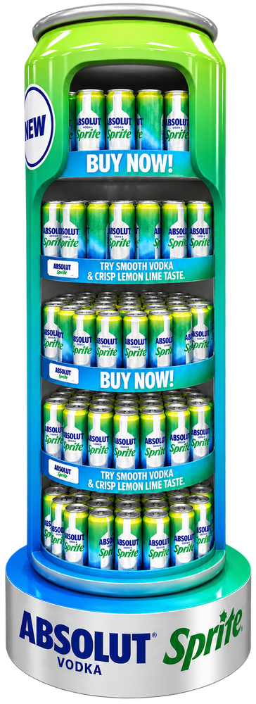
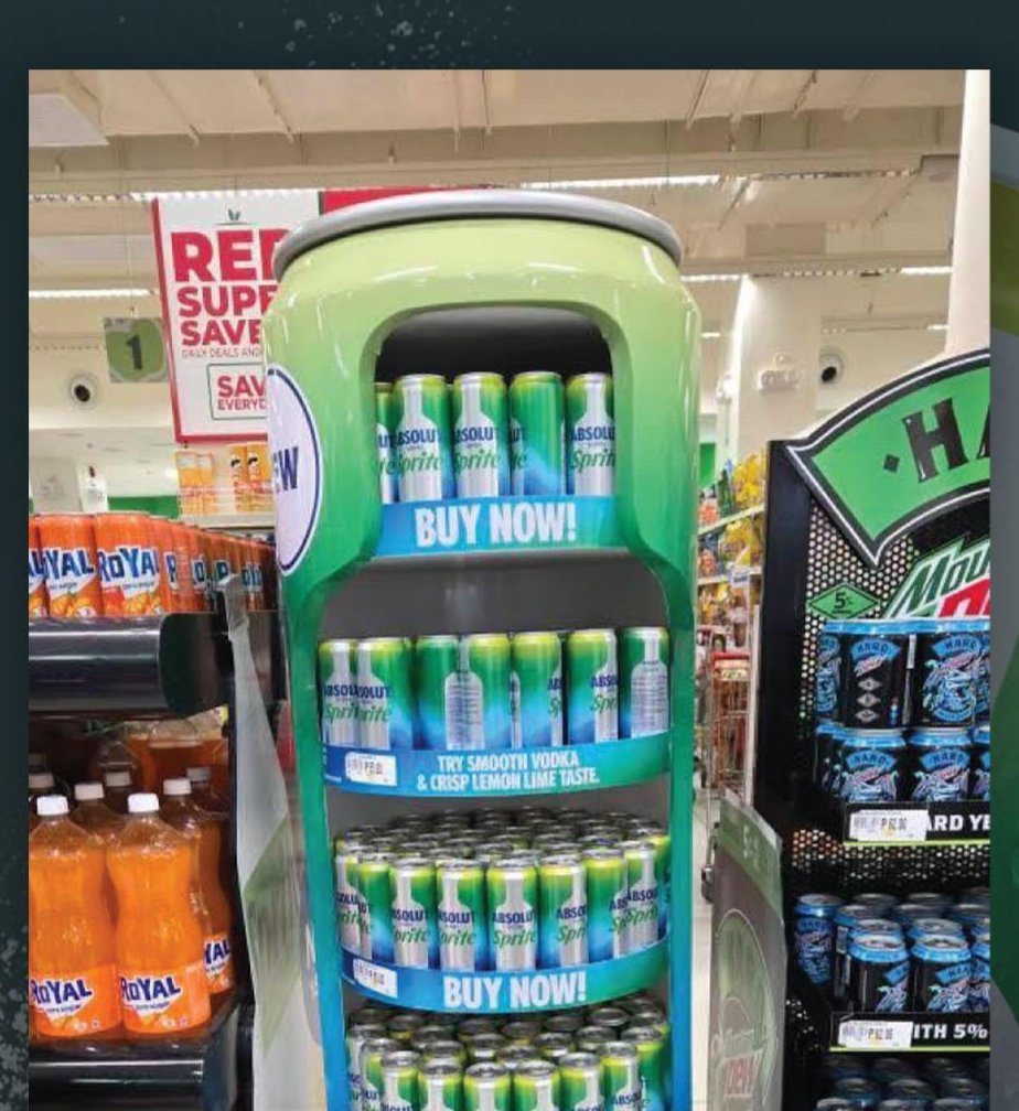
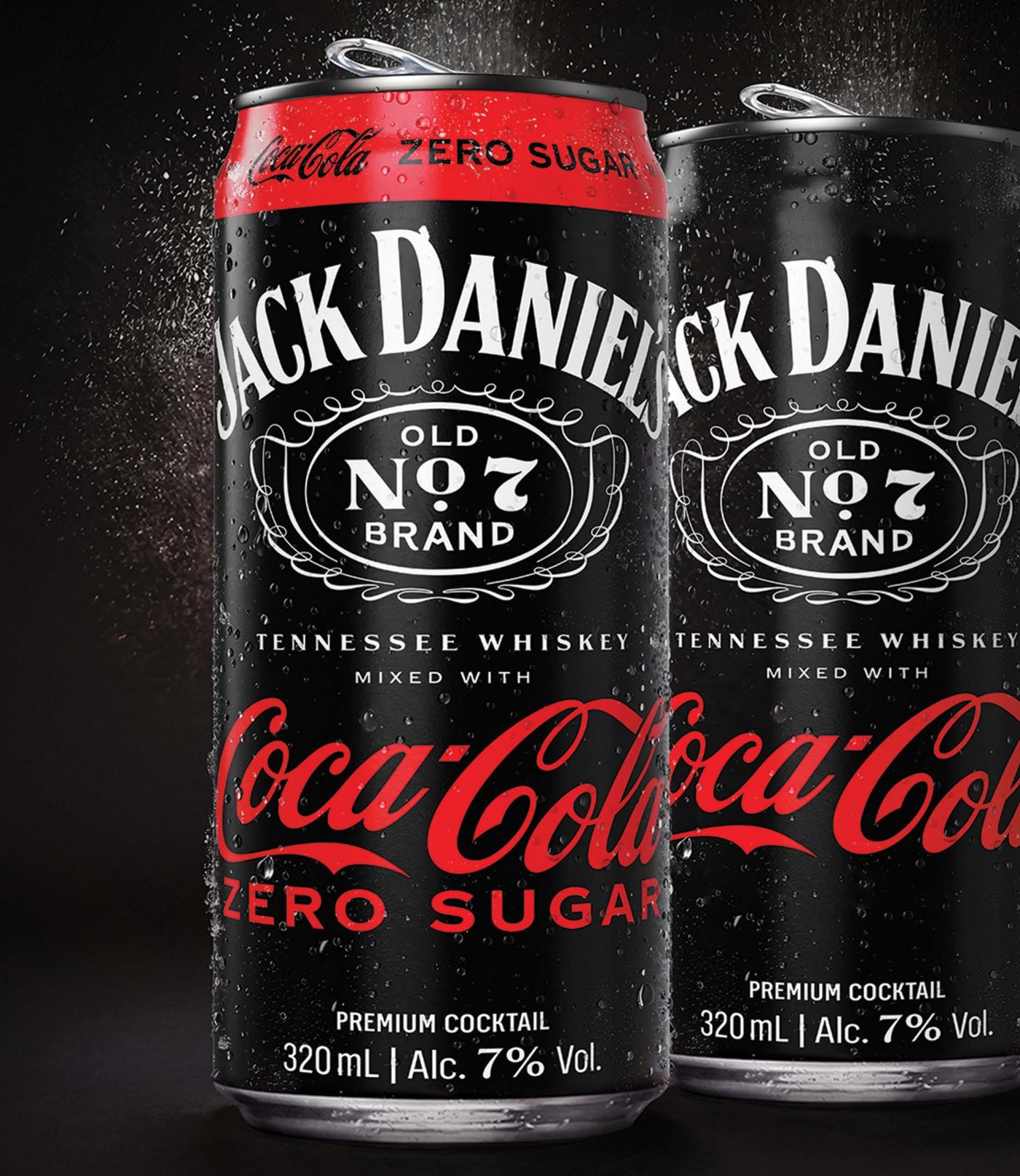
Try Smooth Vodka & Crisp Lemon Lime Taste.
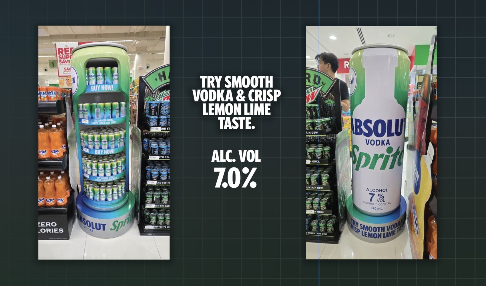
Leading design and execution on the in-store merchandising units for this nationwide Philippine rollout meant taking a single can render — a gradient from vodka-clear to Sprite-green — and building it out into a full-height MDU that had to hold up next to a supermarket's existing shelving and neighboring displays.
The structural planning mattered as much as the graphic: a display this tall needs its own footprint and stability, not just eye-catching print.
Can Label, Shelf Strips & Base
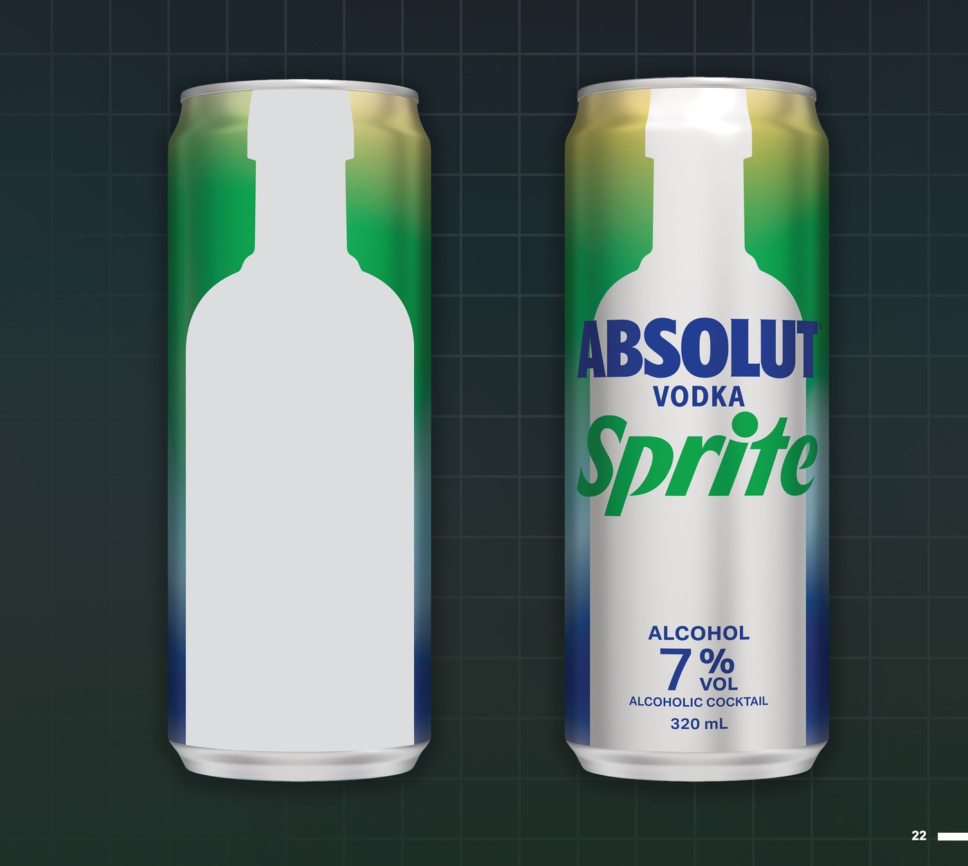


The base drum needed its own wrap and a matching circular disc for the top cap — small pieces on their own, but the ones that keep the display's gradient reading as one continuous surface from cap to floor.


The label had to hold its die-line and print register from a flat template through to the finished art — the bottle-silhouette cutout, the Absolut × Sprite lockup, and the required alcohol and volume callouts all locked to the same shape before it scaled up into every other piece of the system.
The same system carries down to the shelf: two message strips alternate down the display's four tiers — the product line, then the call to action — each one carrying the SRP, the ABV, and the required 18+ drink-responsibly mark at a size small enough to repeat without crowding the shelf.
Born Ready
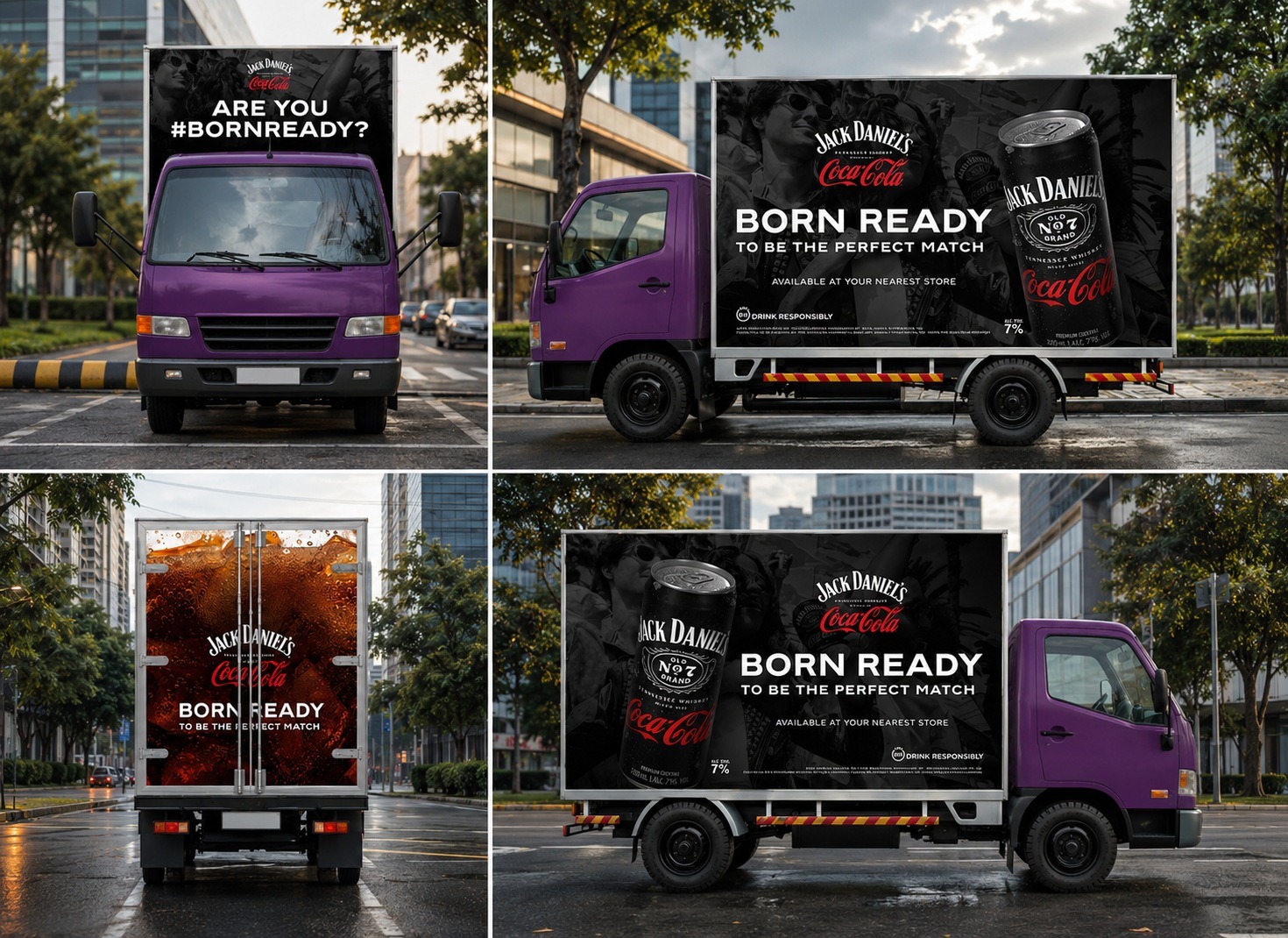
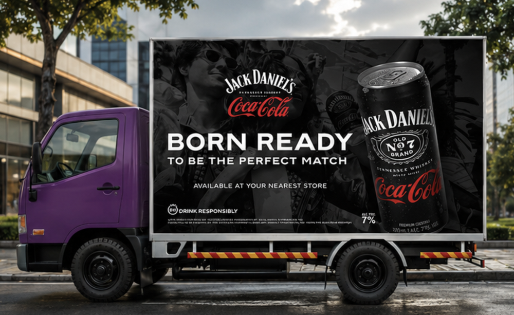
The premium-cocktail positioning meant a darker, more restrained palette than a typical Coca-Cola asset — black, red, and condensation detail doing the work instead of bright color blocking.
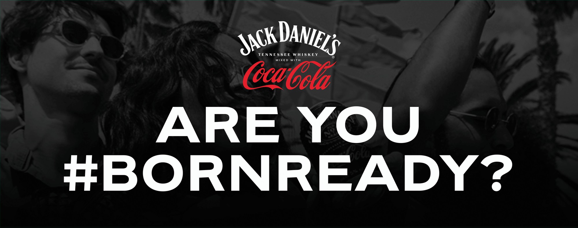
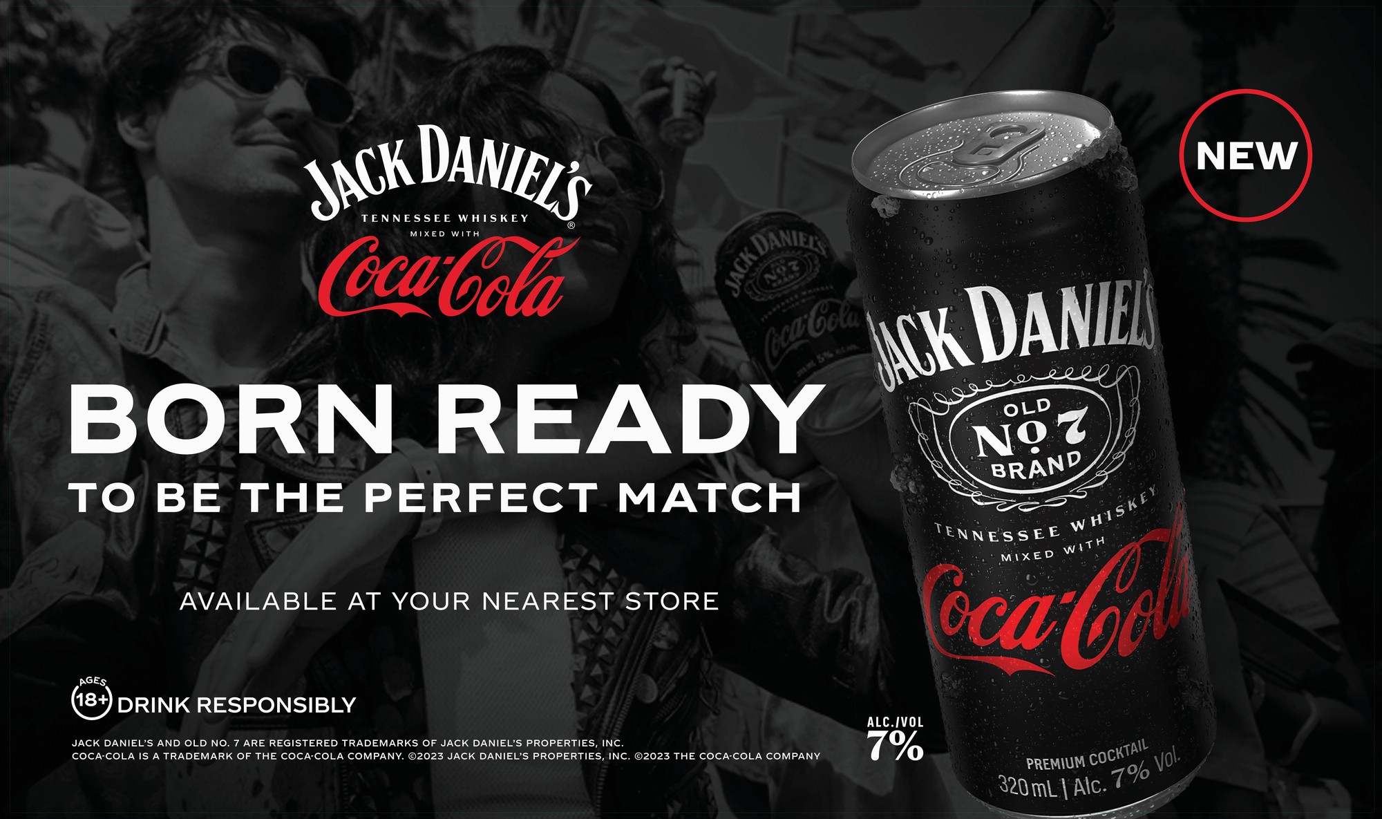
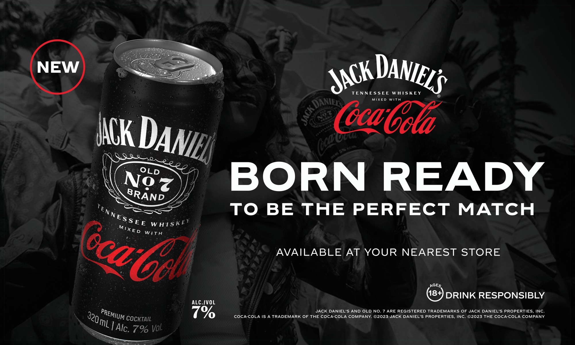
That same restraint had to survive the jump to a full delivery truck: front cab, both side panels, and the rear door each carrying the "Born Ready" line, built out as four separate elevations so the wrap shop could apply it panel by panel.
Full Door Fridge Decal
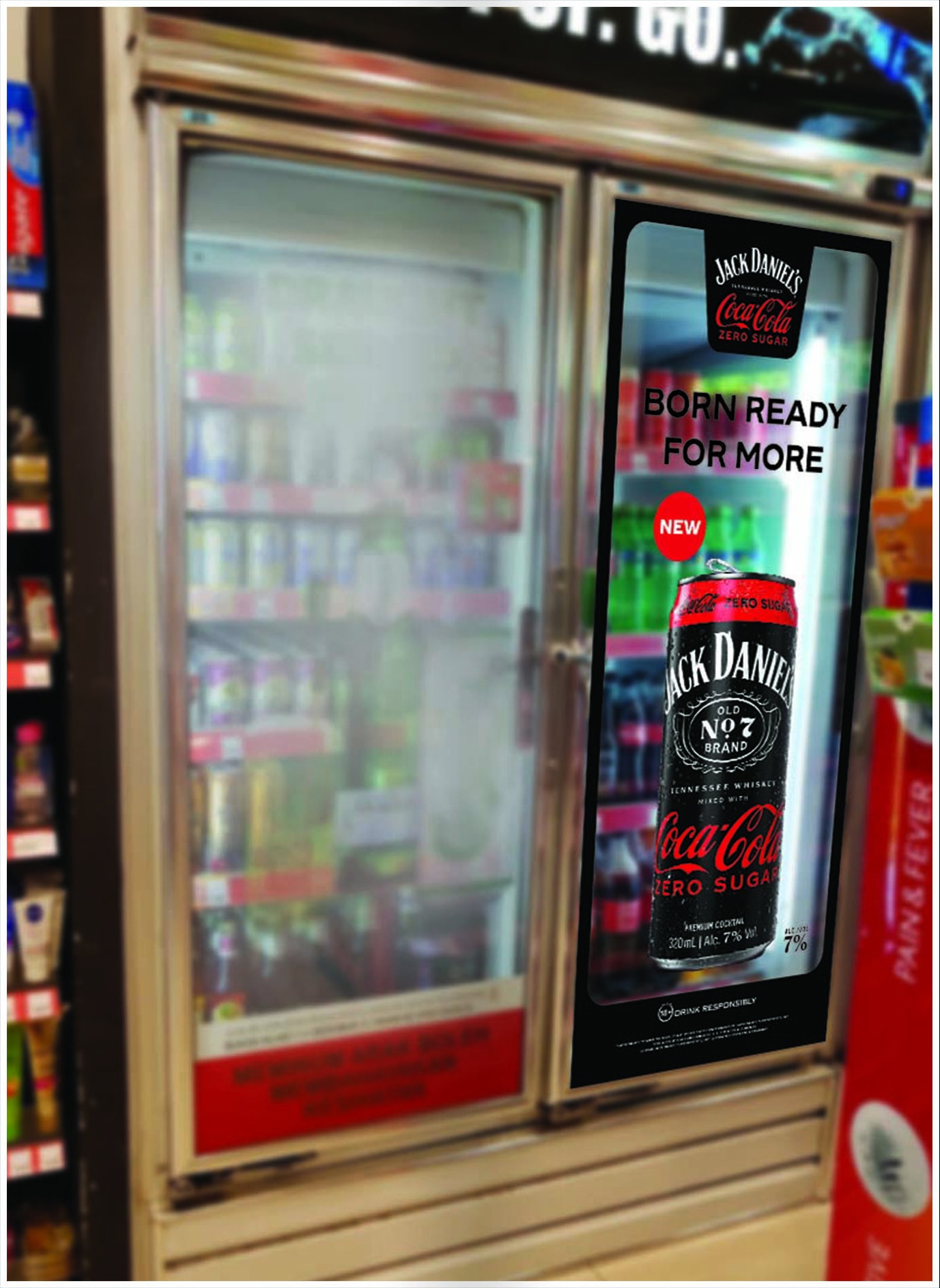
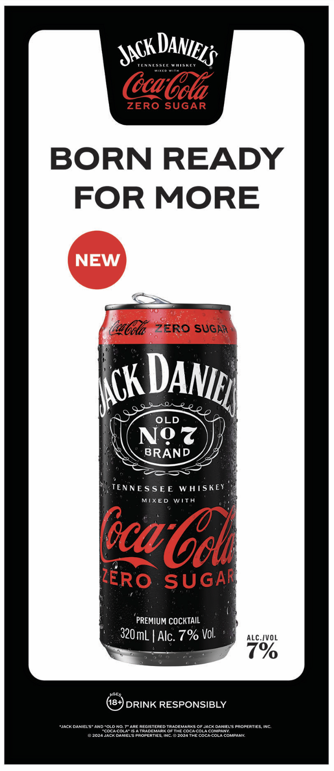
The truck wrap gets the message moving; the fridge decal is where it lands. Same "Born Ready for More" line and can shot, cut down to a single glass door so it reads clean from a few feet away — and had to hold up printed and applied to real cooler glass, not just look good flat. Beside it is the flat production file behind that decal — full bleed, die-line intact, with the "NEW" call-out and every required trademark and drink-responsibly line locked in place before it goes to print.
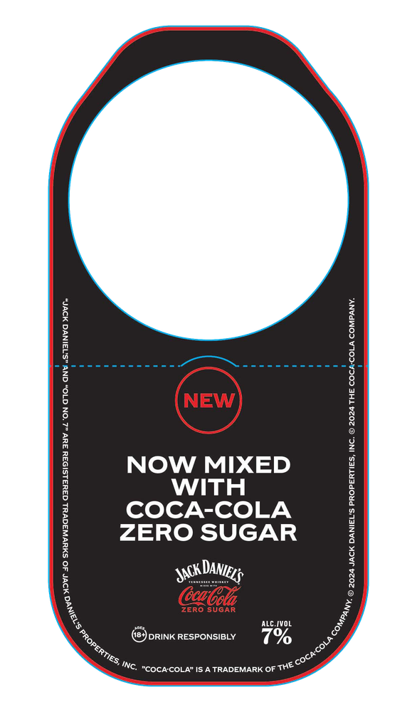
Neck Tag
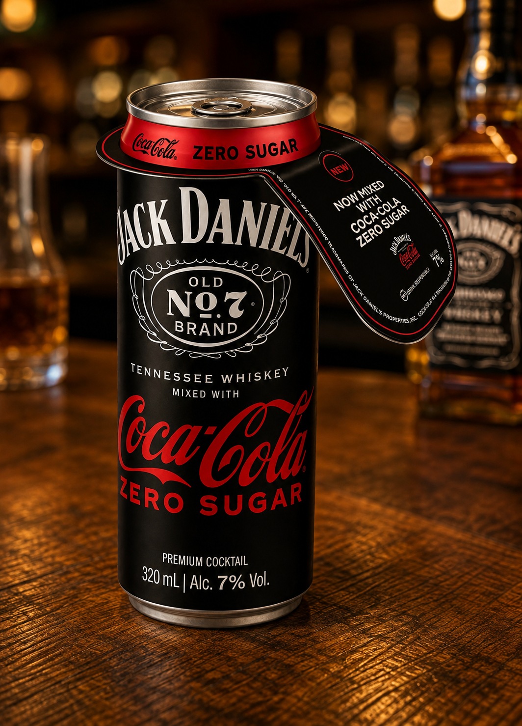
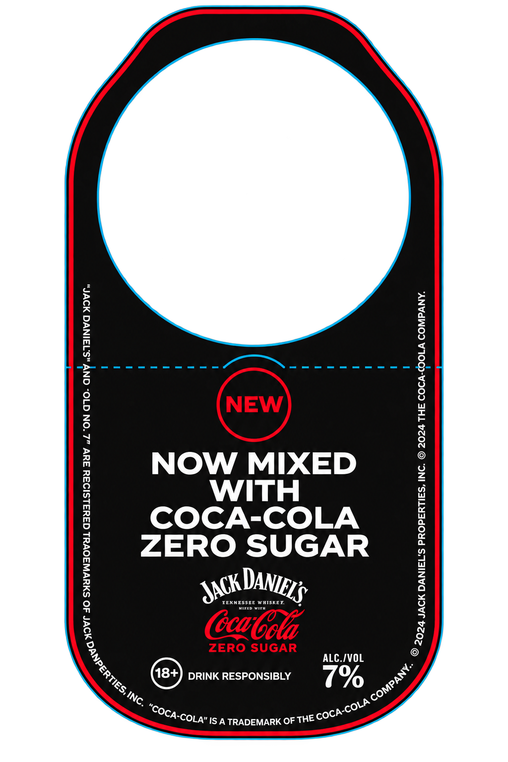
The neck tag carries the same news down to shelf level: a die-cut hanger that slips over the bottle neck itself, front-and-back printed so the "Now Mixed With Coca-Cola Zero Sugar" message is the first thing a shopper sees picking it up.
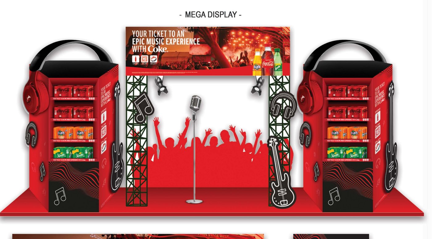
Your Ticket to an Epic Music Experience
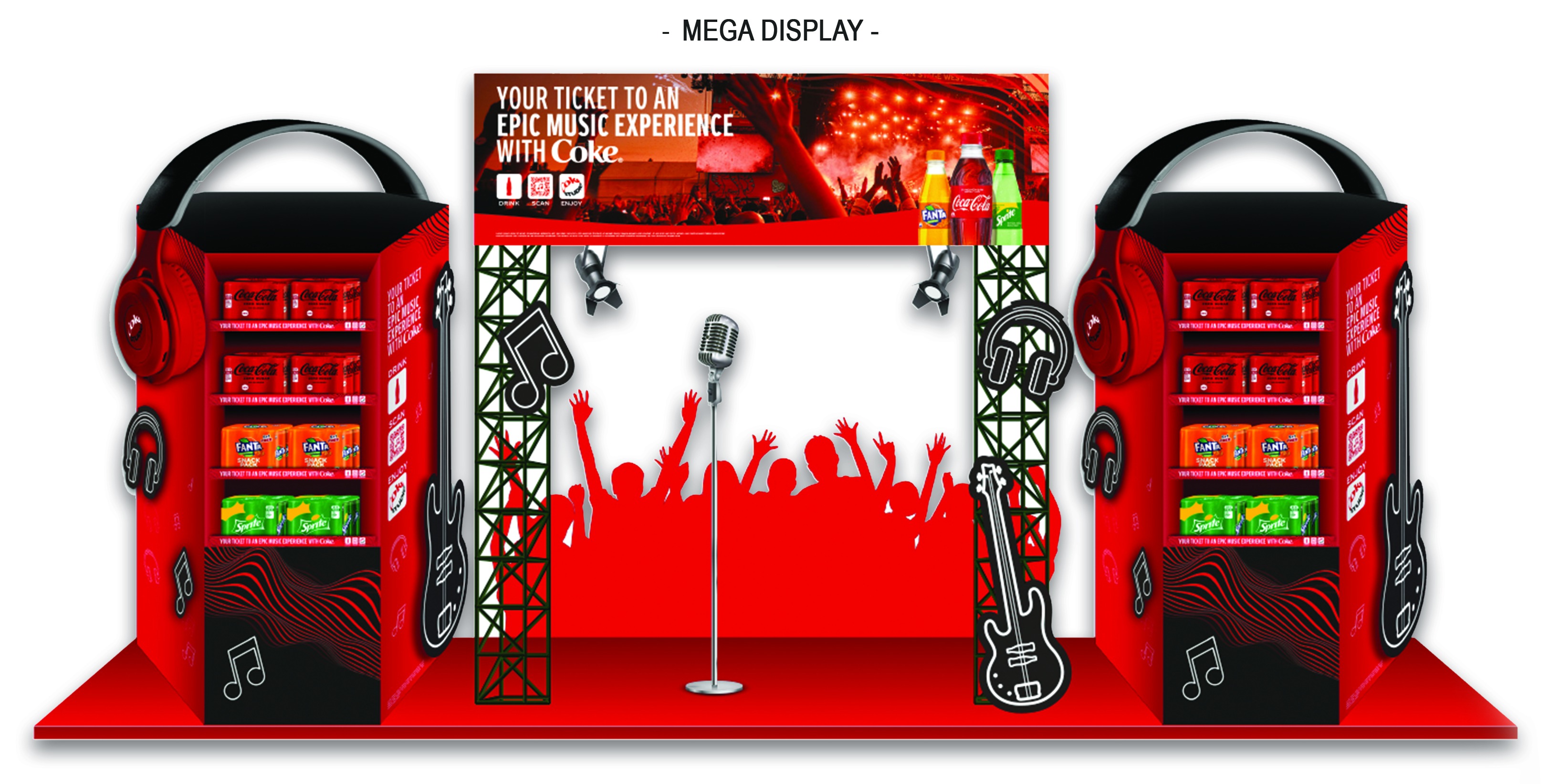
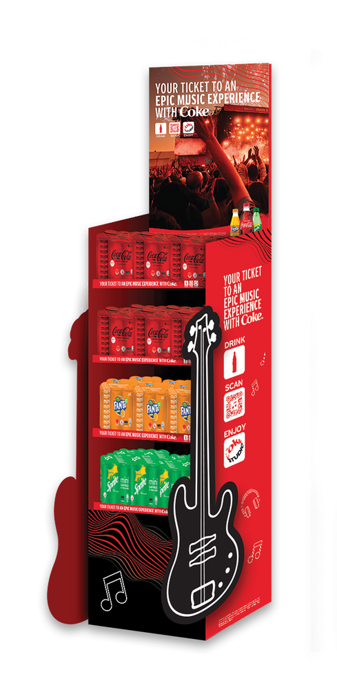
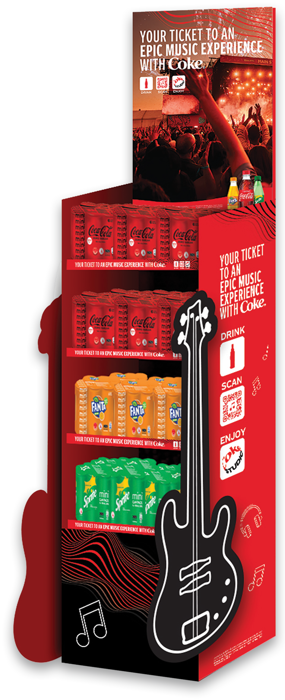
The brief was one fixture, three brands, no brand allowed to dominate. The mega display solved it by borrowing the shape of a concert itself — twin speaker towers doubling as headphone-shaped shelving, a stage arch in the middle, guitar and crowd silhouettes as die-cut trim.
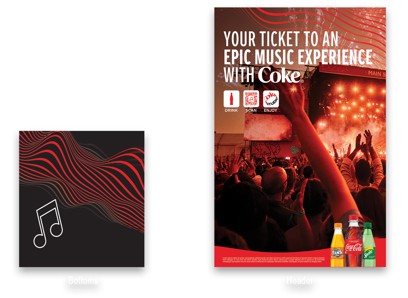
The output file bundled a header, side panels, and bottom panel as separate print-ready components, so store teams could assemble a full stage set from flat-packed board.
Header, Side Panel & Components
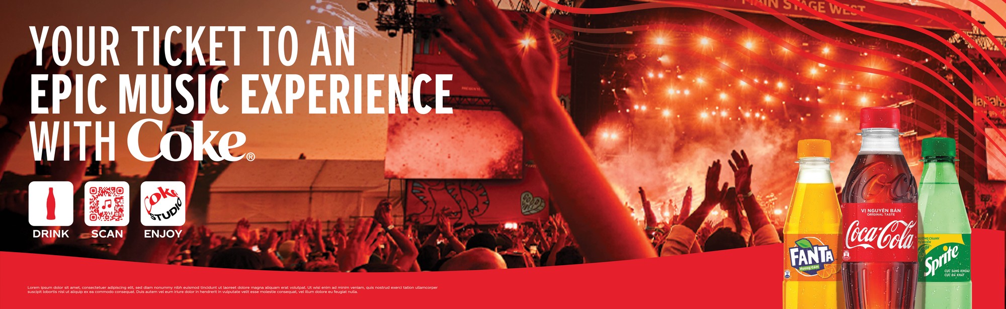
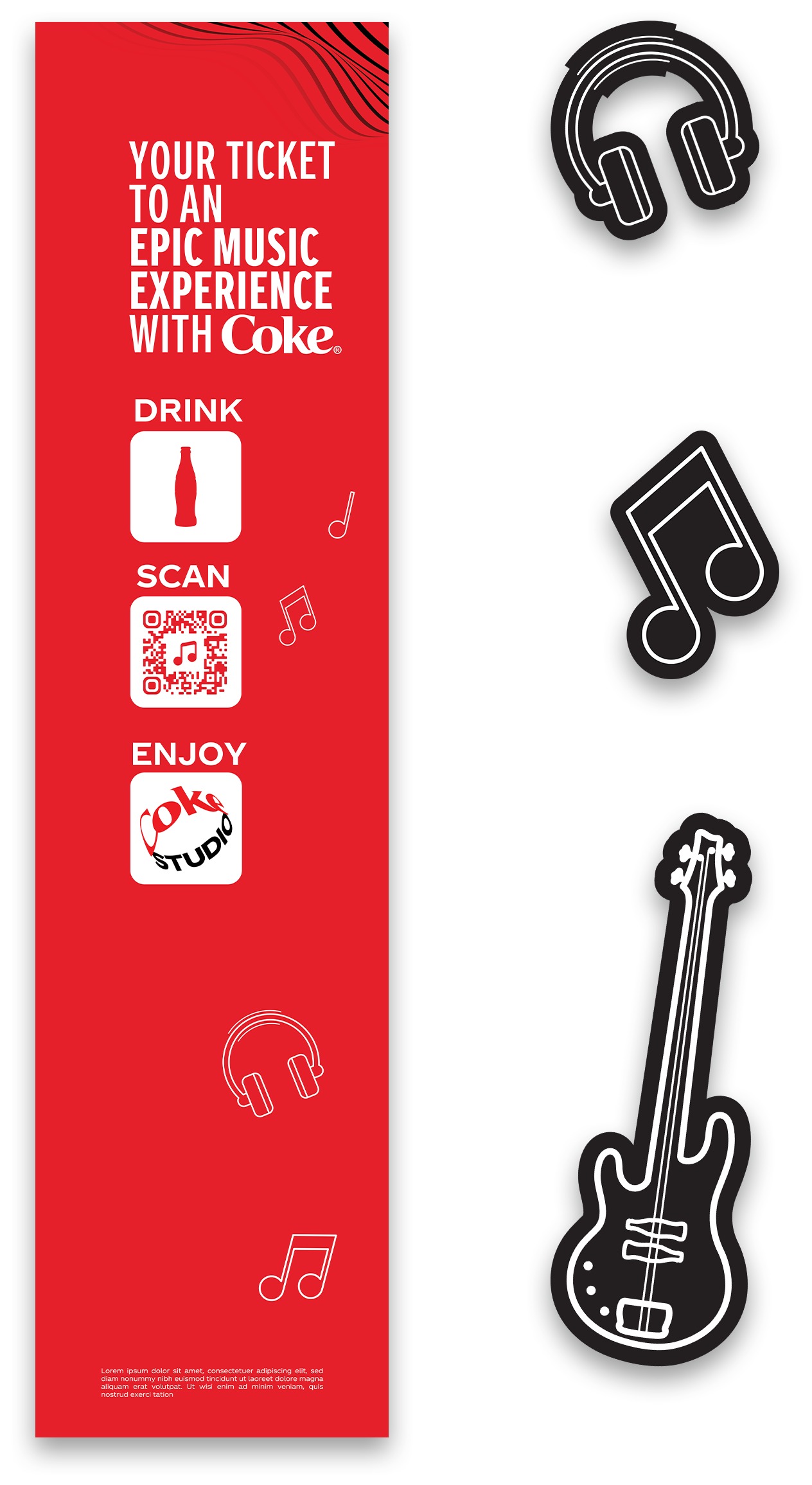

The header carries the same headline and product shot that tops the assembled arch, paired here with the side panel's icon face — Drink, Scan, Enjoy — printed flat before the guitar, headphone, and music-note trim get die-cut and folded into the finished tower.
The base of each tower carries this wavy line pattern — a continuous motif that keeps the display feeling like one built object rather than three stacked boxes, running from the black icon panel down to the floor.
Display Rack
A smaller-footprint companion to the mega display, built for stores that don't have room for the twin-tower stage set — same header, same side-panel icon face, same wavy bottom pattern, just reshelved into a single guitar-necked column.
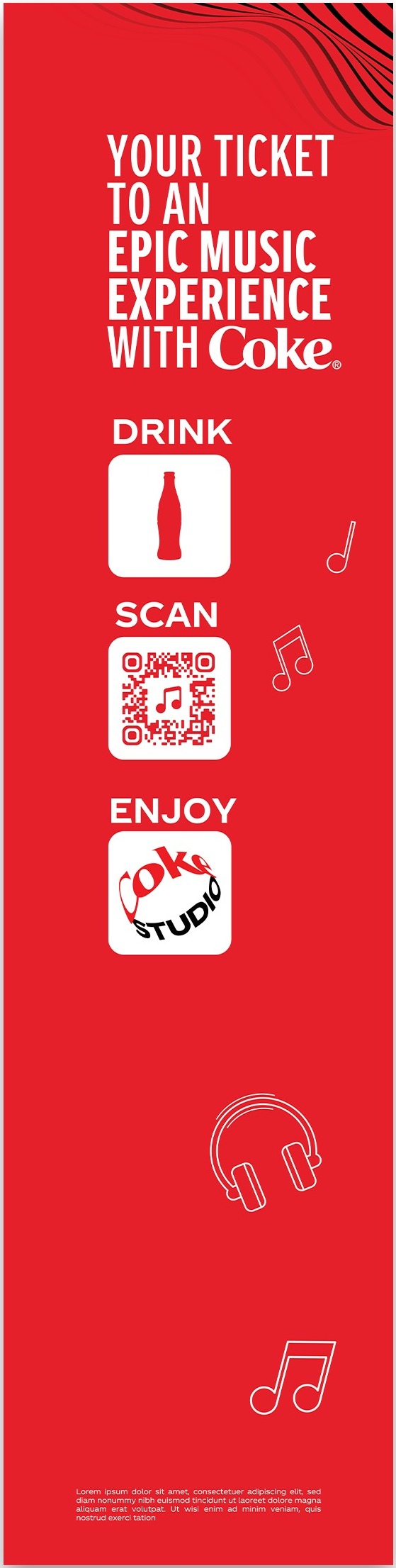 Sidepanel
 Sidepanel Guitar
Coke Breaks
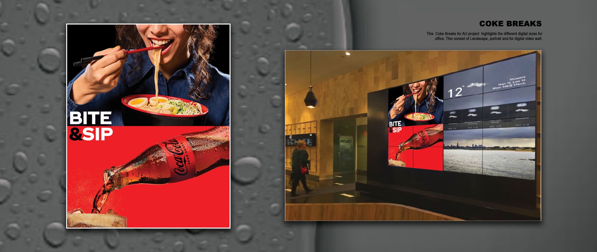
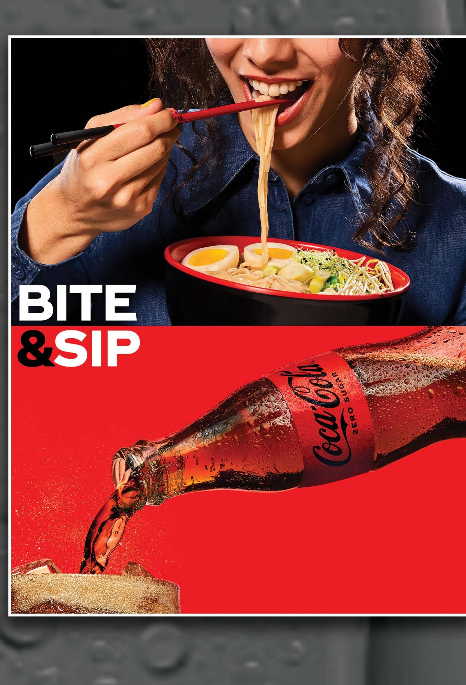
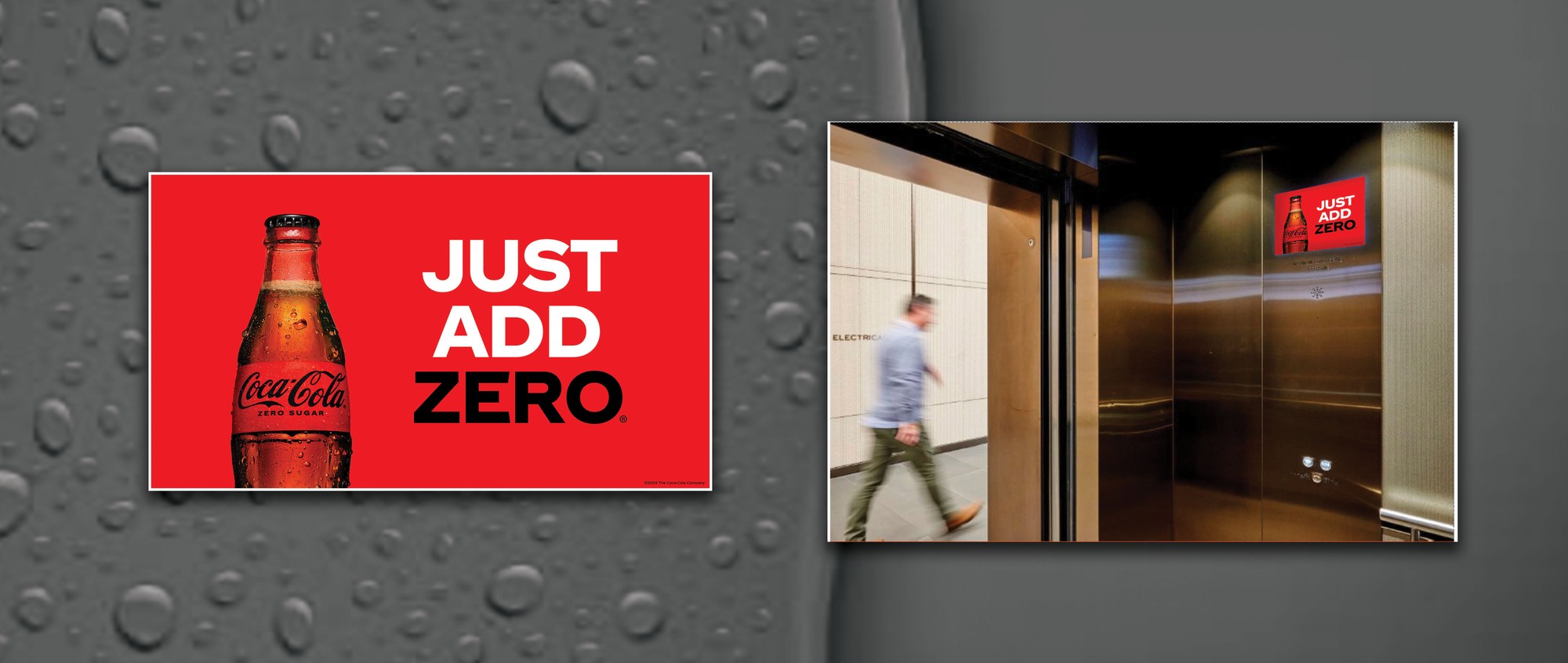
Built for a network of office video walls across Australia, this set needed to work as landscape tiles, portrait panels, and full video-wall grids — three key visuals, three screen formats, one shared design system so the loop never feels like it's repeating itself. "Bite & Sip" paired food and drink into a single beat for the lobby video wall.
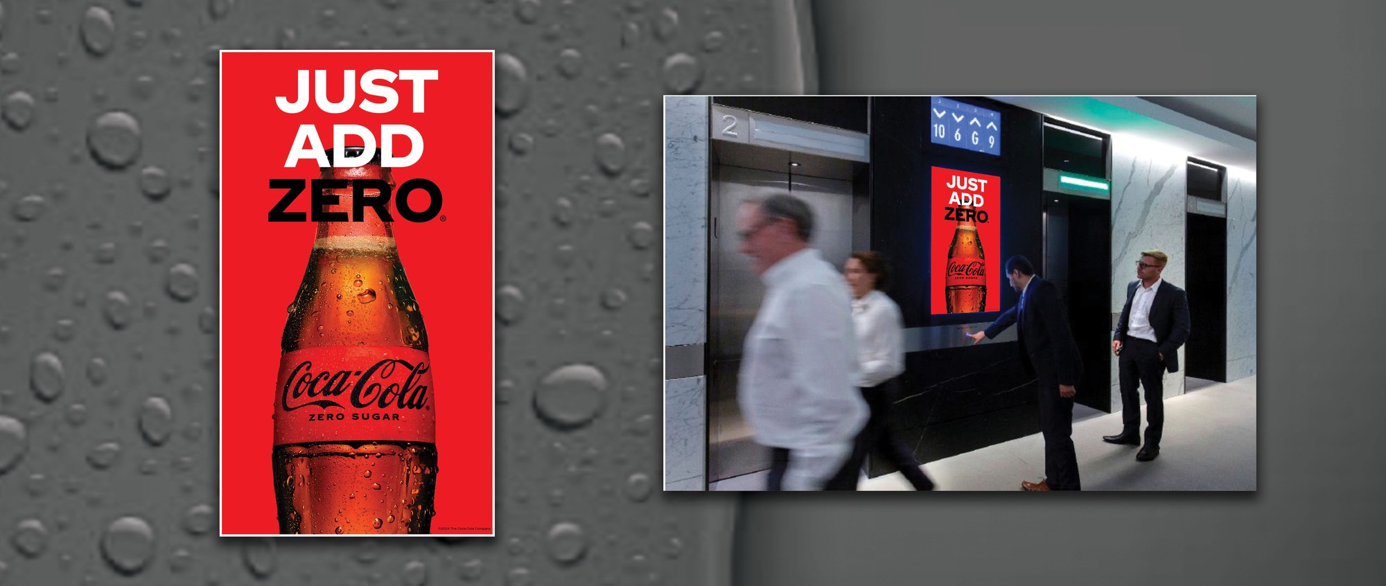
The two "Just Add Zero" cuts carried that same product-forward simplicity down to the elevator bank — a portrait screen at the lift lobby, a landscape screen inside the car itself.
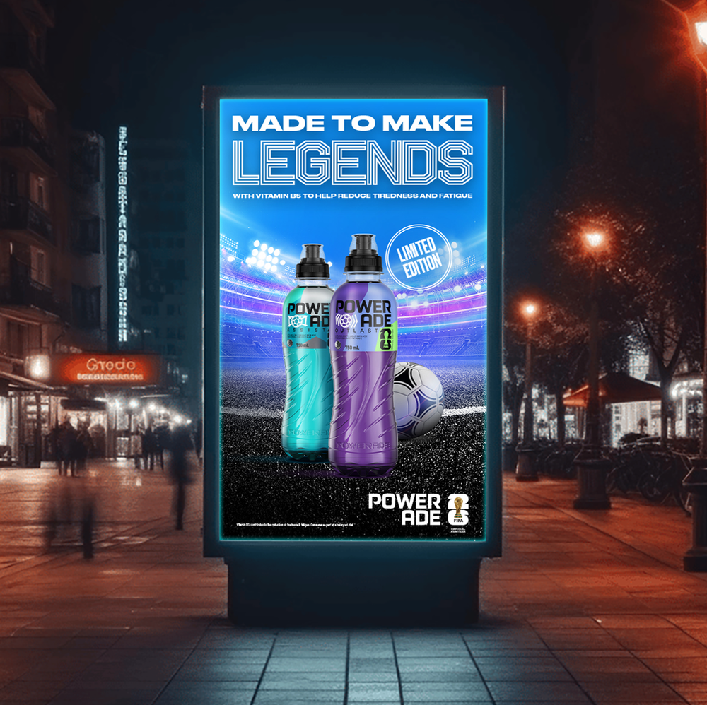
Made to Make Legends
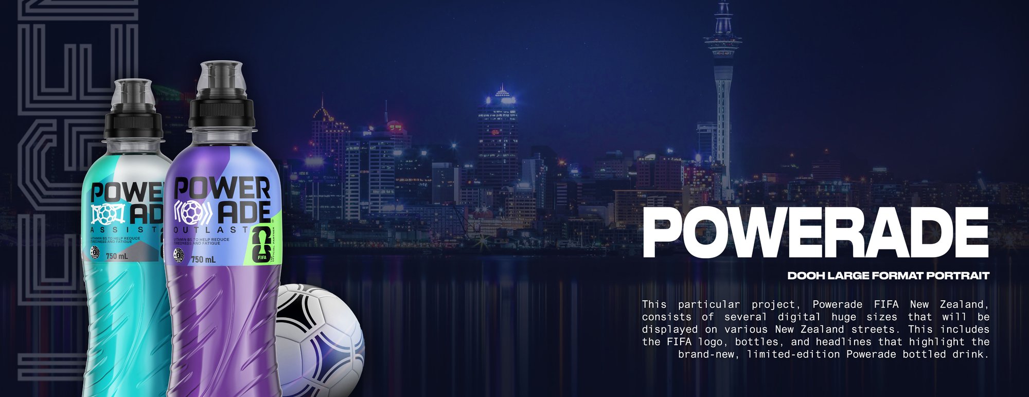
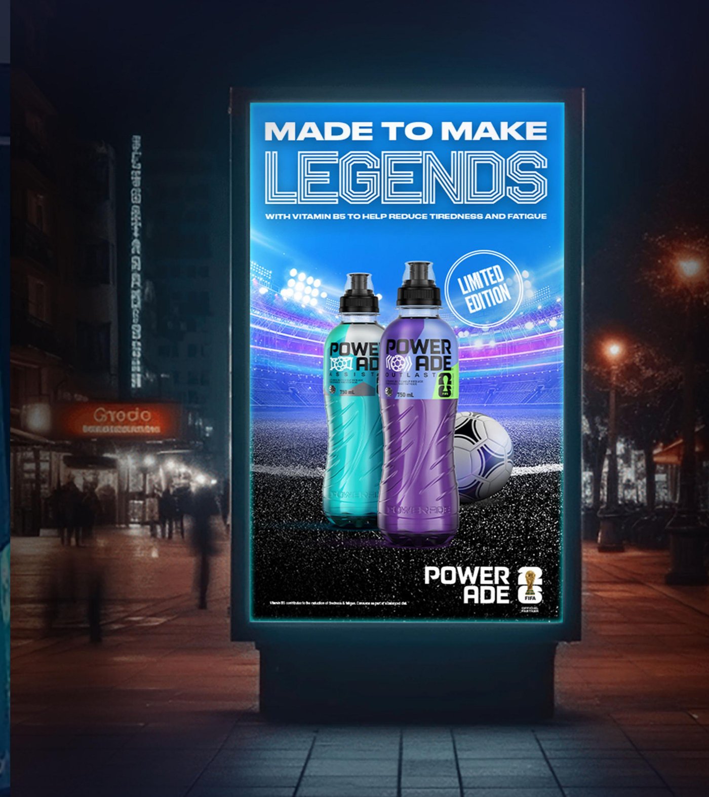
A limited-edition Powerade x FIFA release needed a hero visual big enough to hold its own against an entire city skyline — literally. The Auckland waterfront became the backdrop for a large-format DOOH portrait built to run across several huge digital placements on New Zealand streets.
Street to Screen: Scaling the System
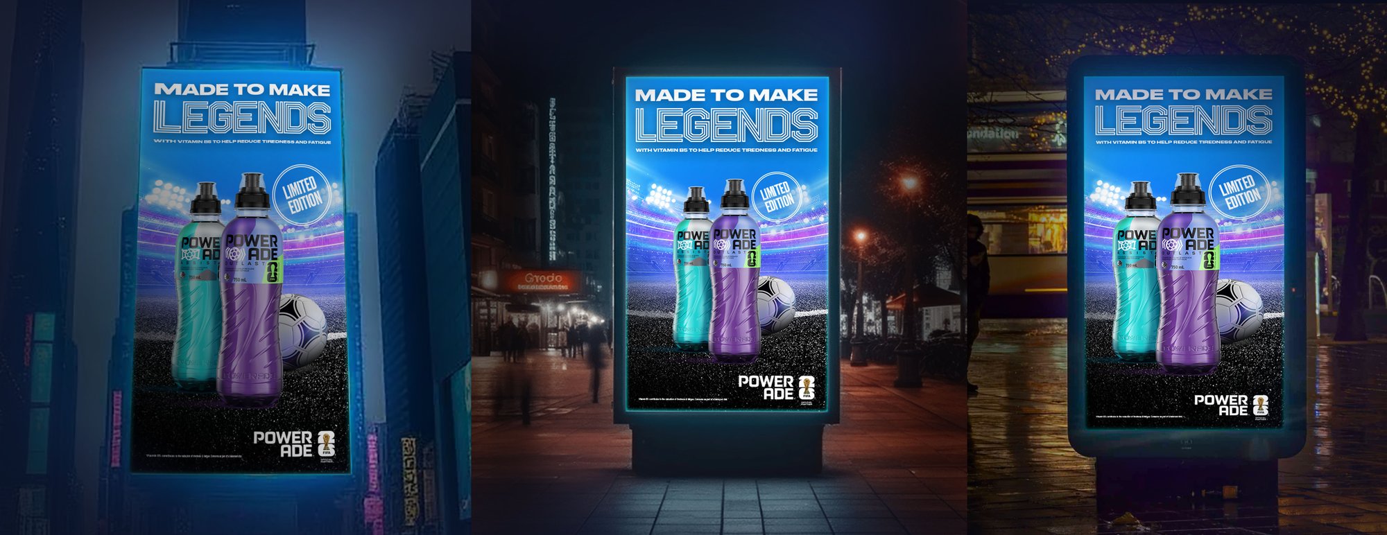
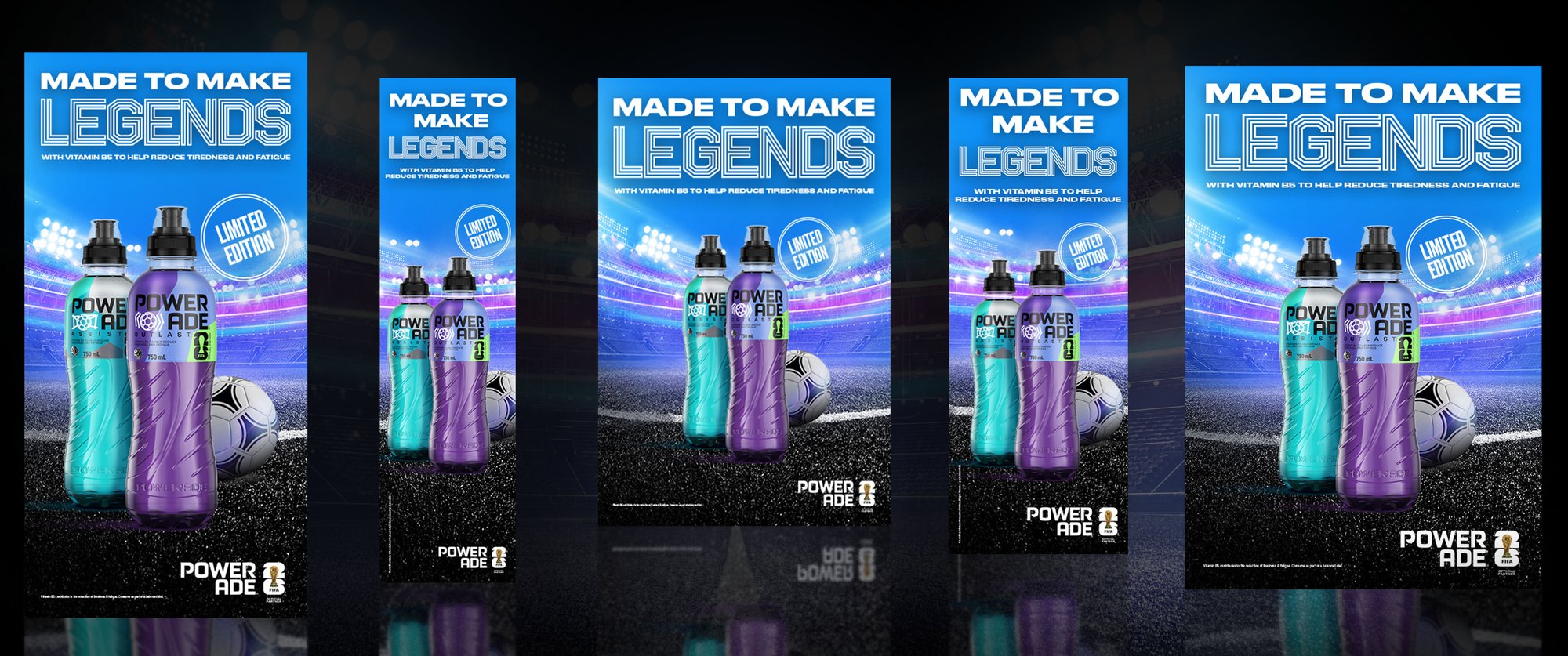
The same key visual had to travel across a full network of screen sizes and aspect ratios without losing the "Limited Edition" badge, the FIFA mark, or the two-bottle hero shot — from narrow citylight panels to wide jumbotron formats, each crop was checked to keep the composition legible at a glance from the street.
A New Way to See Lemons
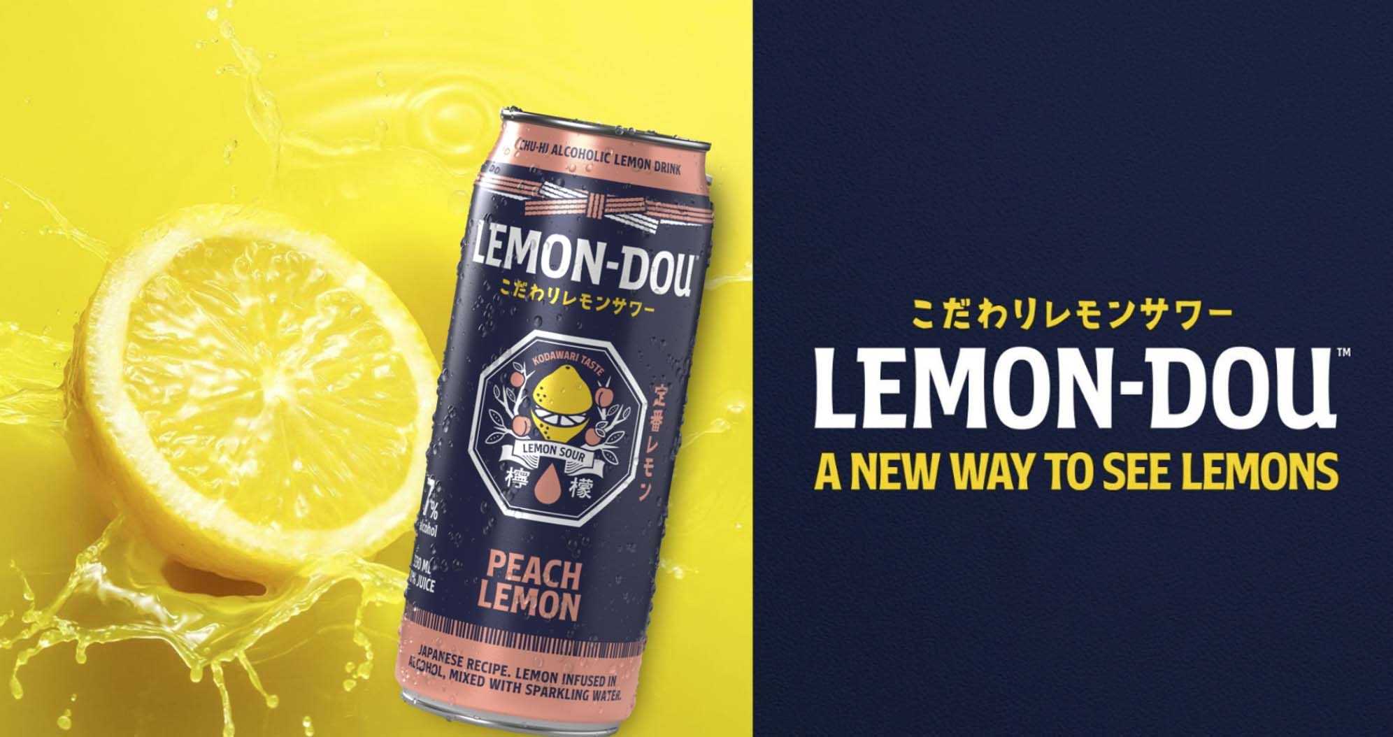
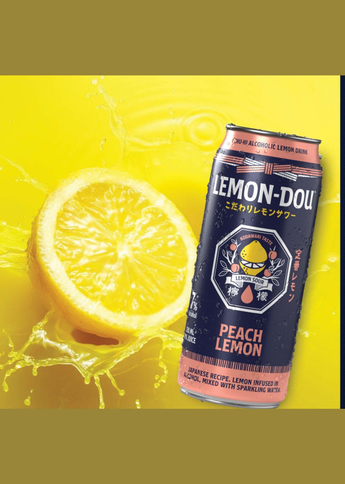
Four flavor variants — Honey, Signature, Peach, and Devil Lemon — needed their own can identity while staying recognizably one family, all built around a single Japanese-recipe positioning and one lemon-and-splash key visual.
Building the Billboard: From File to Facade
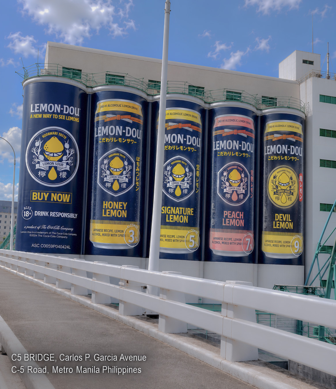
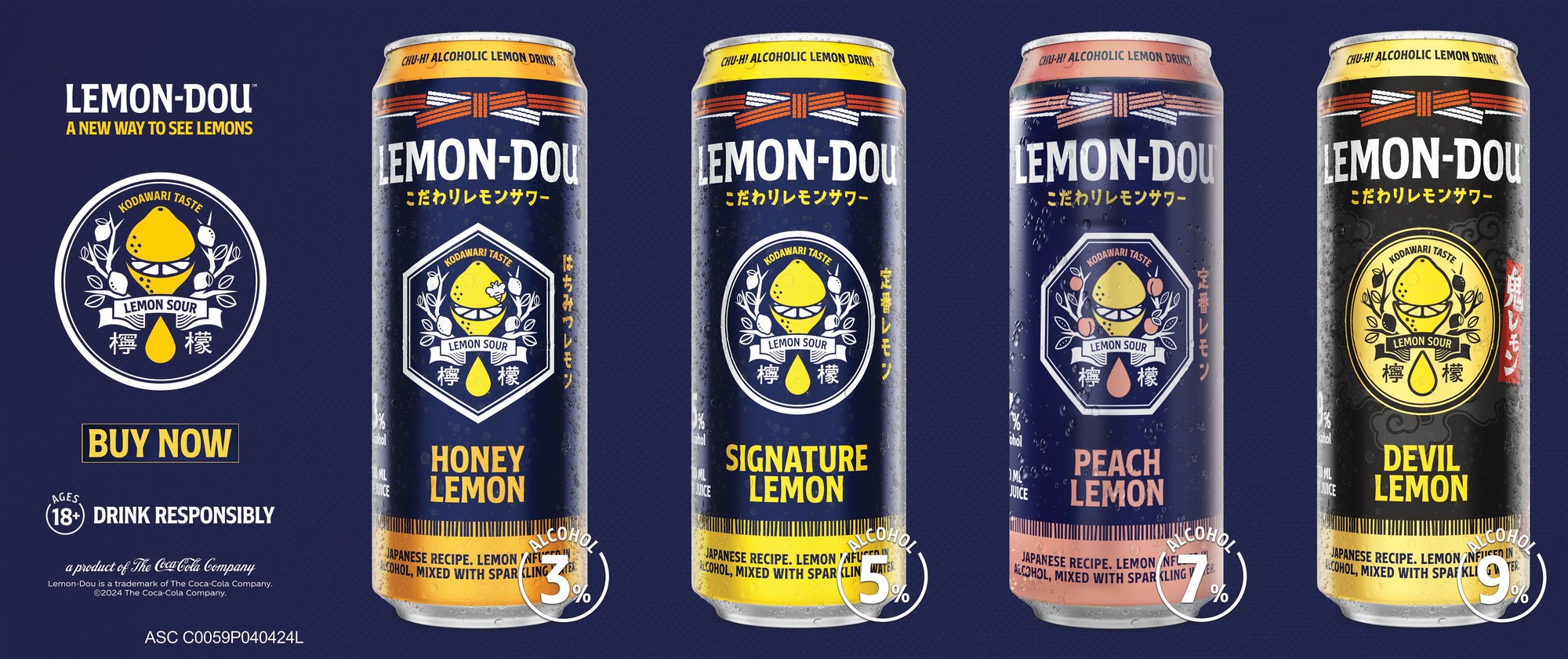
The same key visual had to scale from a single can label all the way up to five story-tall silos wrapping an entire building along C-5 Road — the billboard design carried all four flavors at once, each can rendered large enough to read correctly from a moving car below.
Banners: Buy Now, Down the Block
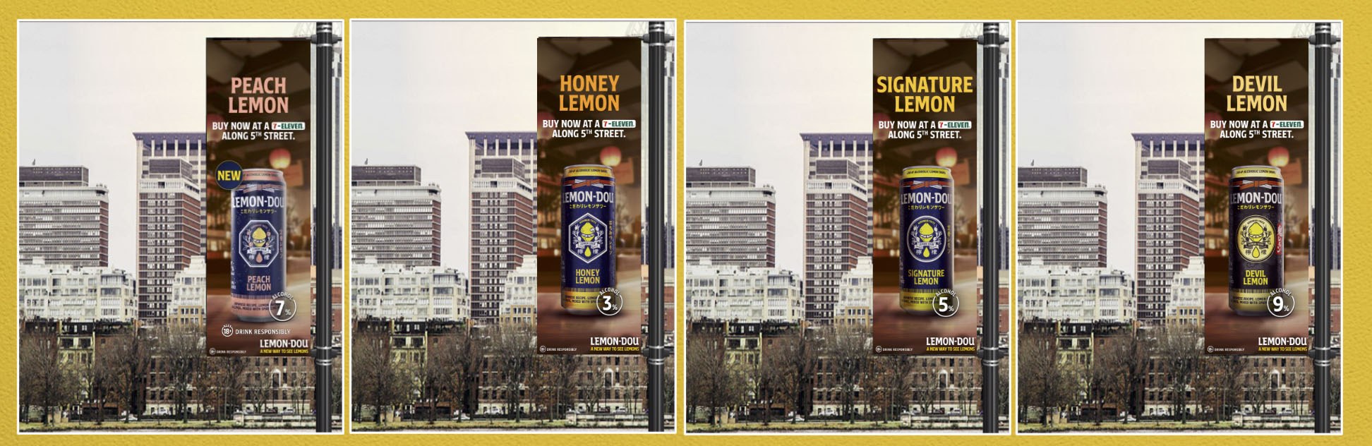
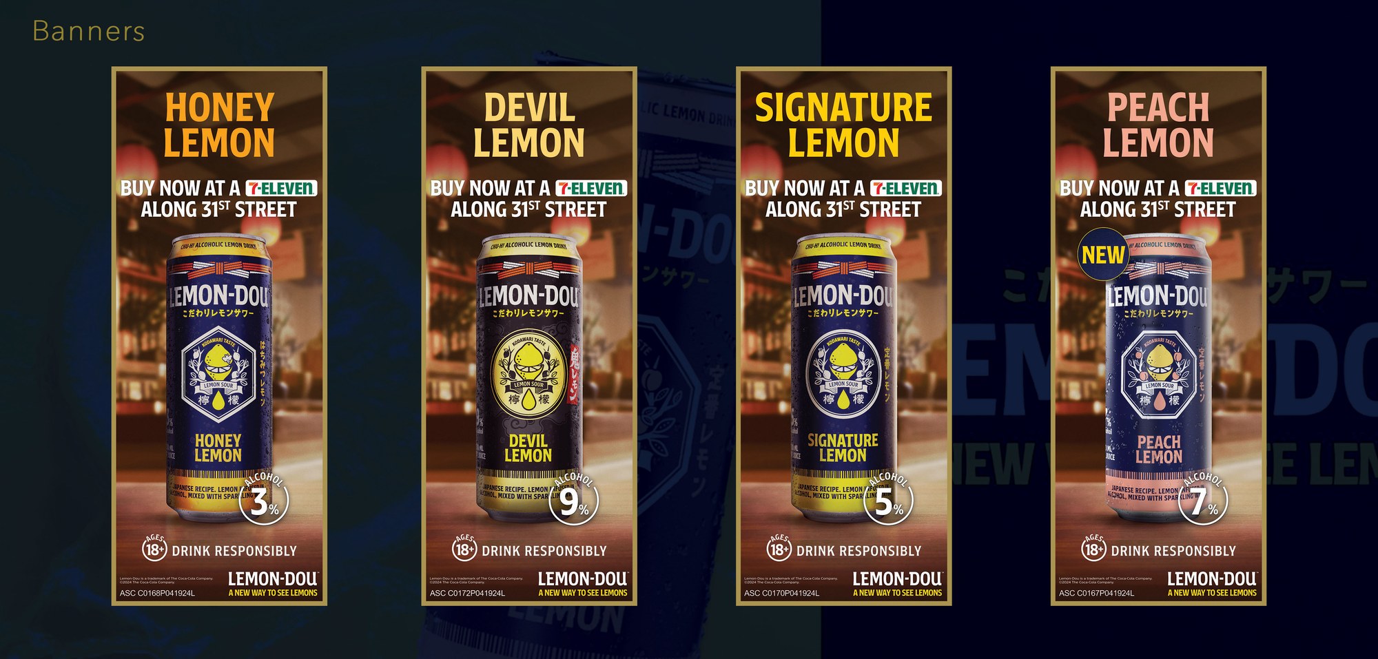
At street level, four lamp-post banners carried the same system down to a single can and a "buy now at 7-Eleven" call to action — each flavor keeping its own color cue, honey gold, signature blue, peach pink, devil black, so shoppers could spot their flavor from the sidewalk.
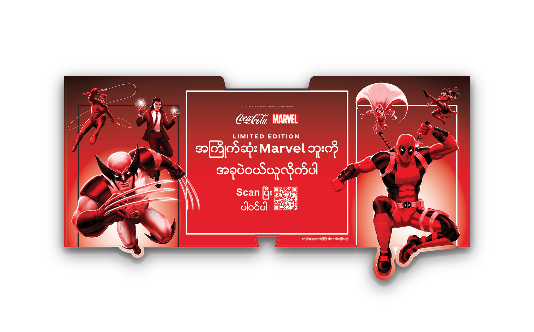
Marvel Universe, Collect & Unlock
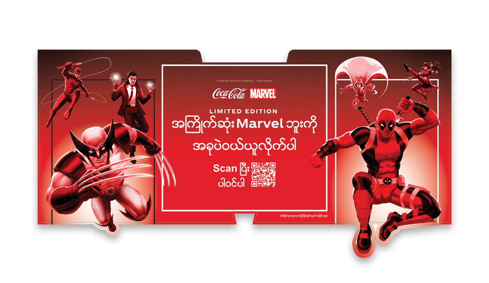
Every promotional asset here — buy-4-get-1 danglers, entrance arches, shelf headers — had to work in Burmese script while staying inside two separate brand guideline systems at once: Marvel's character usage rules and Coca-Cola's own.
The illustrated character work carried the campaign; the production challenge was making dense promotional copy sit cleanly around it without crowding the artwork or breaking either license's layout rules.
Entrance Arch — Header & Side Panels
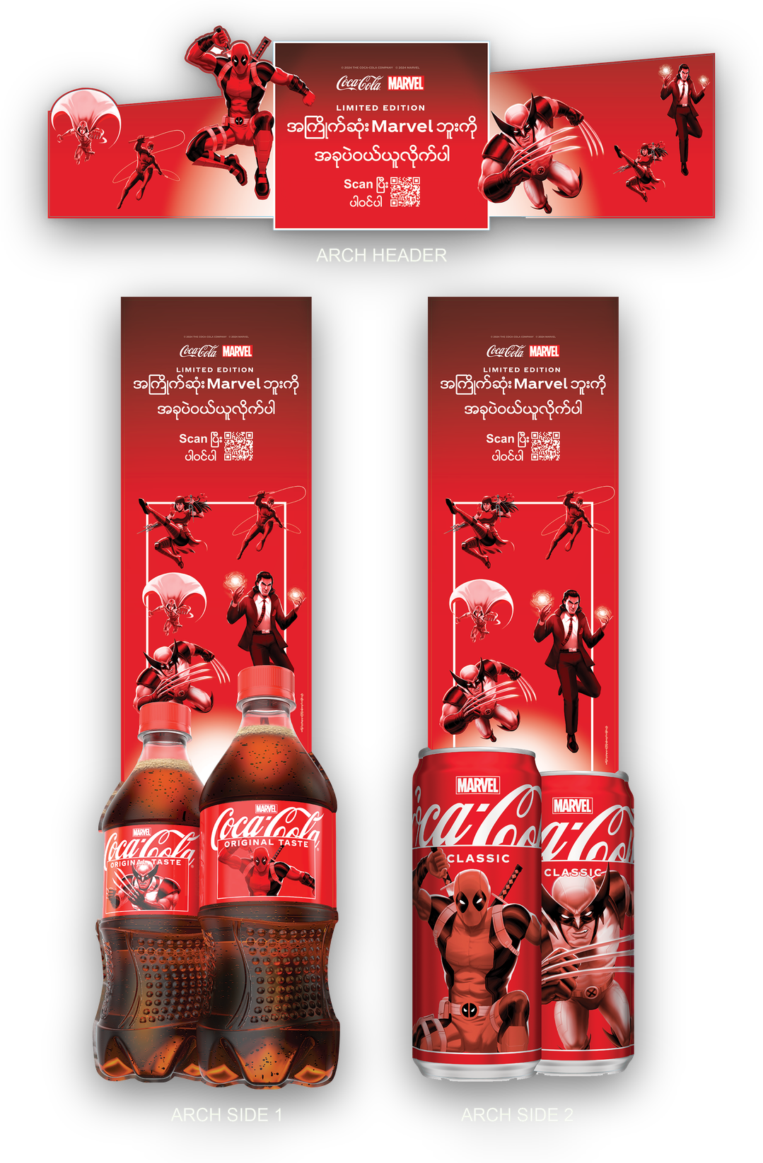
The arch fixture breaks into three flat-packed pieces — a wide header panel carrying the QR call-to-action, and two side panels that each carry the character artwork down into a product mock-up, one for bottles, one for cans, so stores can build whichever pack size they're stocking.
Gondola Header
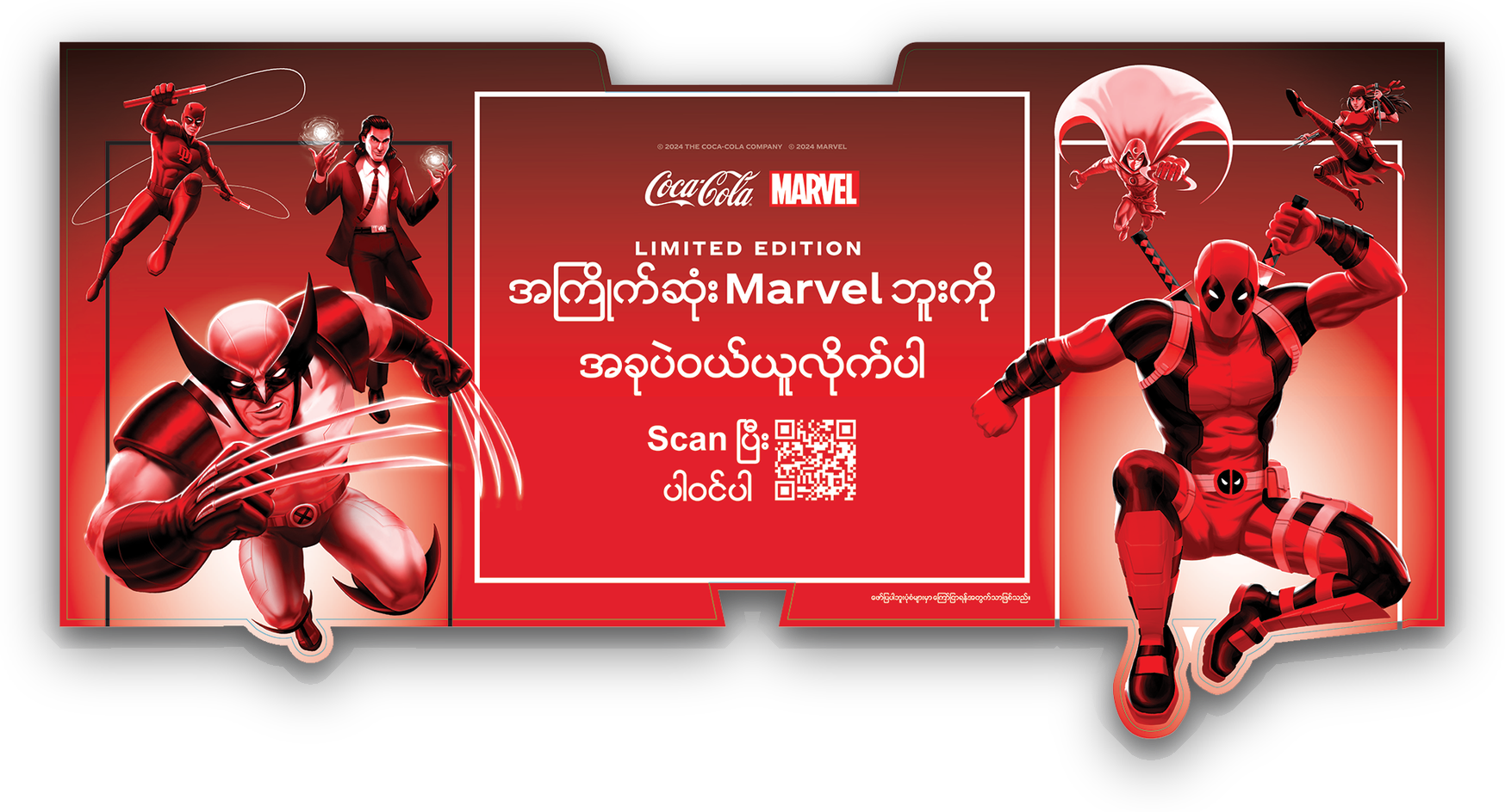
A shorter-run alternative to the full arch — same offer panel and QR code, but built as a single wide header that clips straight onto a gondola end-cap, with the characters breaking past the die-cut edge so the shelf doesn't read flat.
Block Display — Shelf Banners
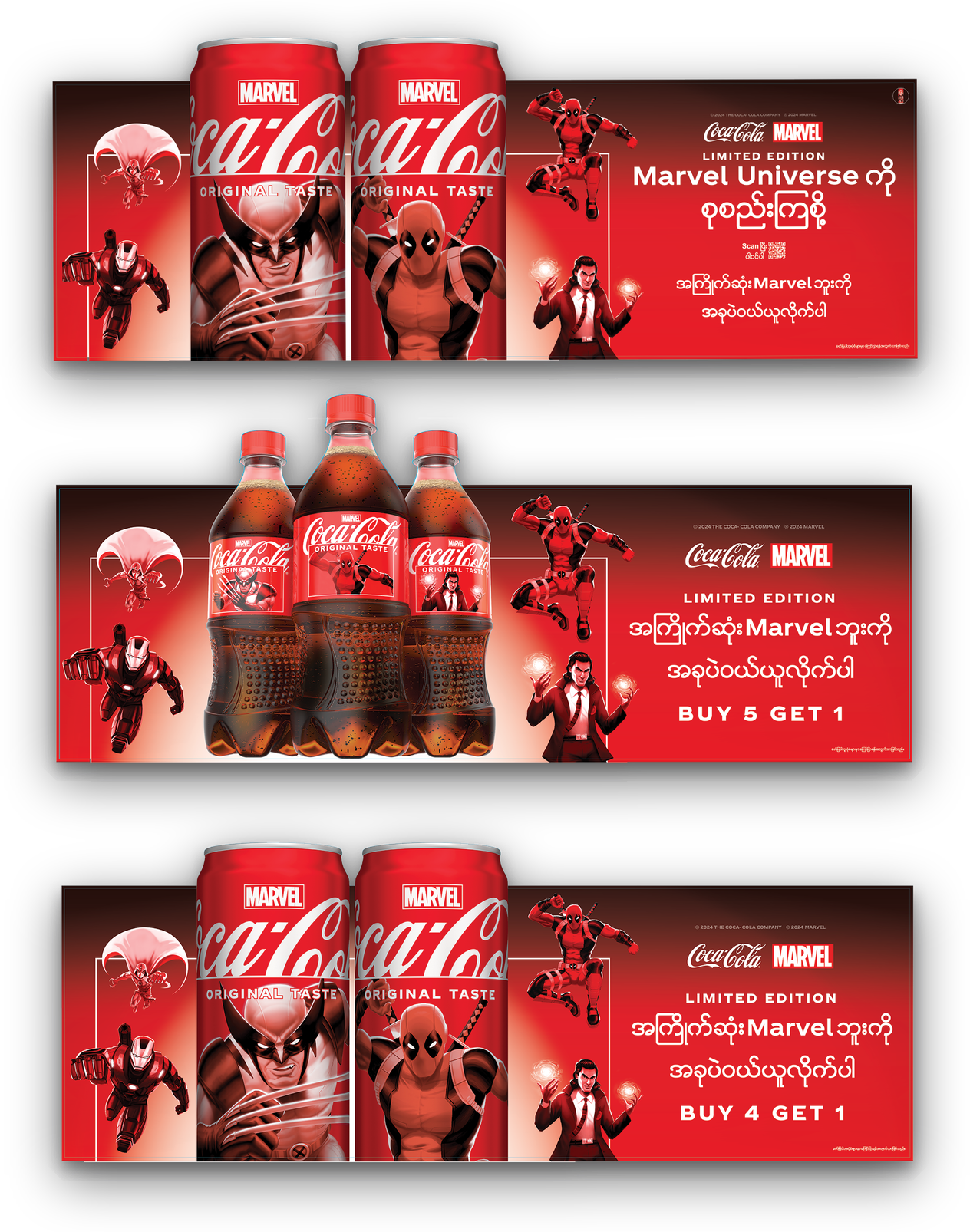
For stores running the promotion off open shelving rather than a standalone fixture, the same system compresses into three stacked banner strips — each carrying its own buy-more offer, from a straight product callout down to "Buy 4 Get 1."
Magic Happens When We Bond
Coca-Cola's "Chinese New Year: Magic Happens When We Bond" campaign needed one dragon motif, in Coca-Cola's signature red and gold, to carry across a full spread of formats — escalator decals, pillar stickers, large-format wall decals, and a city bus transit wrap — so the same story held together whether a commuter caught it stepping onto a bus or walking through an MRT interchange.
Bus Transit — Full Wrap
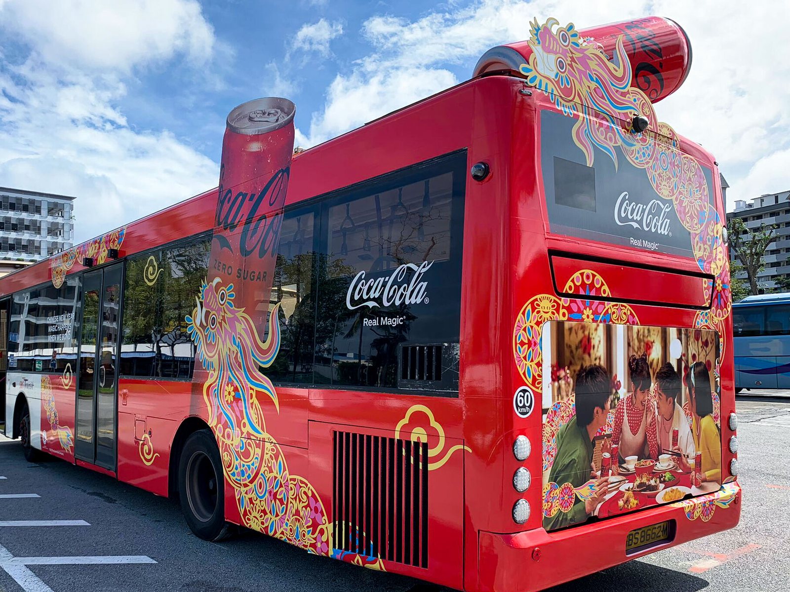
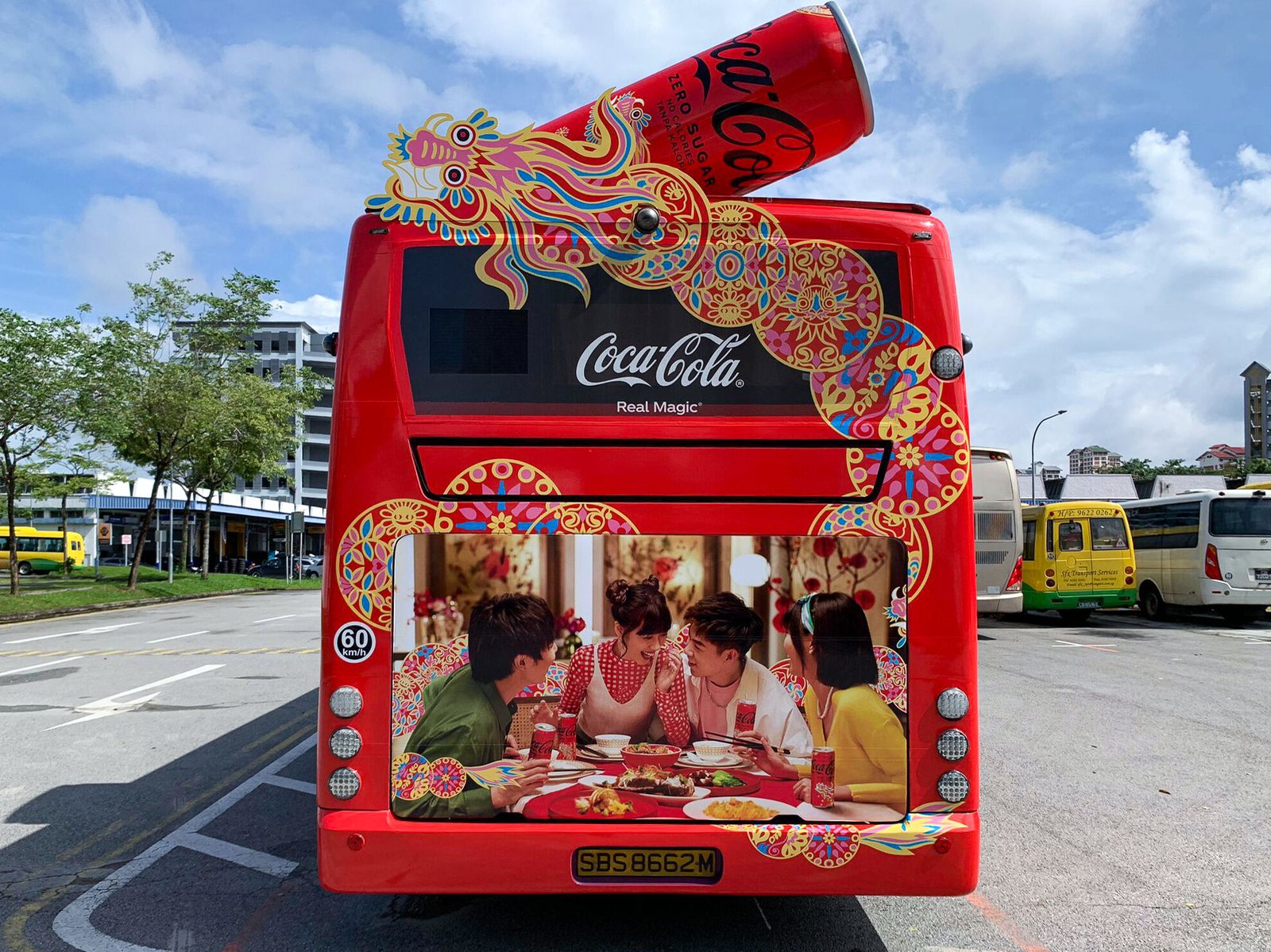
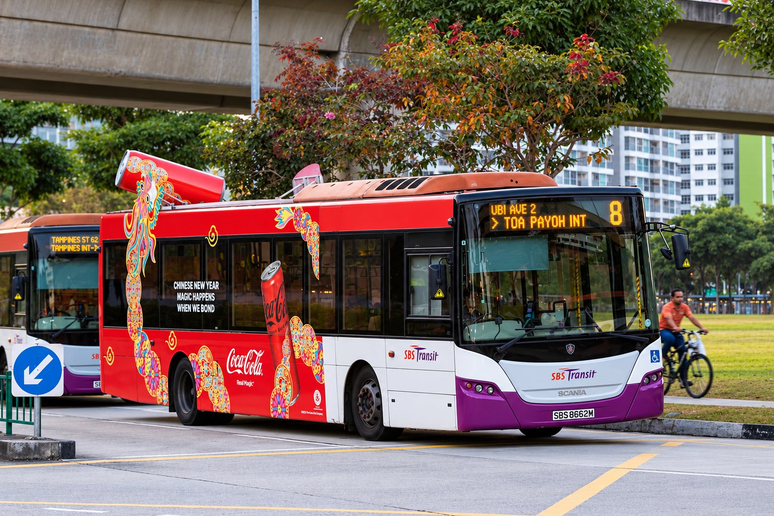
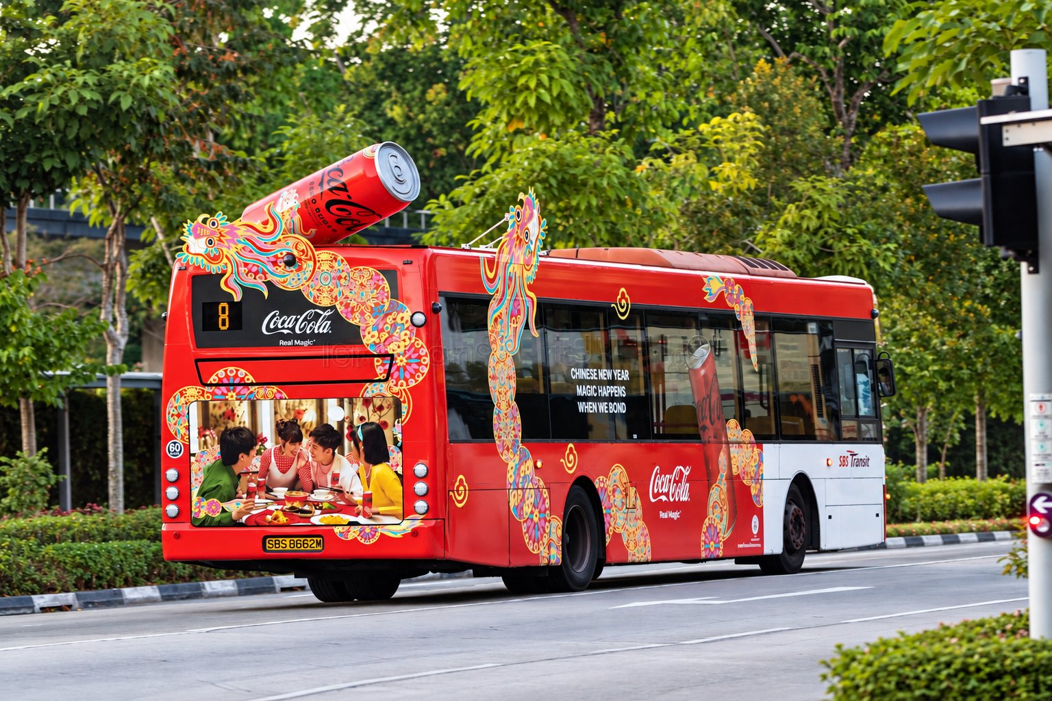
In-market photos © Moove Media — all rights belong to Moove Media; shown here for portfolio reference only. View the original post on LinkedIn ↗
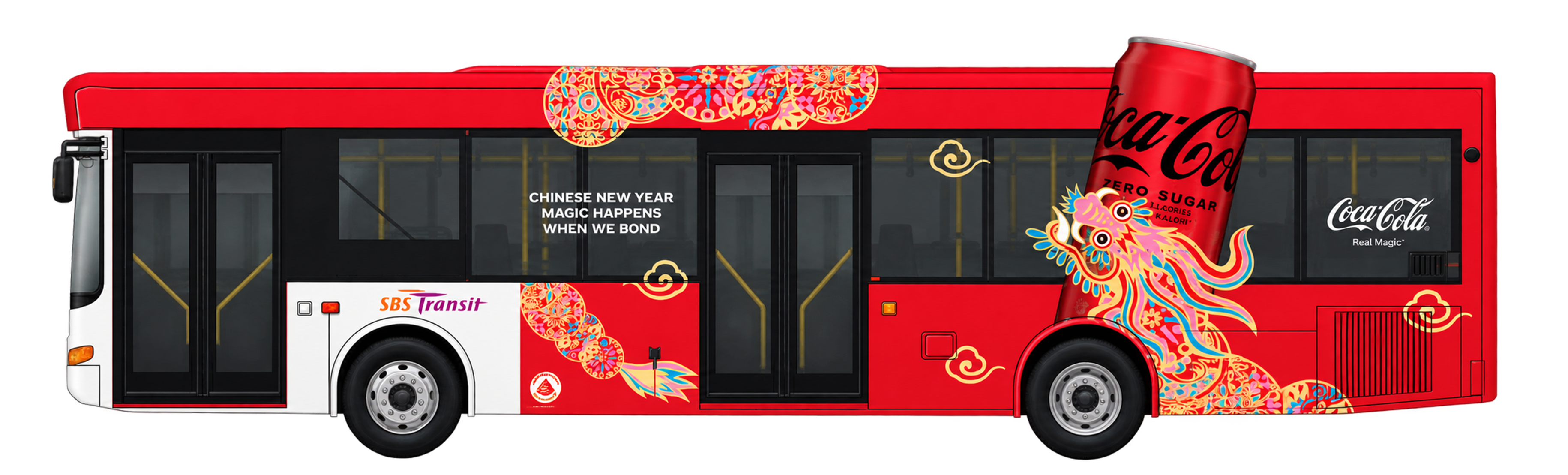
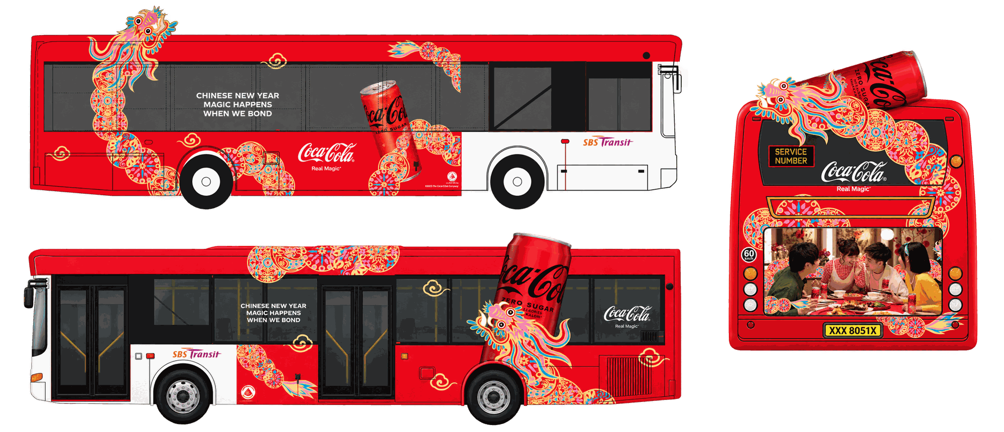
The bus transit wrap carried the campaign onto the street: a full-body dragon wound down both sides of an SBS Transit bus, with a die-cut 3D can bursting off the roofline and a lifestyle ad panel filling the rear window for traffic stopped behind it — running the campaign across the regular route network rather than a single fixed site.
Escalator Wall Sticker — Paya Lebar
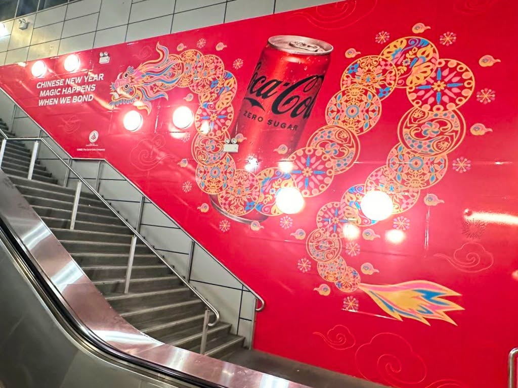
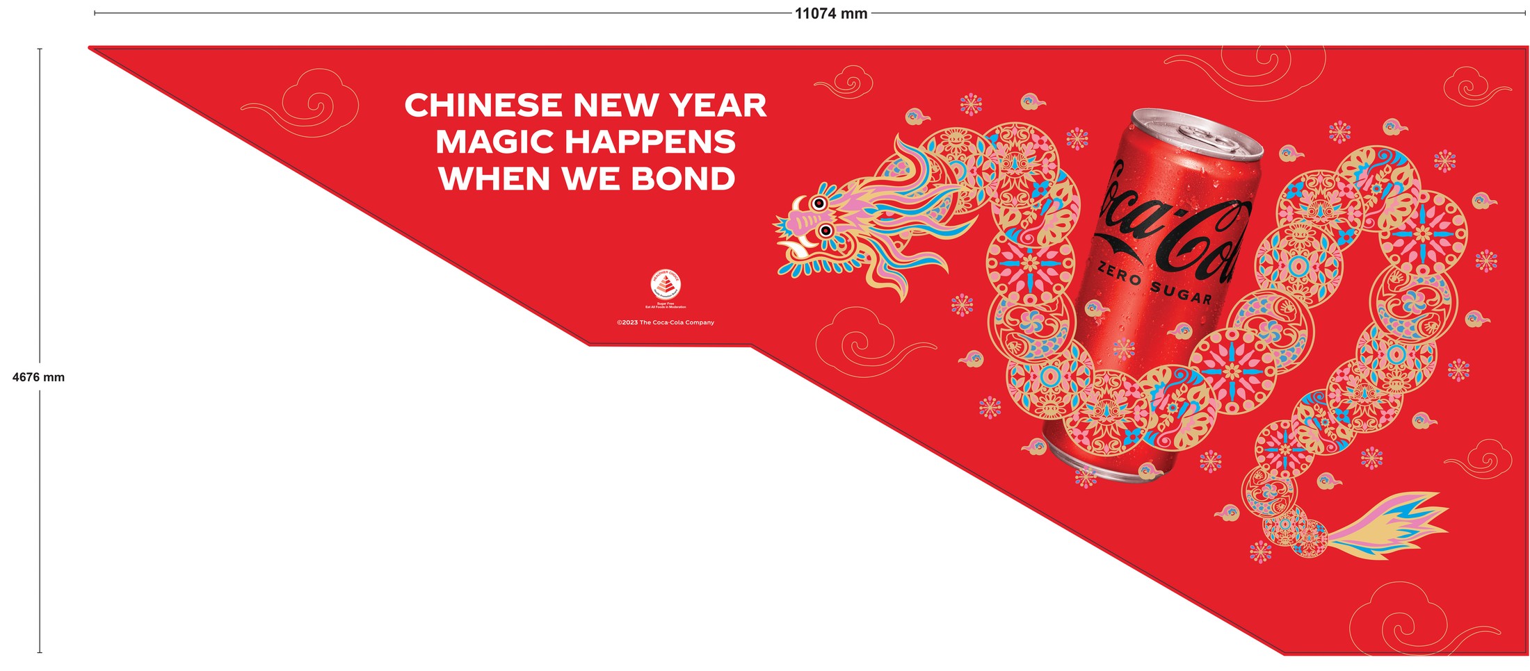
At Paya Lebar MRT, the dragon motif ran down the full wall beside the escalator and stairwell as one continuous sticker, sized to the station's own dimensions rather than a generic panel — the production flat below shows it laid out at full 11,074mm by 4,676mm scale before installation.
Station Wall — Interactive Install & Full Corridor Run
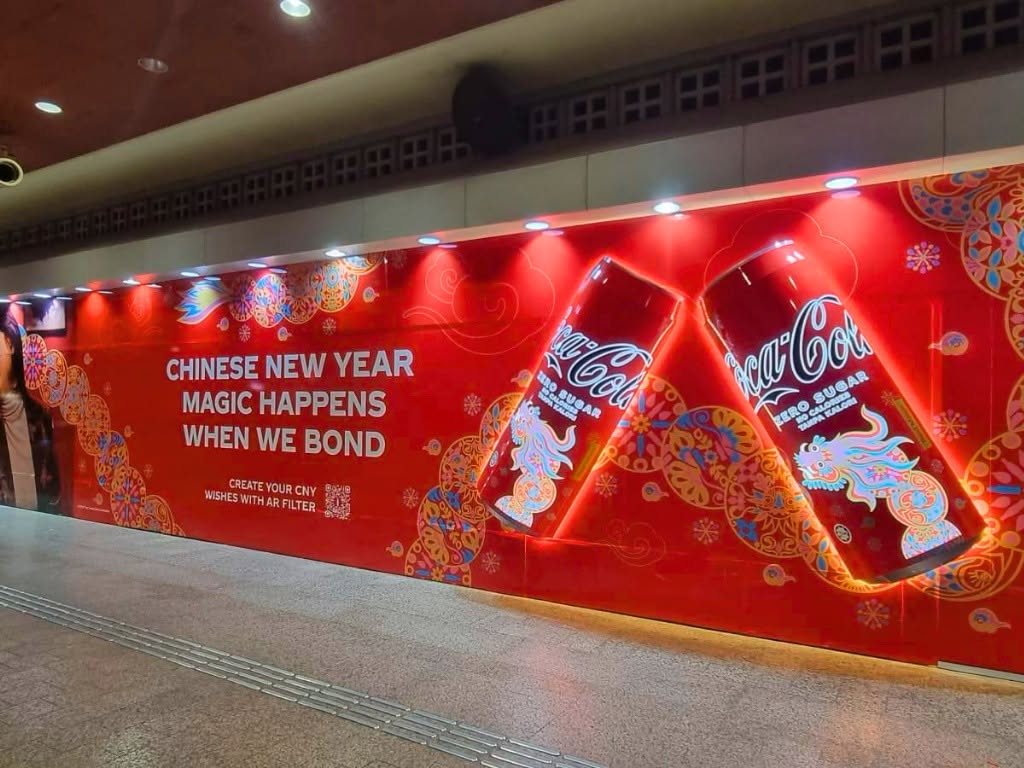
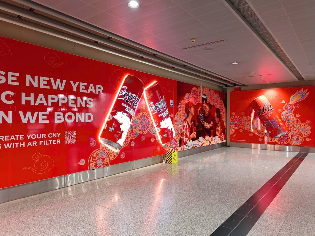
The station wall pieces carried the campaign furthest: each paired a backlit die-cut dragon with illuminated 3D Coke cans and a QR code linking to an AR filter, letting commuters generate their own Chinese New Year greeting on the spot. Installed across major transit hubs including Bugis, Dhoby Ghaut, and Serangoon, every format had to hold the same color and line work at wildly different scales — a tight pillar wrap versus a building-length wall. The same wall system had to repeat cleanly down the length of a working station corridor — the dragon pattern and headline reading as one continuous run rather than a series of disconnected panels, so it held its impact for commuters passing at any point along the hall.
Dhoby Ghaut — Escalator, Pillar & Floor Takeover
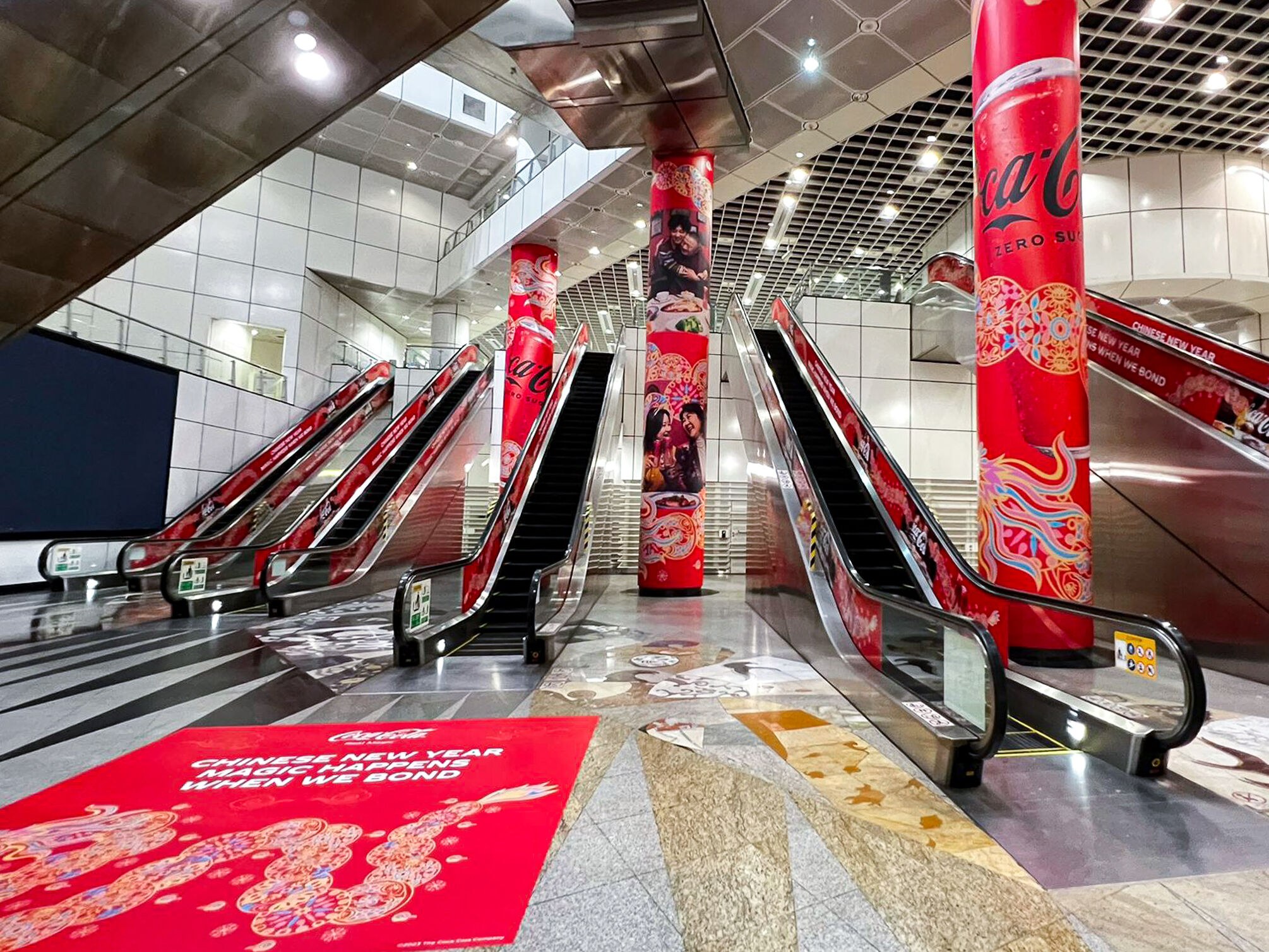
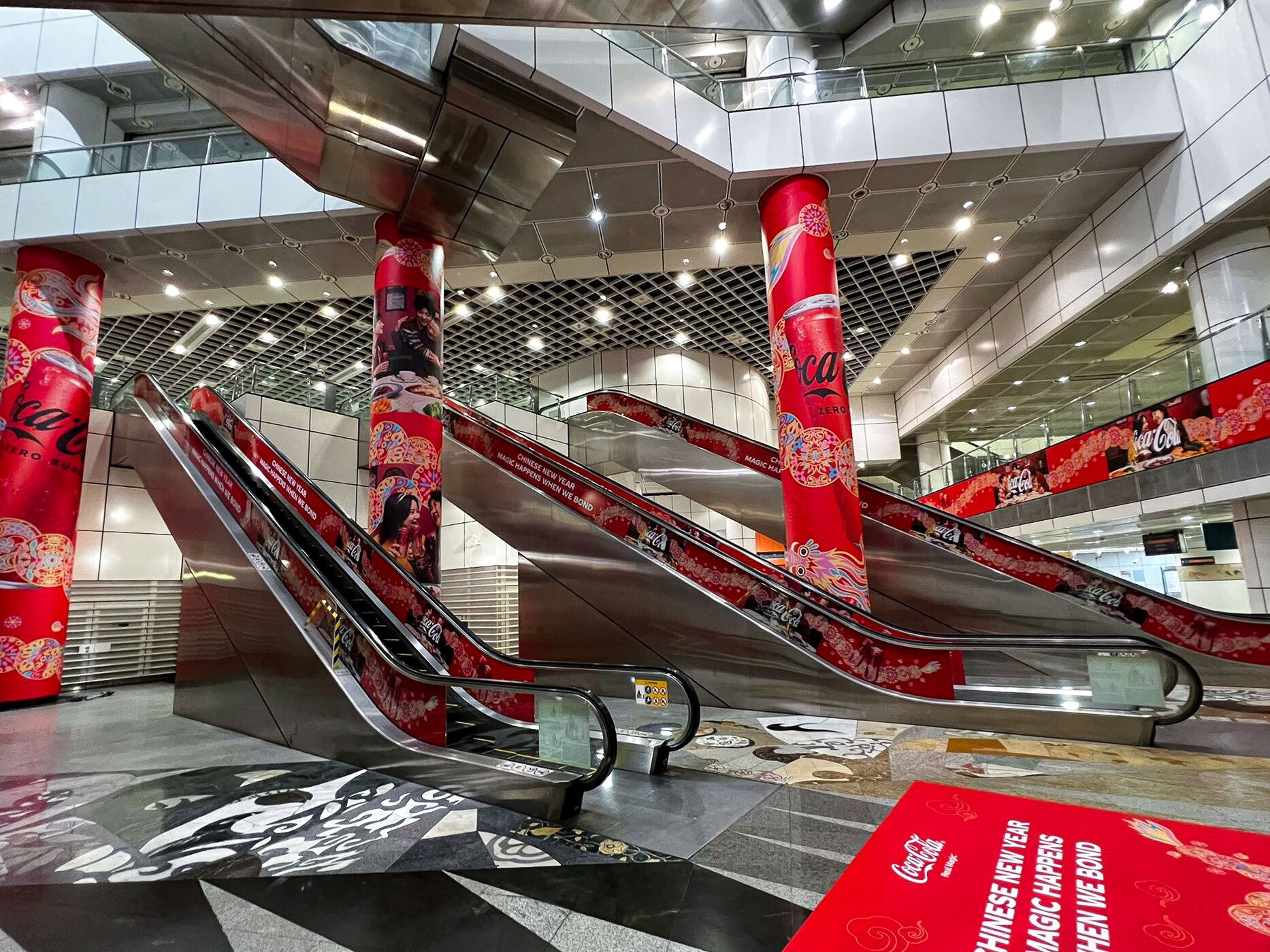
In-market photos © Moove Media — all rights belong to Moove Media; shown here for portfolio reference only. View the original post on LinkedIn ↗
At Dhoby Ghaut, the campaign was installed as one connected takeover made of three formats: escalator side wraps, mega pillar wraps, and a floor sticker. The dragon motif ran from the floor decal at the entrance, up the escalator side panels, and around the pillars, so commuters were surrounded by it as they rode up. The pillars each carried their own layout cut from the same artwork: a family reunion dinner portrait pair and two hero-can versions with the dragon curling around the can from opposite ends. The three print-ready pillar files are shown below.